Trueleafs
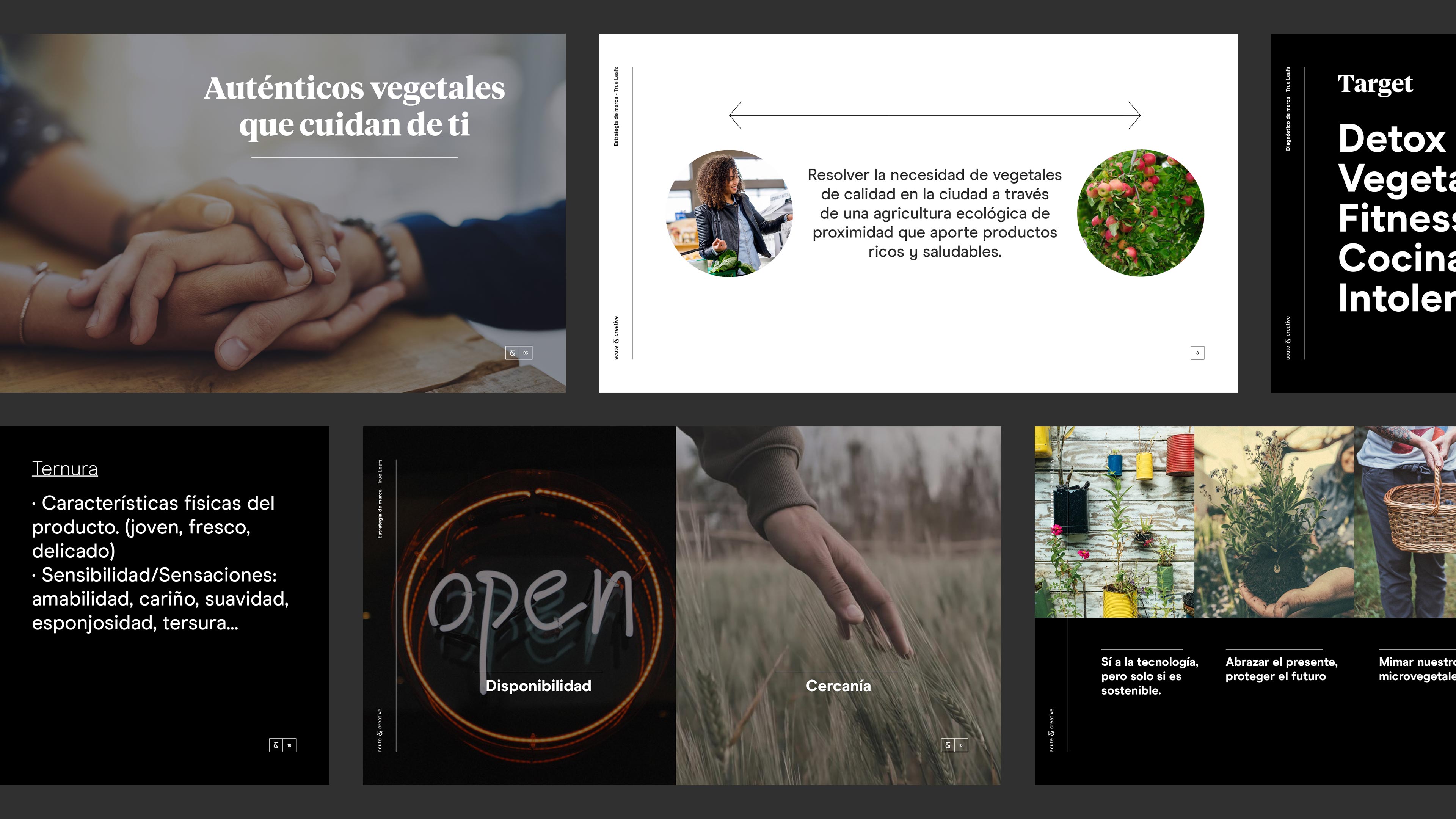
Authentic vegetables caring for you
Situation
Daniel Fernández, the mind and hands behind Trueleafs, had an idea. Their microgreens crops only reached the kitchens of great chefs, but this was not enough for him. High nutritional benefit and powerful flavor are the most important characteristics of microgreens, so… why are they only available to a few? His objective was clear: position Trueleafs into all audience and promote a healthier diet based on quality vegetables consumption. To do this, he needed to create a solid brand that would help him tell his story. And there is where we appeared.
Idea
After a user research we realized that the several benefits of Trueleafs products are still unkown for the audience: nutritional power, quality, ecology and ‘zero-mile’ production, taste… but these values are increasingly taken into consideration by society. Ecology and sustainability were worn out ideas to position the brand so we decided to focus on another property of microgreens: tenderness.
Of course, not a characterless tenderness. It had to be a simple and authentic tenderness.
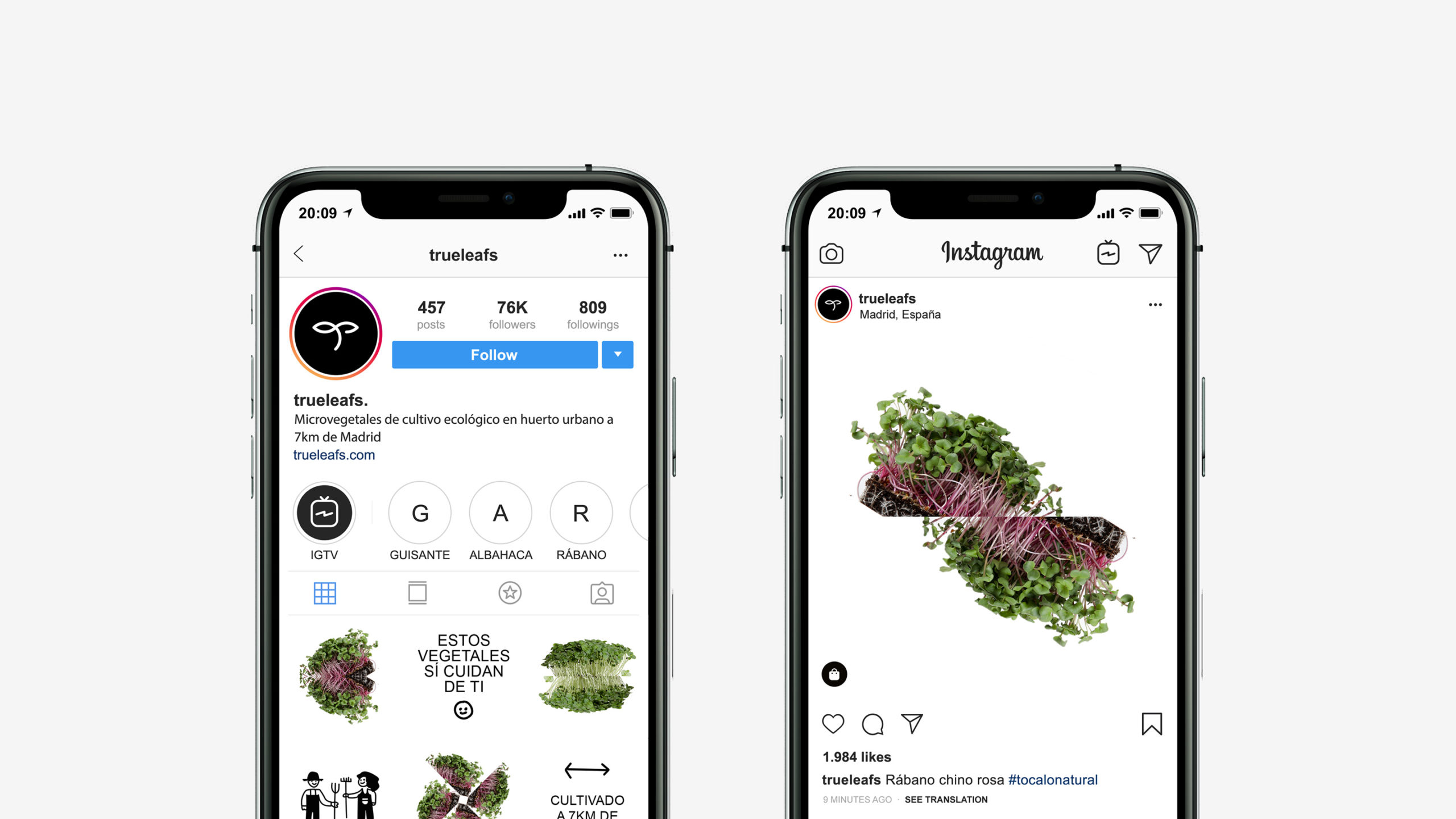
Result
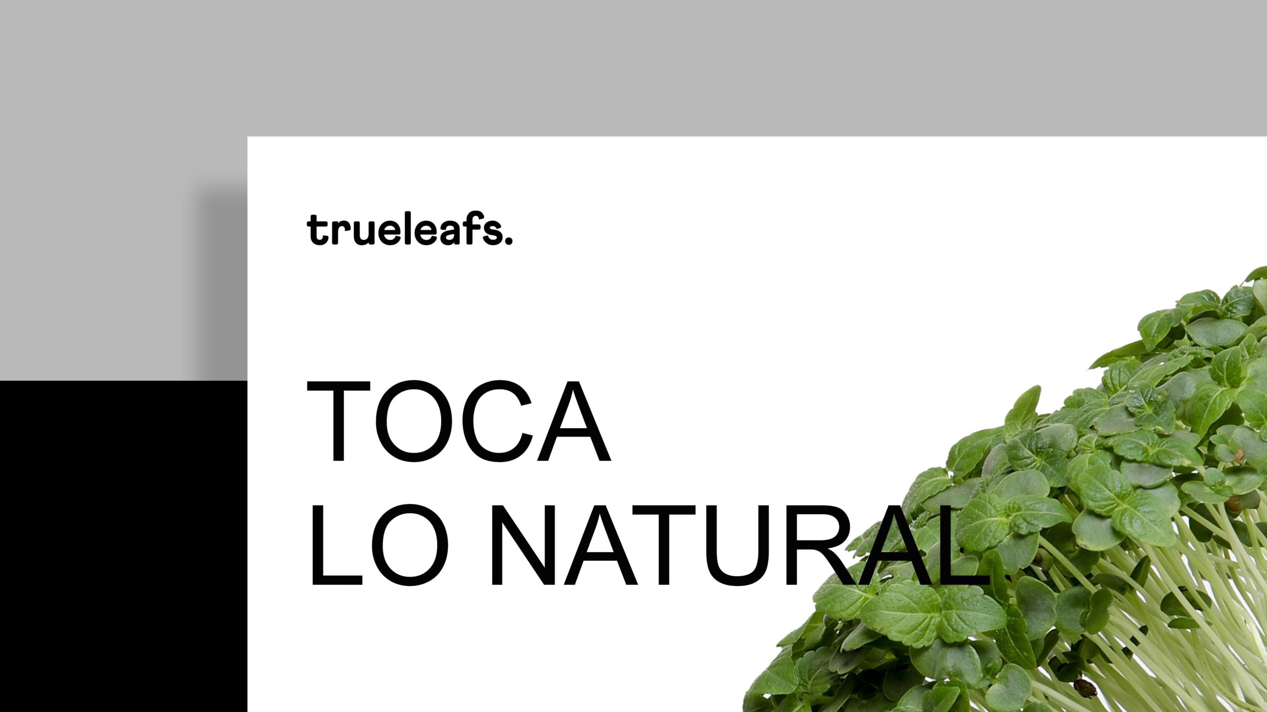
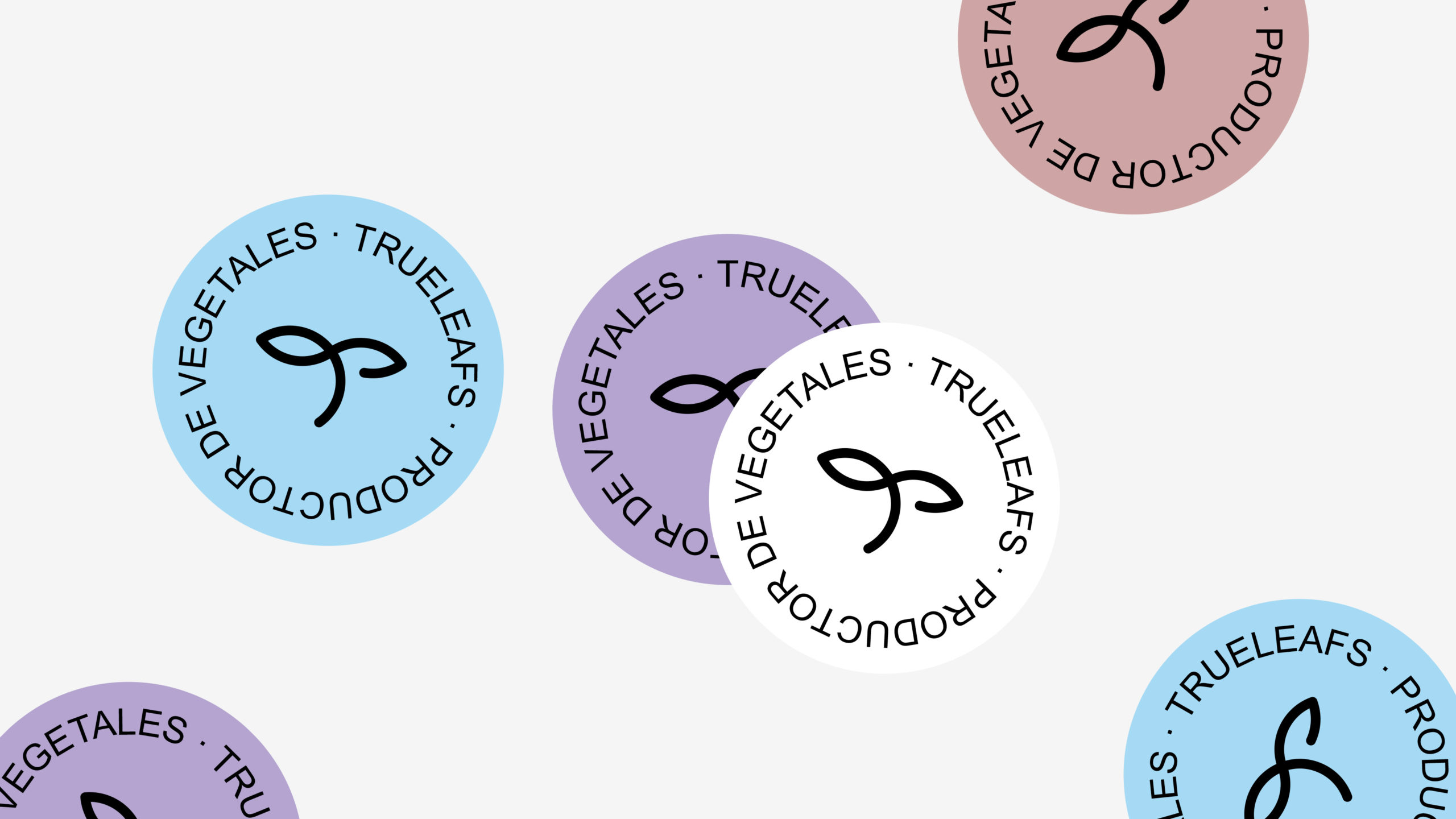
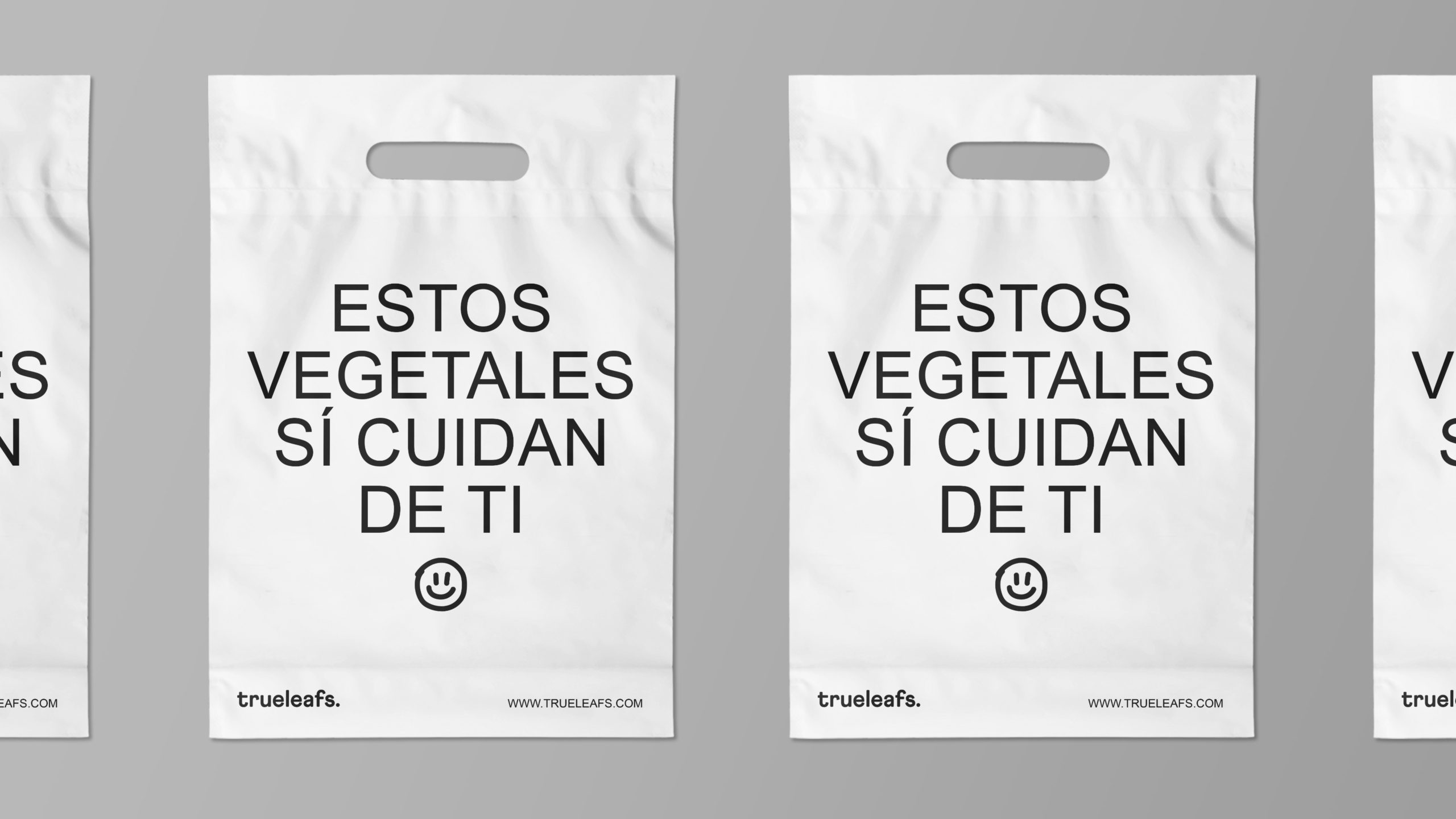
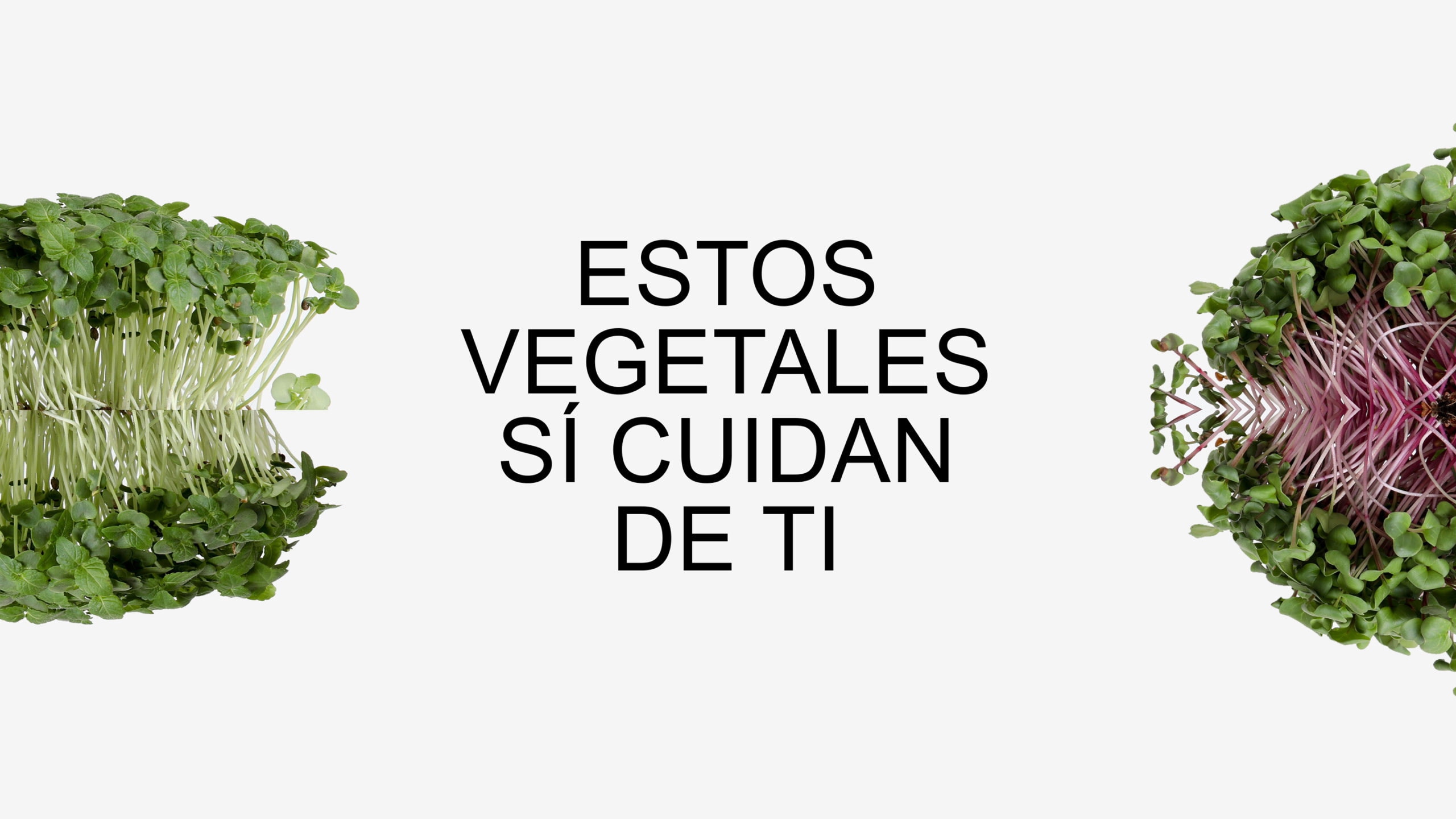
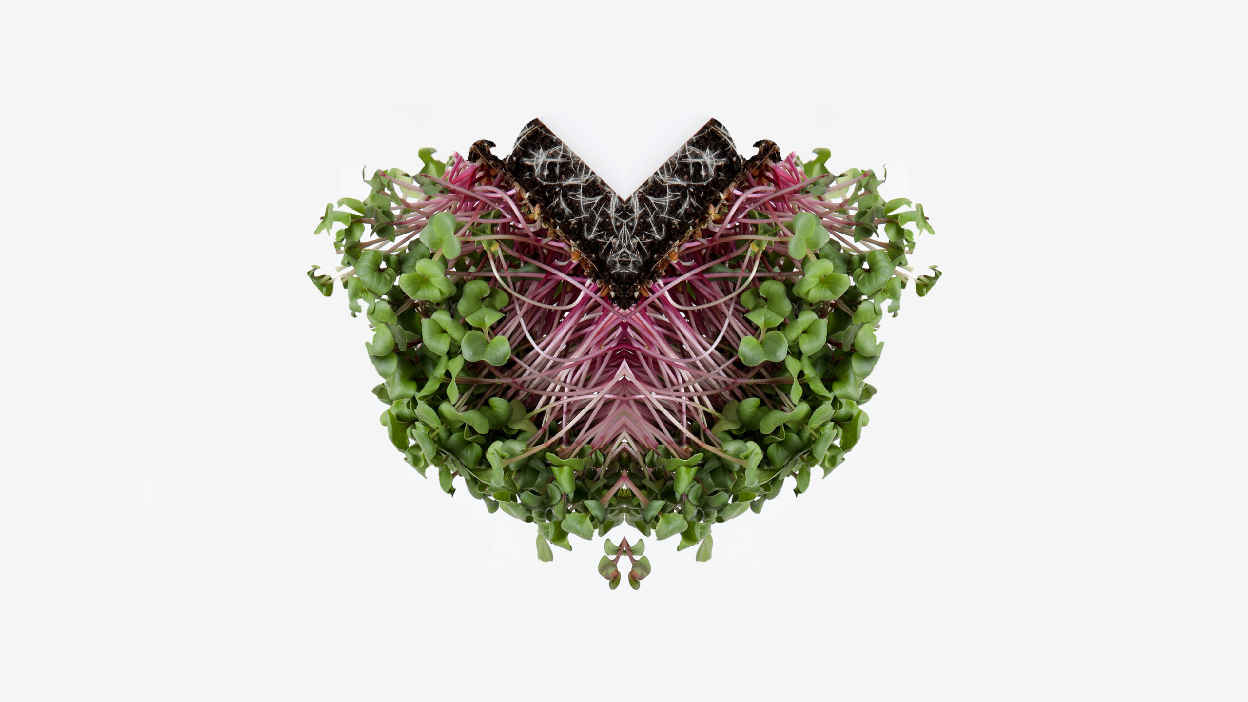
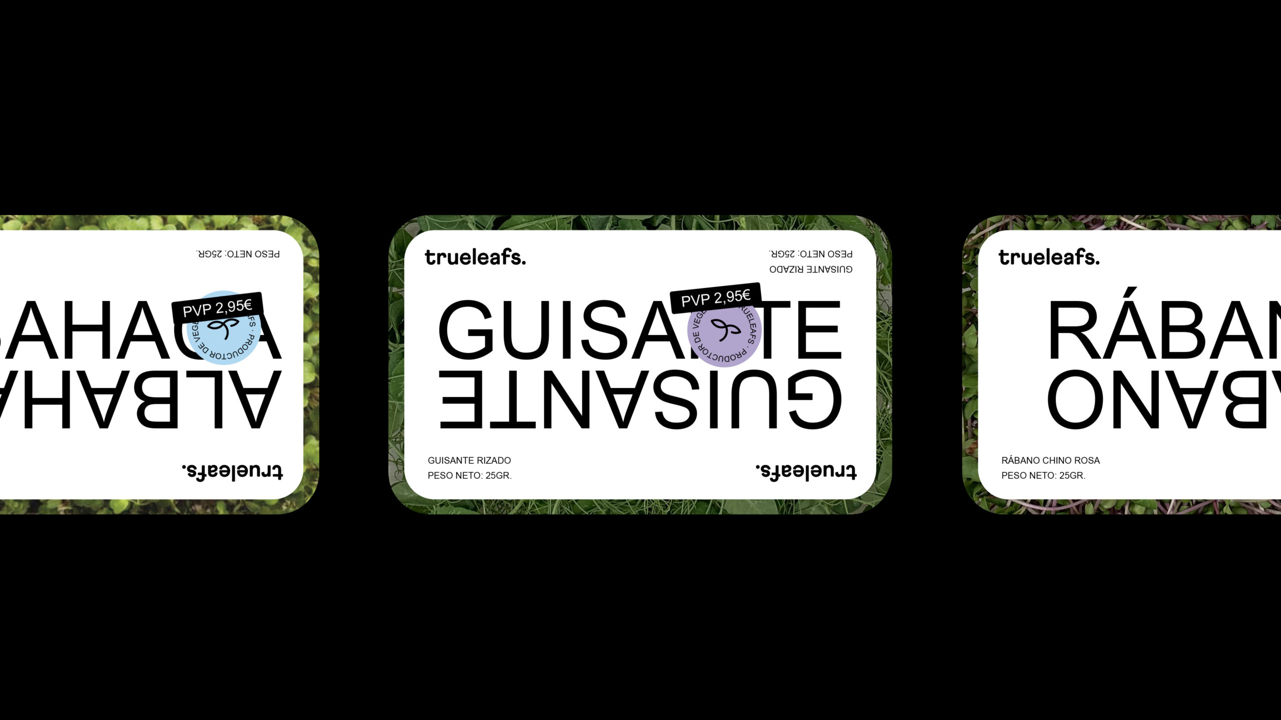
A transparent and authentic brand guided by simplicity and spontaneity. To express itself, it uses resources such as illustration and iconography. Trueleafs wanted to show their commitment to sustainability beyond their discourse, and for this reason, the colors of the brand are white and black. On the other hand, his tone of voice is young, natural and affectionate, and communicates through direct phrases. Trueleafs talks about food and the environment, cares about its consumers, and informs them its objectives and advances.