Toqio’s growth is aligned to the advances of its sector: Fintech companies (finance and technology). After only two years since its founding, Toqio’s management team wanted to reestablish its brand, set its ideas in order, and refresh its identity in order to continue growing without limits.
Research: What Toqio looks like from the inside ... and from the outside
The analysis phase is key in branding: internal and external surveys, customer interviews, benchmark/competitors study, discovery workshop, etc. Within this phase, we extract the most valued differential points of the startup, its company philosophy, and its objectives for the present and future. Toqio’s points to improve in this regard? Organize the brand ideas and enhance its differentiation by refreshing its visual identity.
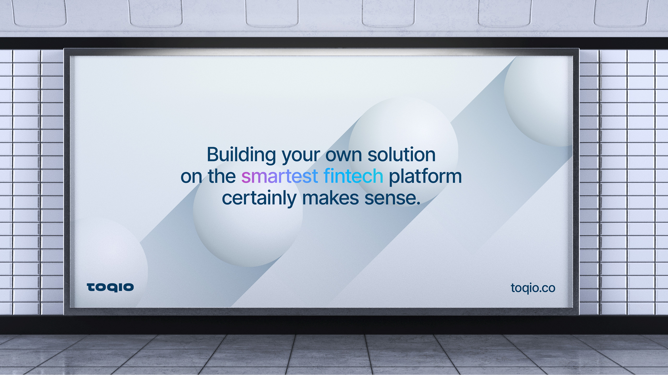
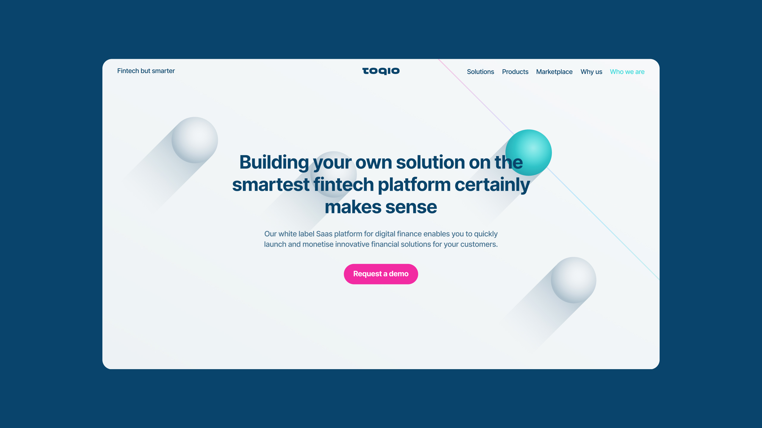
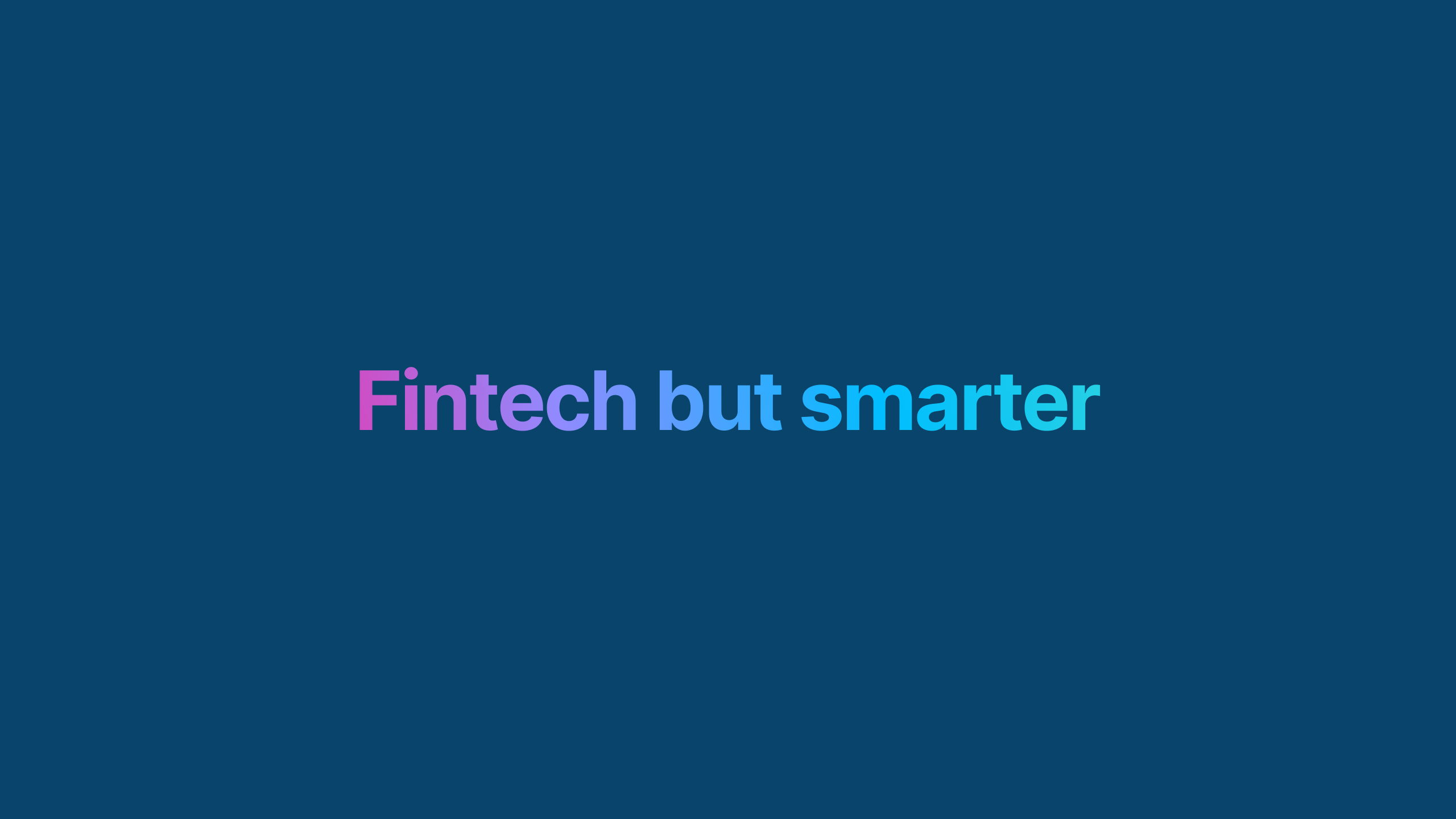
Fintech but smarter: The starting point.
If something characterizes Toqio (company-product-people) is its pragmatism. Now, you don’t need to build your own solution from scratch. Toqio provides a smarter way to deliver Fintech innovation taking advantage of existing technology. After our constant conversations with them, it was clear to us that Toqio offers the smartest solution – which does not necessarily have to be the most complex-.
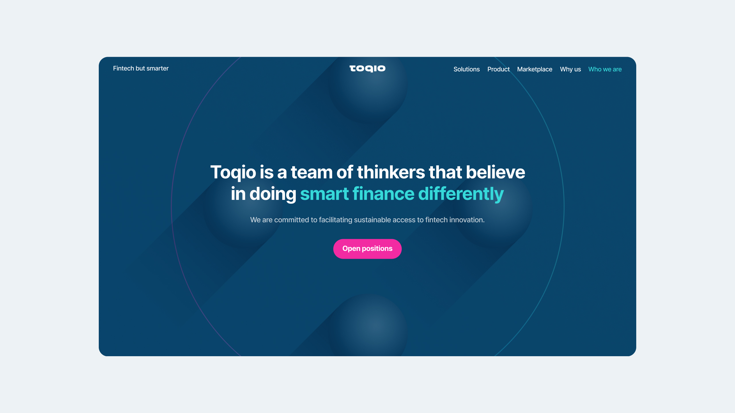
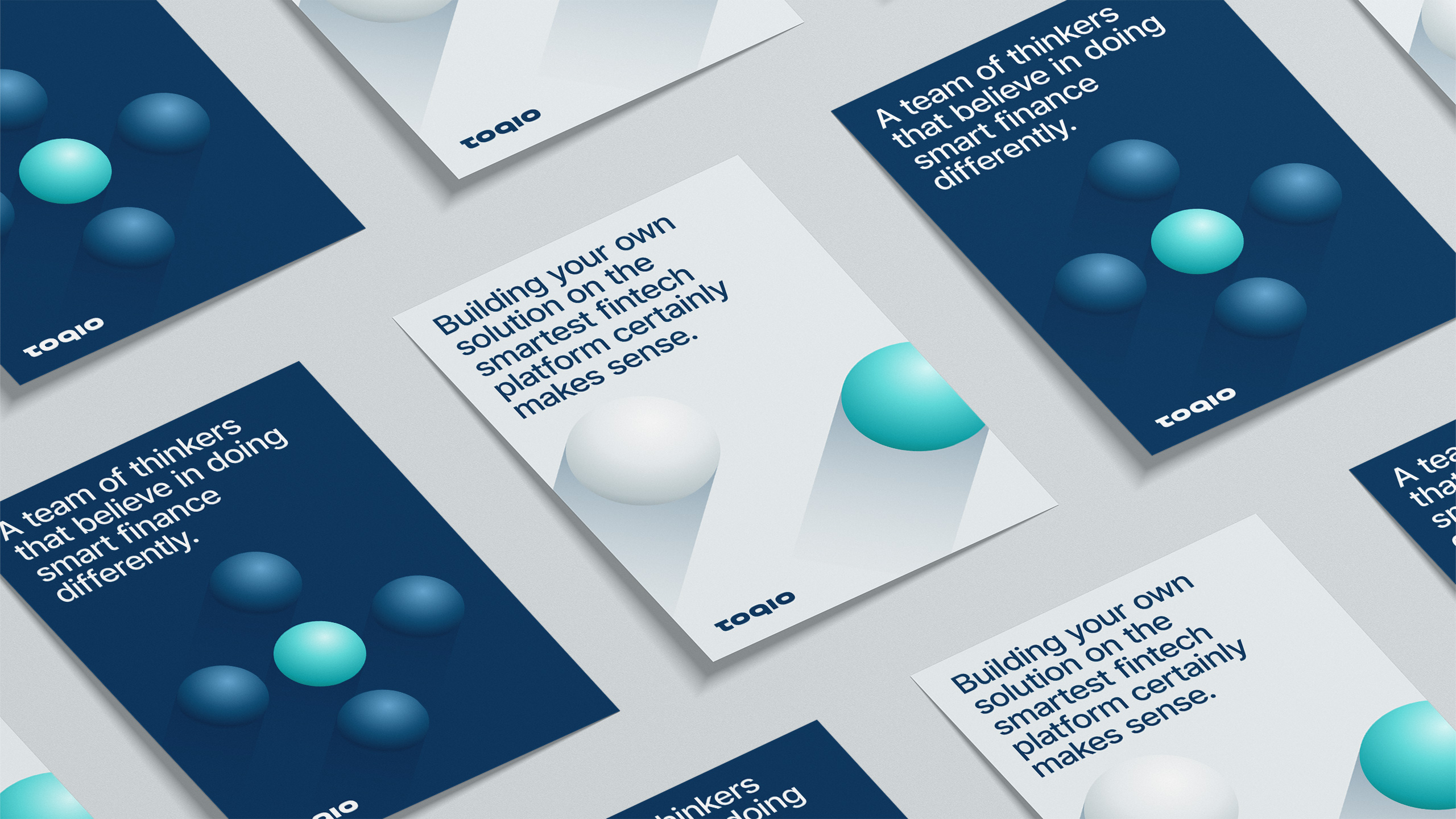
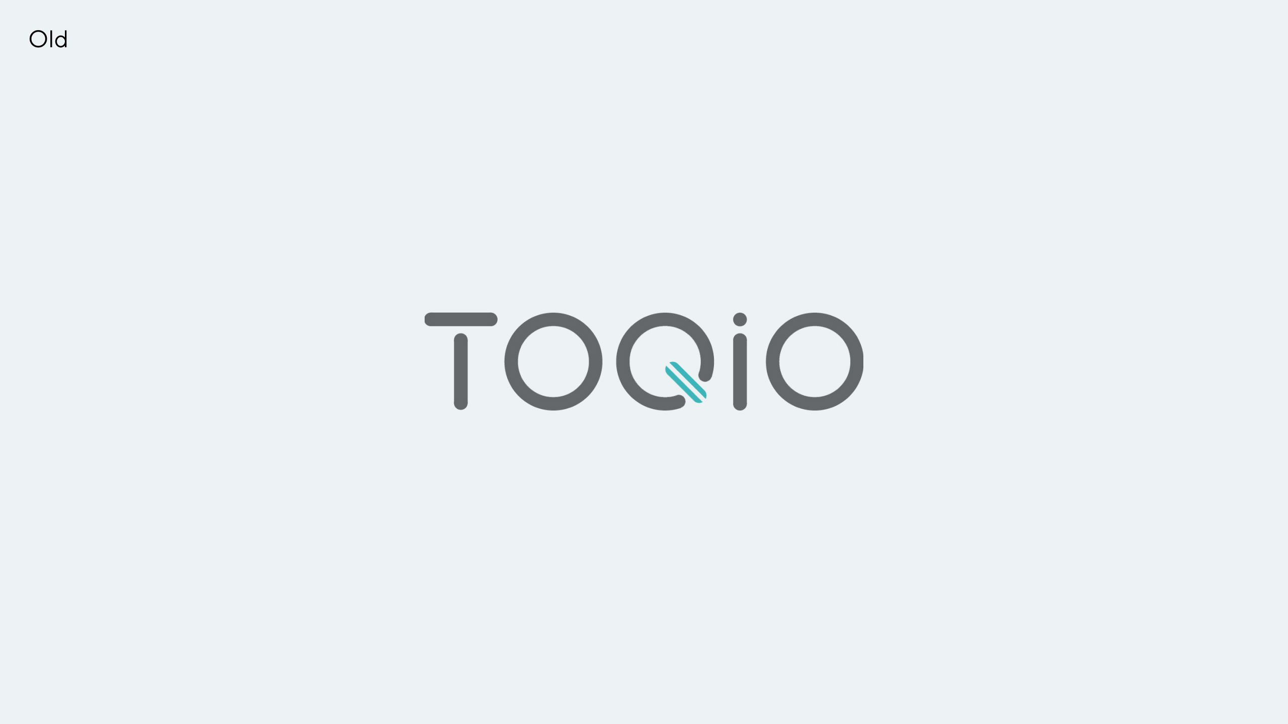
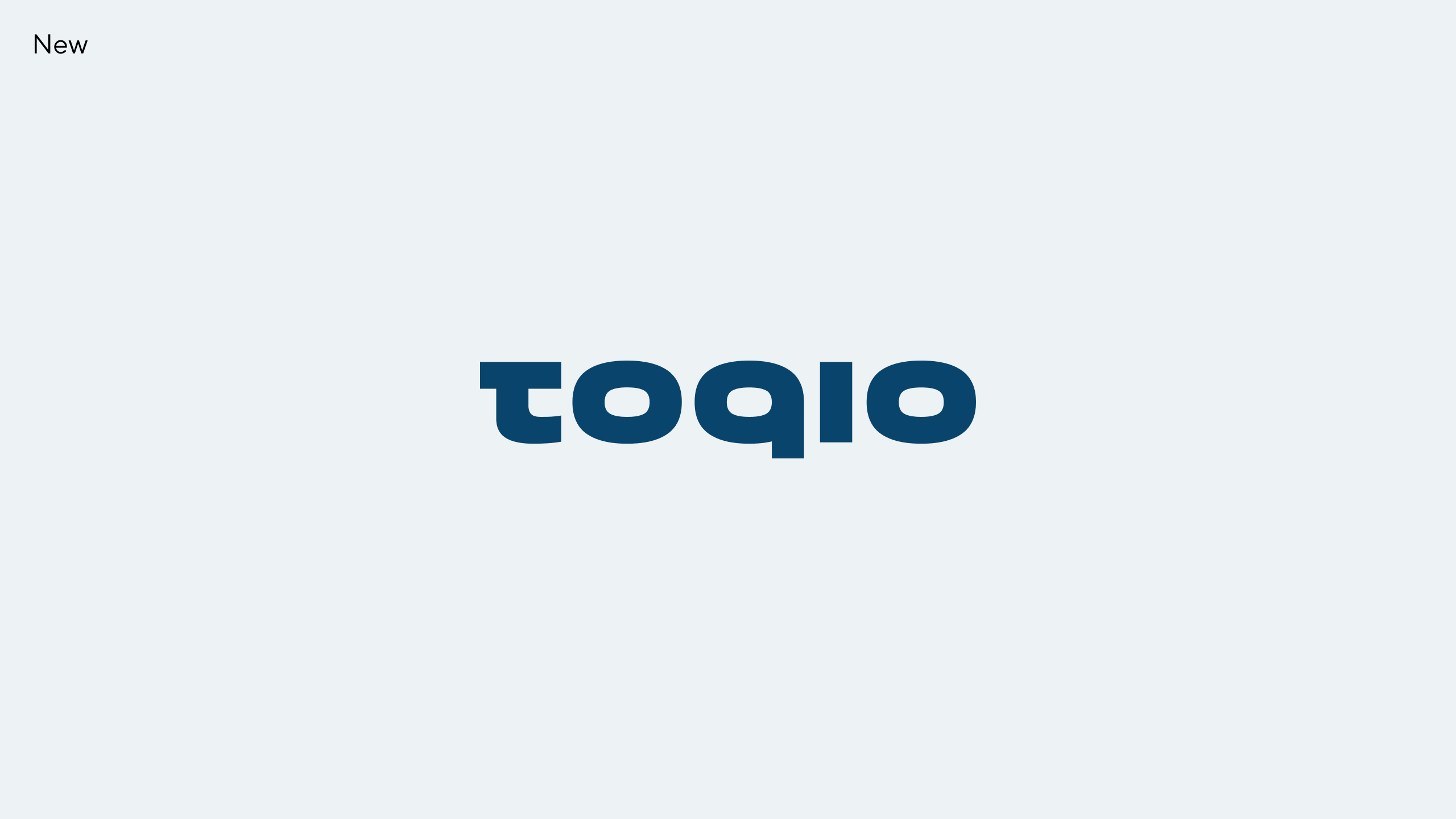
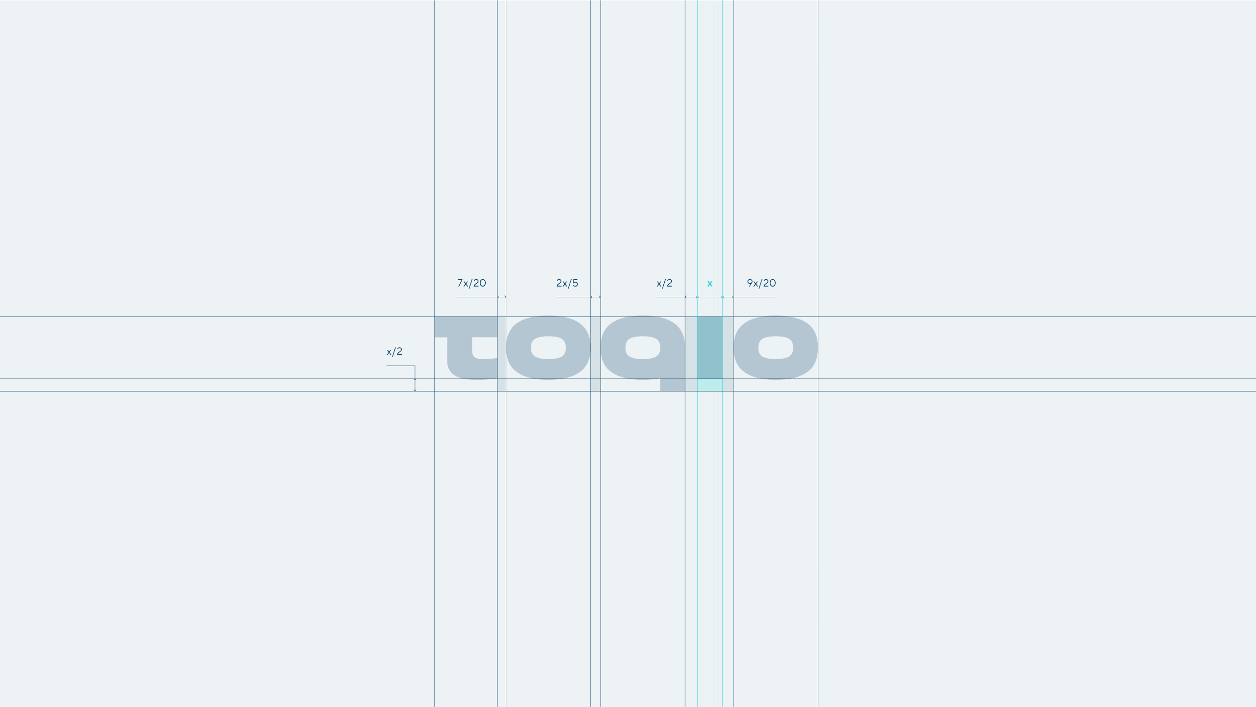
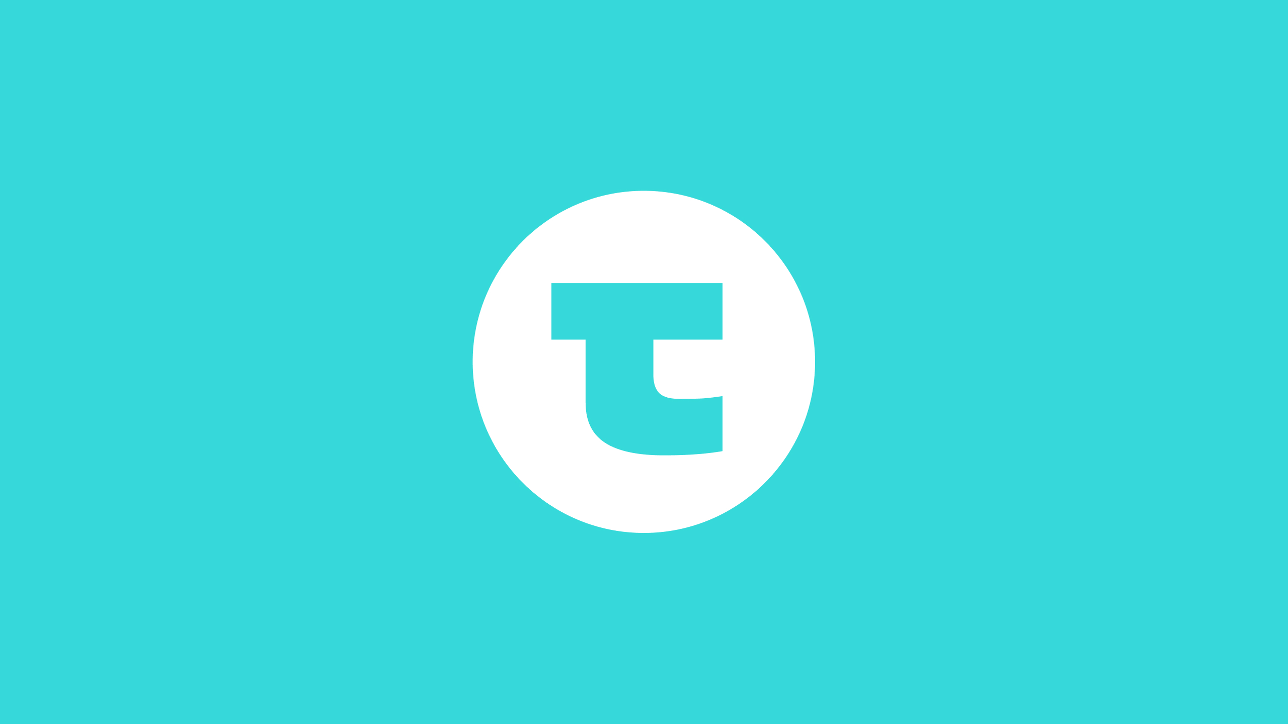
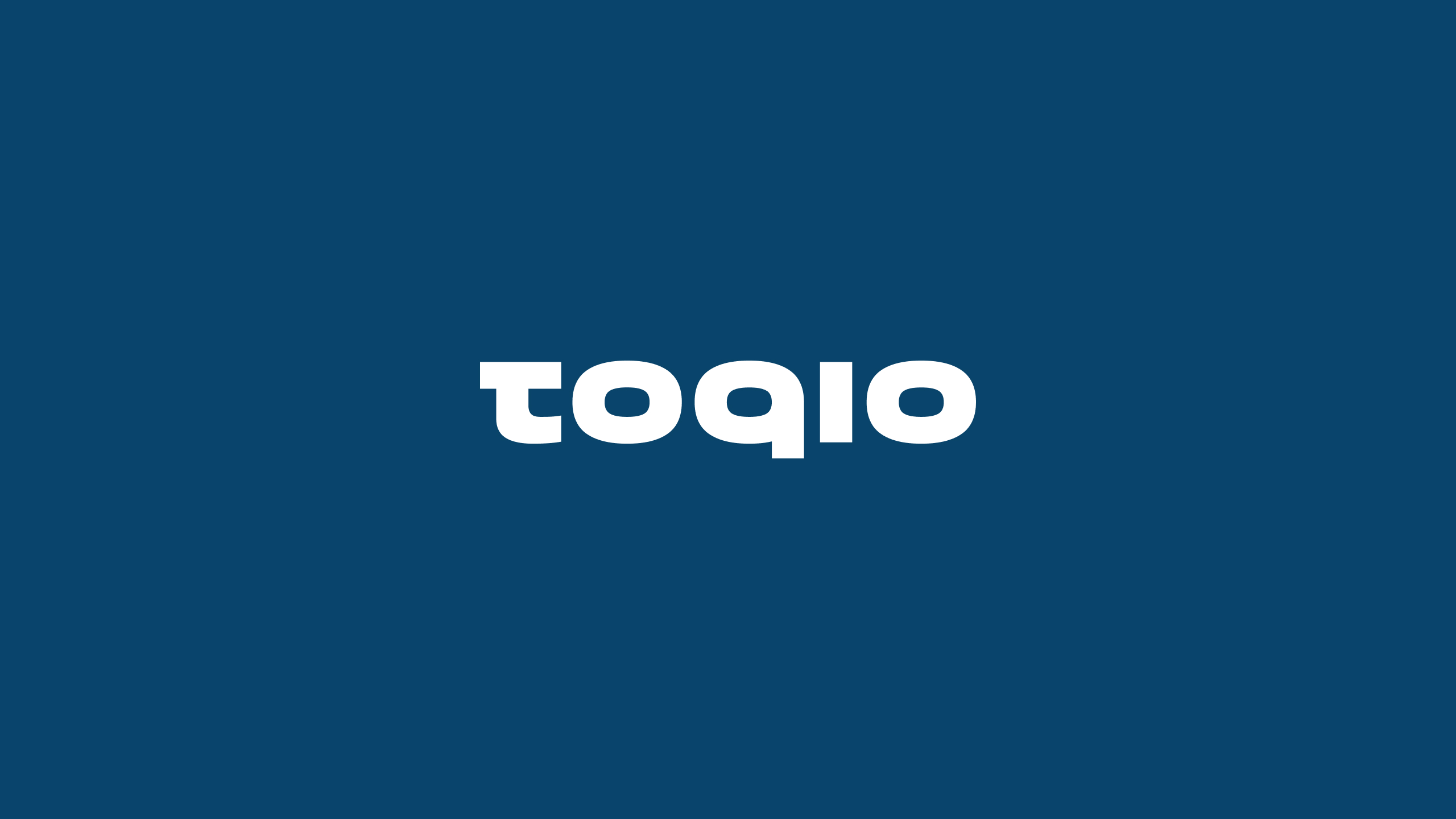
From TOQIO to Toqio
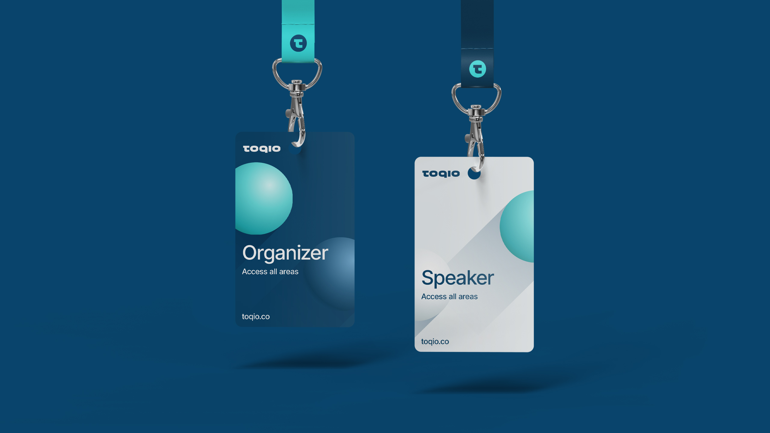
Redesigning Toqio’s logo was a logical step towards brand cohesion and coherence. With it, we wanted to create a simpler and more memorable logo, that could fit in with the new creative path and brand resource of the spheres. Hence the rounder and thicker typeface. On the other hand, Toqio’s “t” is reminiscent of a Japanese character, which helps to differentiate the brand. It gives it a unique touch.
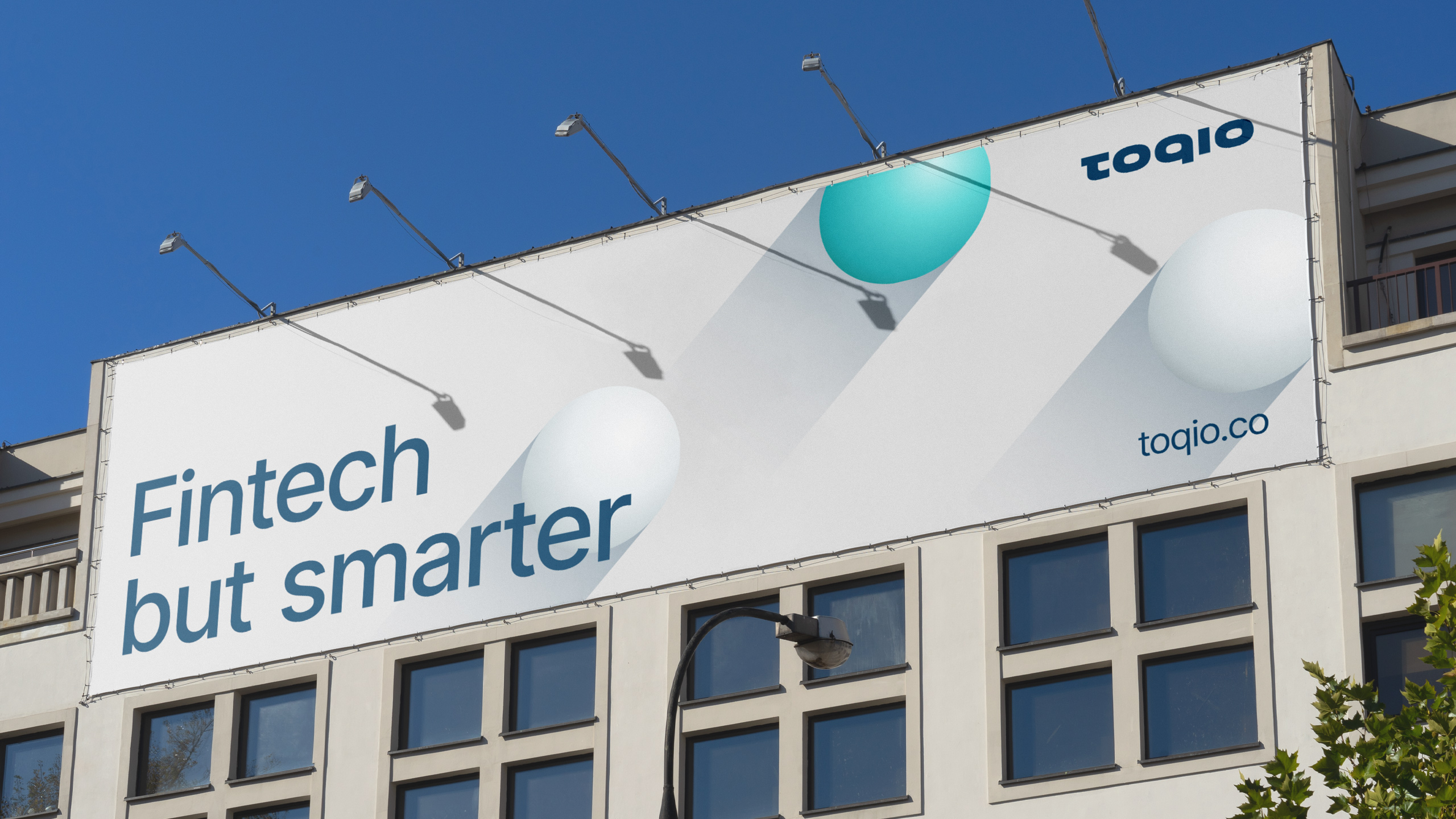
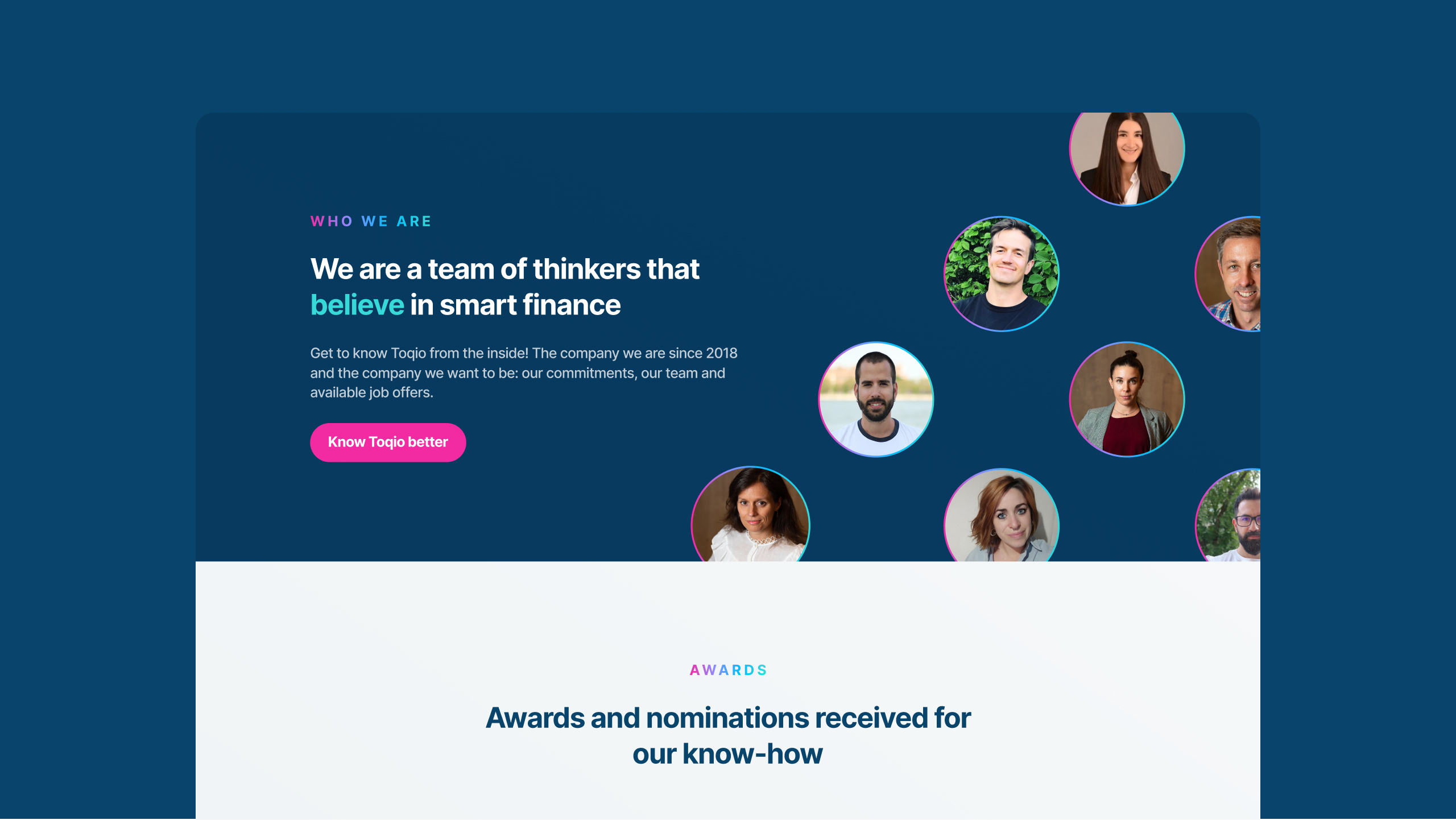
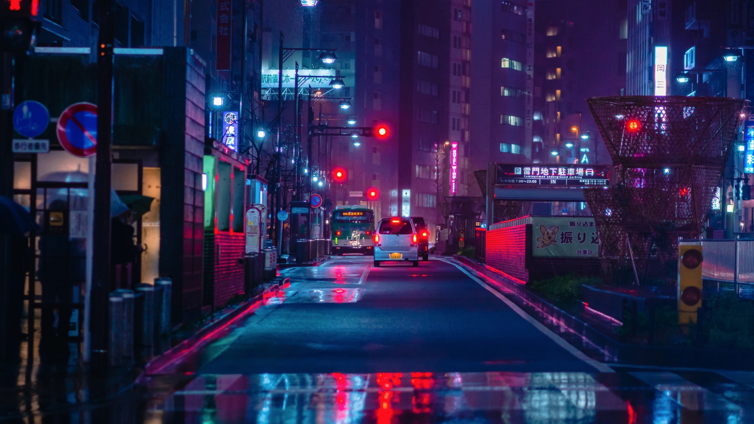
Bright fintech, bright people, bright cities
To develop Toqio’s new color palette, we were inspired by the night lighting of the city of Tokyo, both in colors and gradient effect. We tested several options but truth said, both teams agreed that Toqio’s old brand’s turquoise was actually a key differentiator. On the other hand, devices needed to appear always next to people, and people should look spontaneous and natural. Toqio’s photographic style is represented by the people who form it.


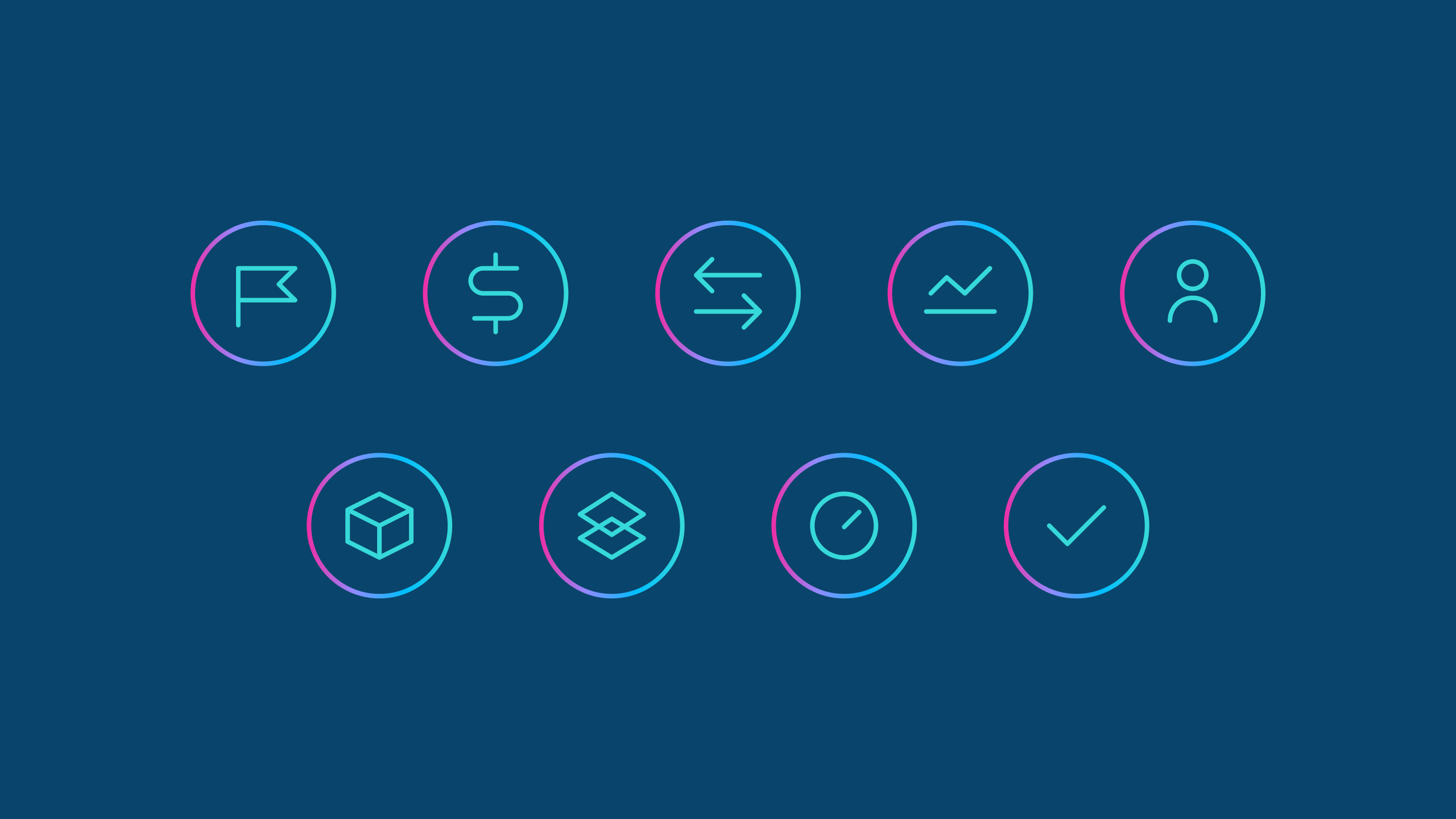
Spheres, the smartest figure
In order to represent Toqio’s intelligence, innovation, and efficiency, we resorted to the most efficient geometric shape: the sphere. In addition, the 3D shapes are not a common graphic used resource in the sector, its use as a brand key element provided Toqio a smart differentiation from its competitors. By adding animation resources to the spheres we enhanced all meanings (being the smartest, quickest, and most efficient).