Situation
Bluu is a company that belongs to the telecommunication sector and it has been helping improve customer care service for 10 years. They made contact with us to help them improve their brand. When we started working with them, we detected that they had a significant brand identity problem between Bluu-company and Schaman (their best known service). The objective we set was to build a differentiated and recognizable purpose and to improve the coherence and interrelation of brands.
Idea
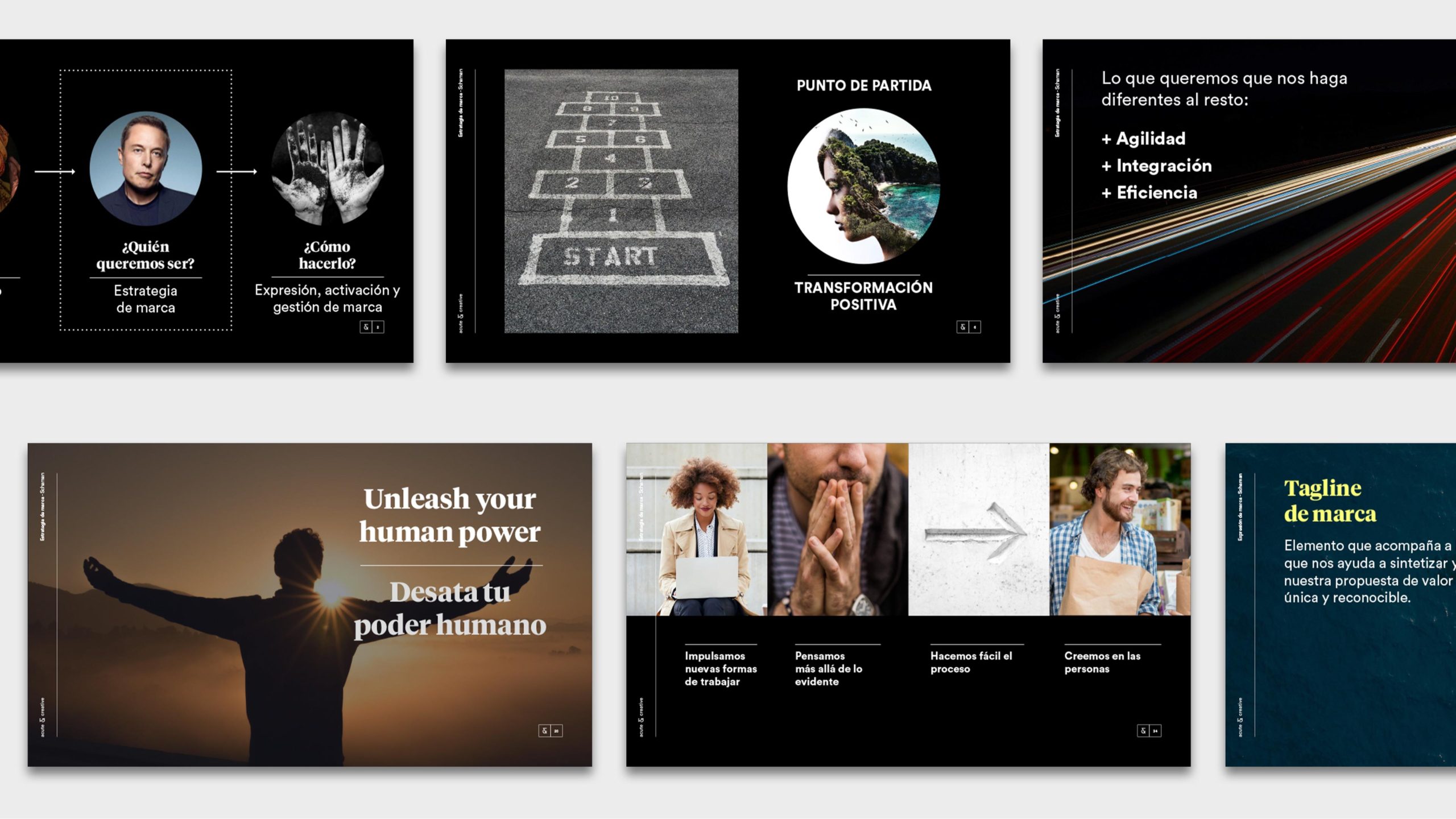
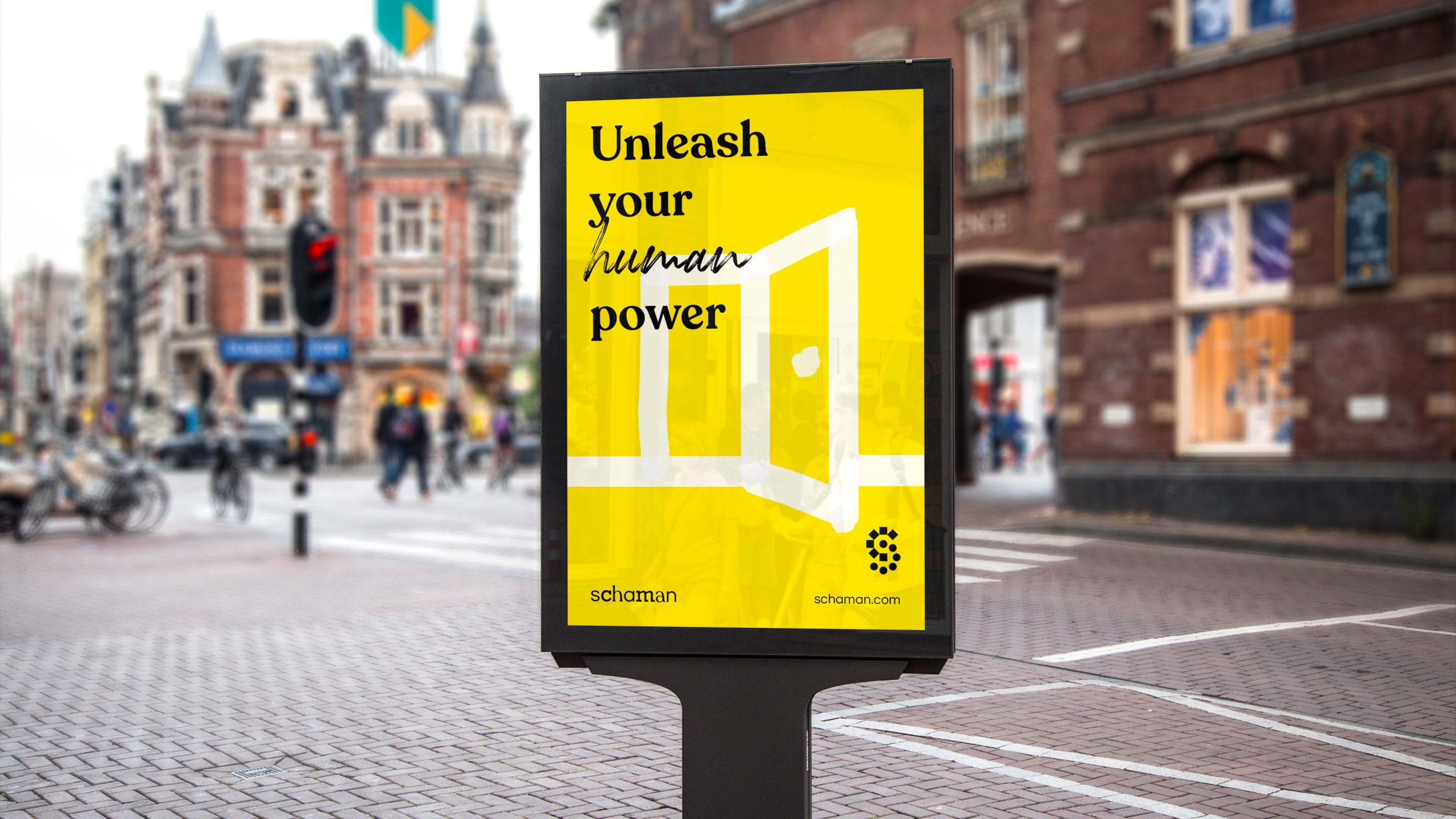
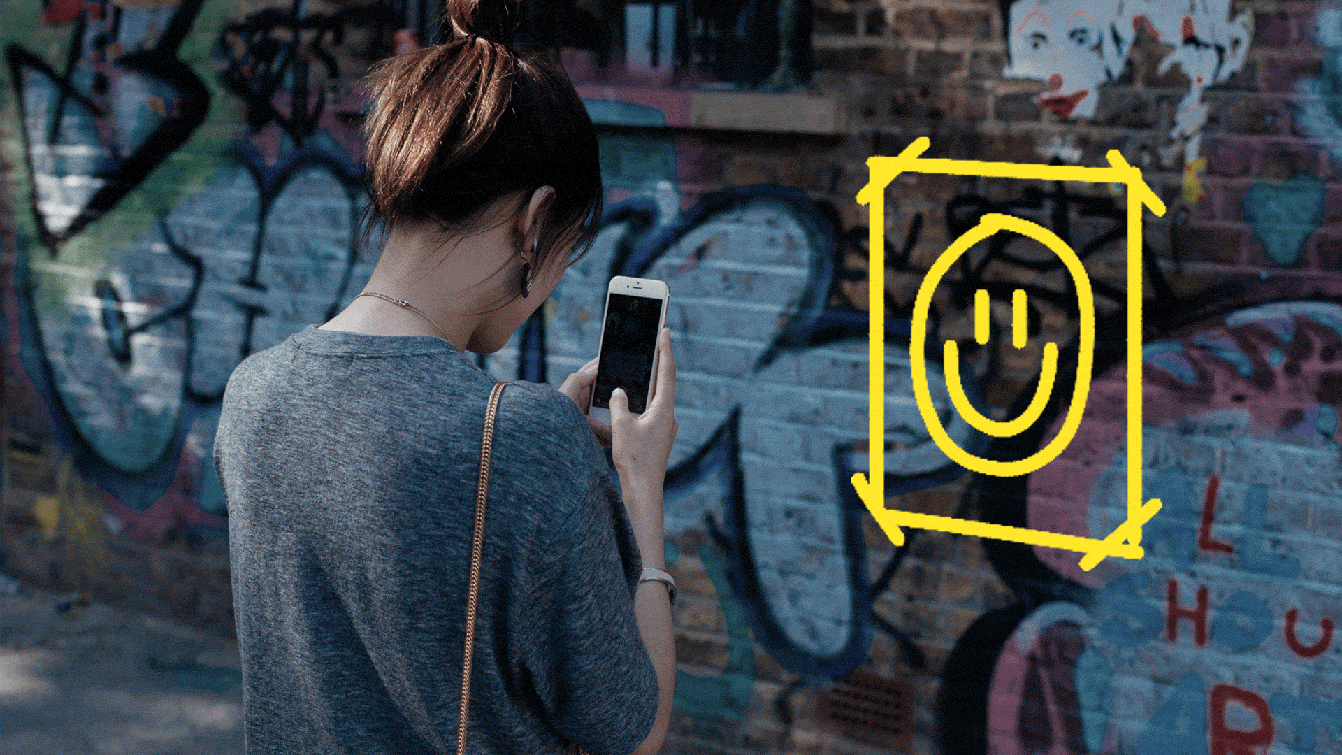
We started from the positive transformation and took advantage of one of the brand’s competitive benefits, process automation. From this perspective of change and momentum, Schaman established as the name of both product and company. People were placed at the center of the brand’s concerns; the goal is to automate processes so that end customers can receive quality and human attention. The new brand big idea is to unleash your human power.
Result
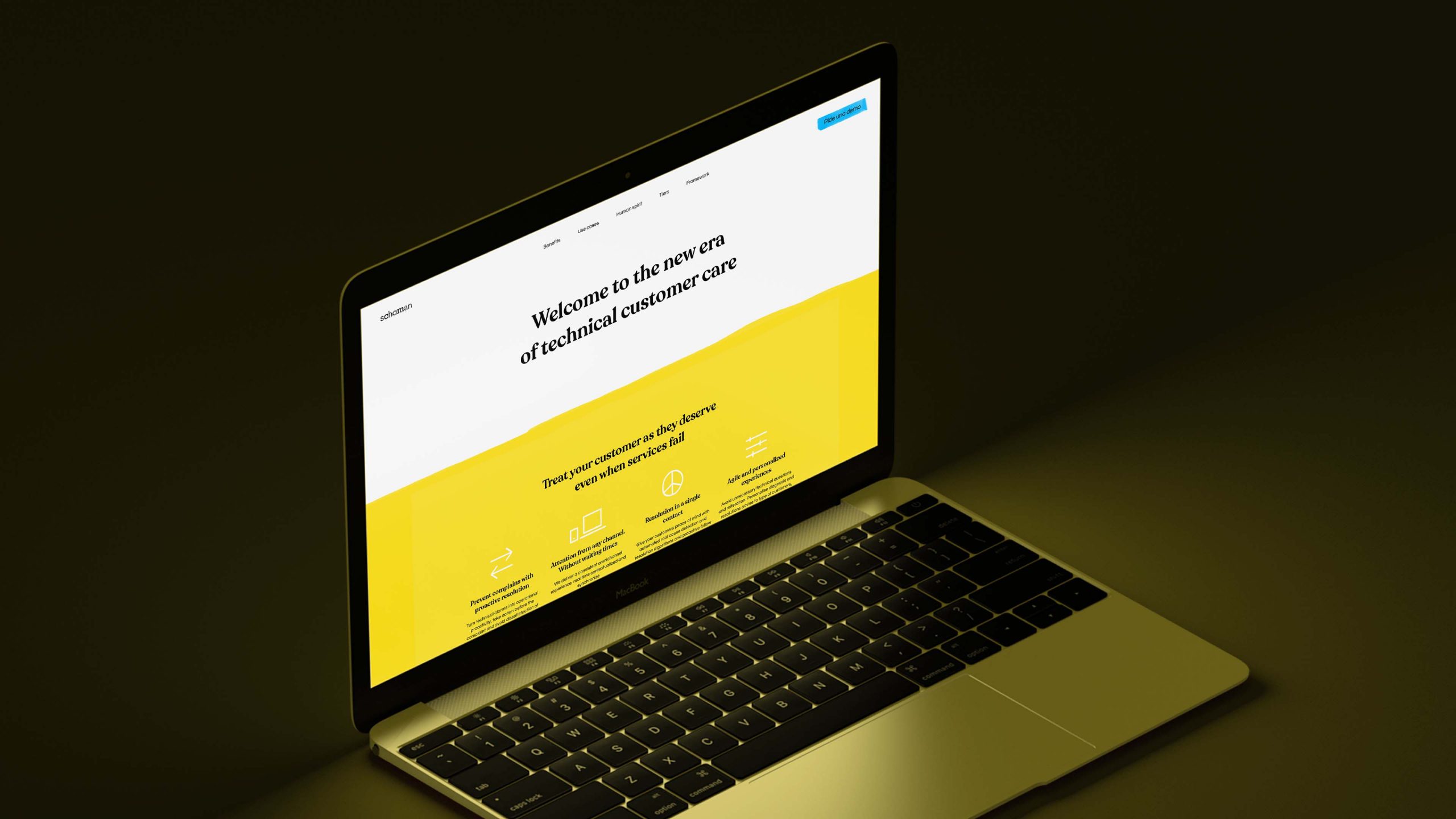
Schaman is a new brand much more defined and efficient which develops its human side.
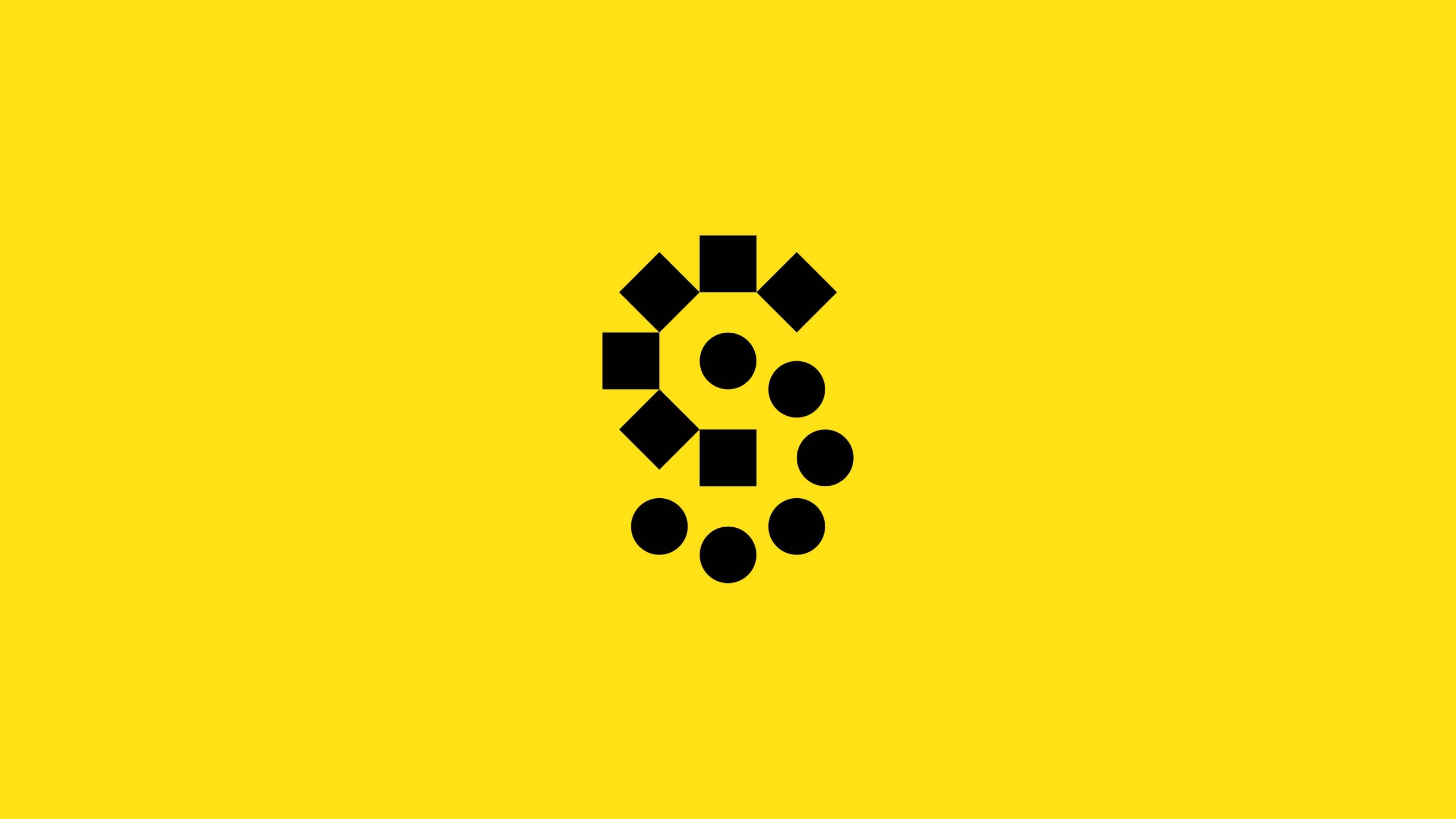
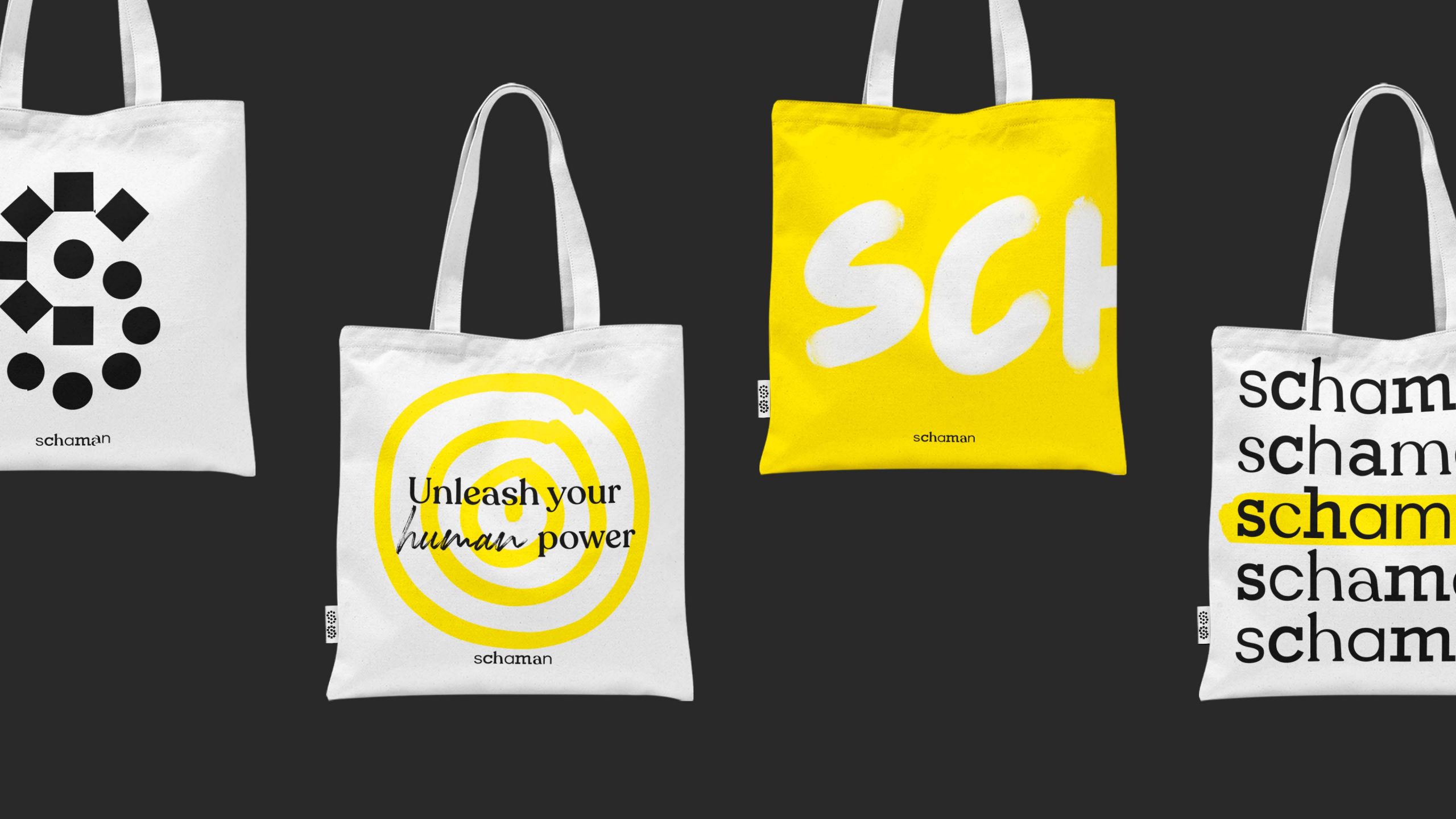
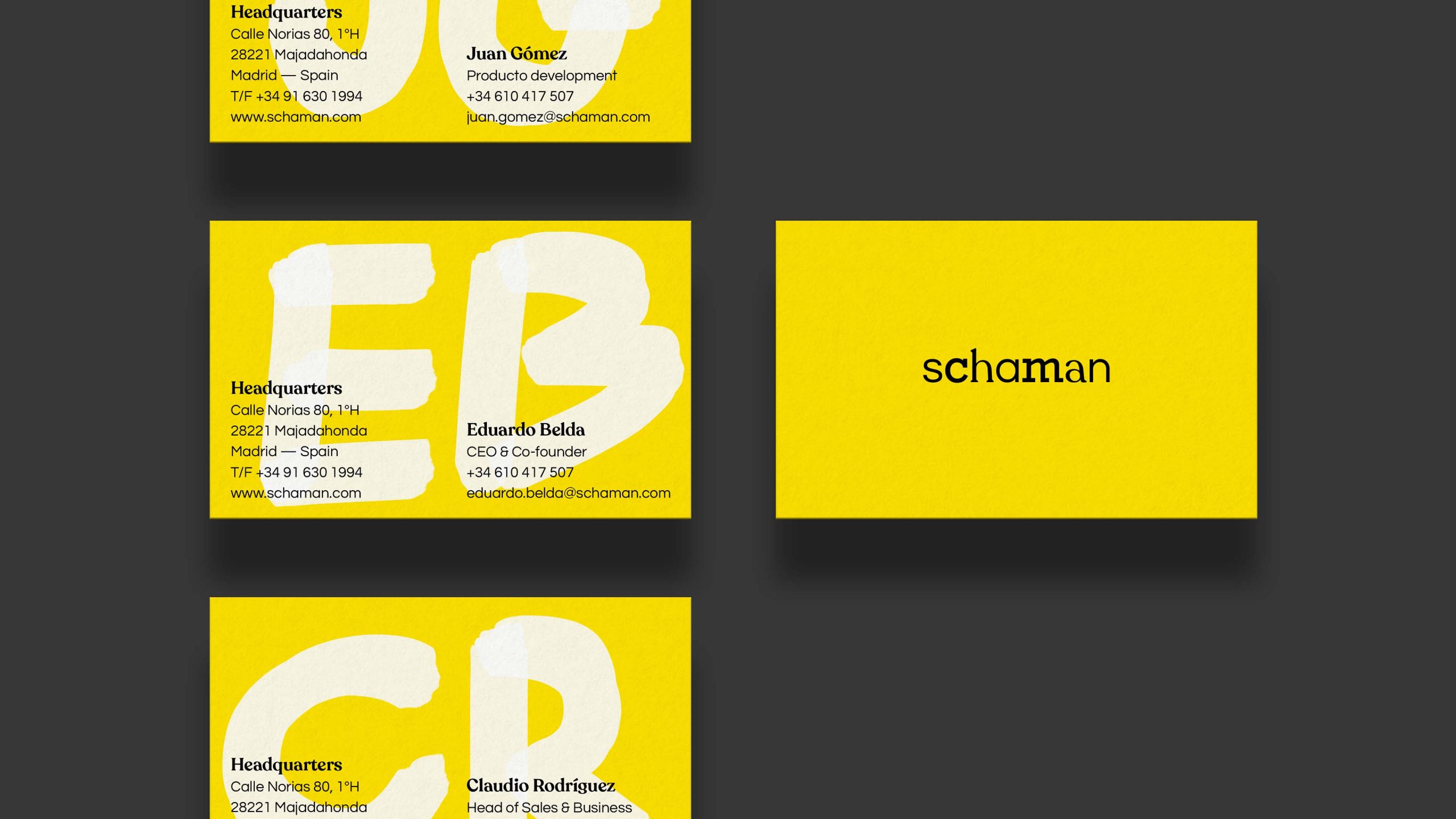
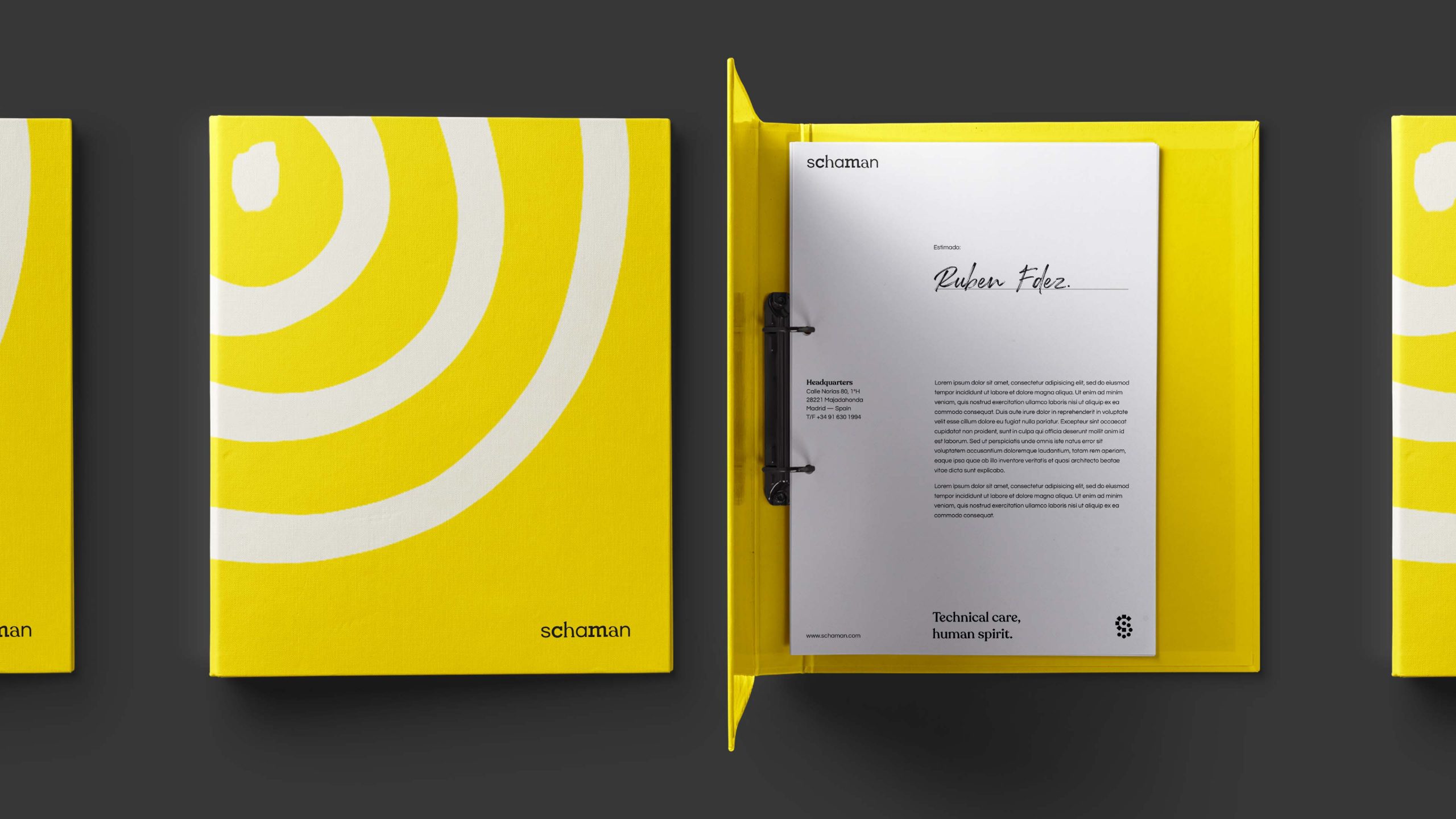
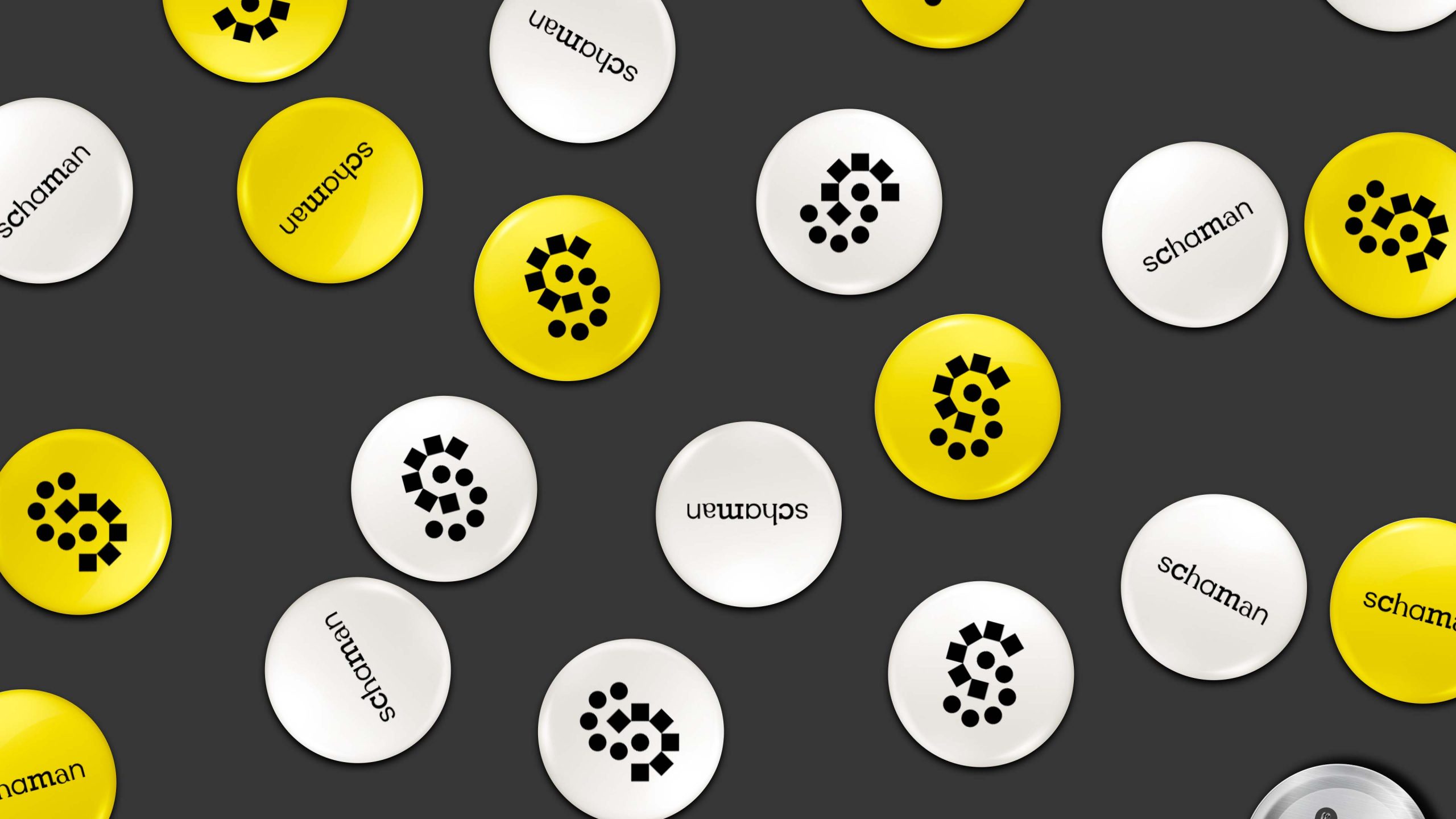
Identity gets rid of the ethnic visual universe provided by the name: sorcerers, tribes, mystic, etc. In order to improving its differentiation from its competitors, it separates itself from the graphic resources of technological ideology (networks, servers, lights, flashes…). From here, we designed a graphic identity that reveals the human side through tacks, underline and errors.
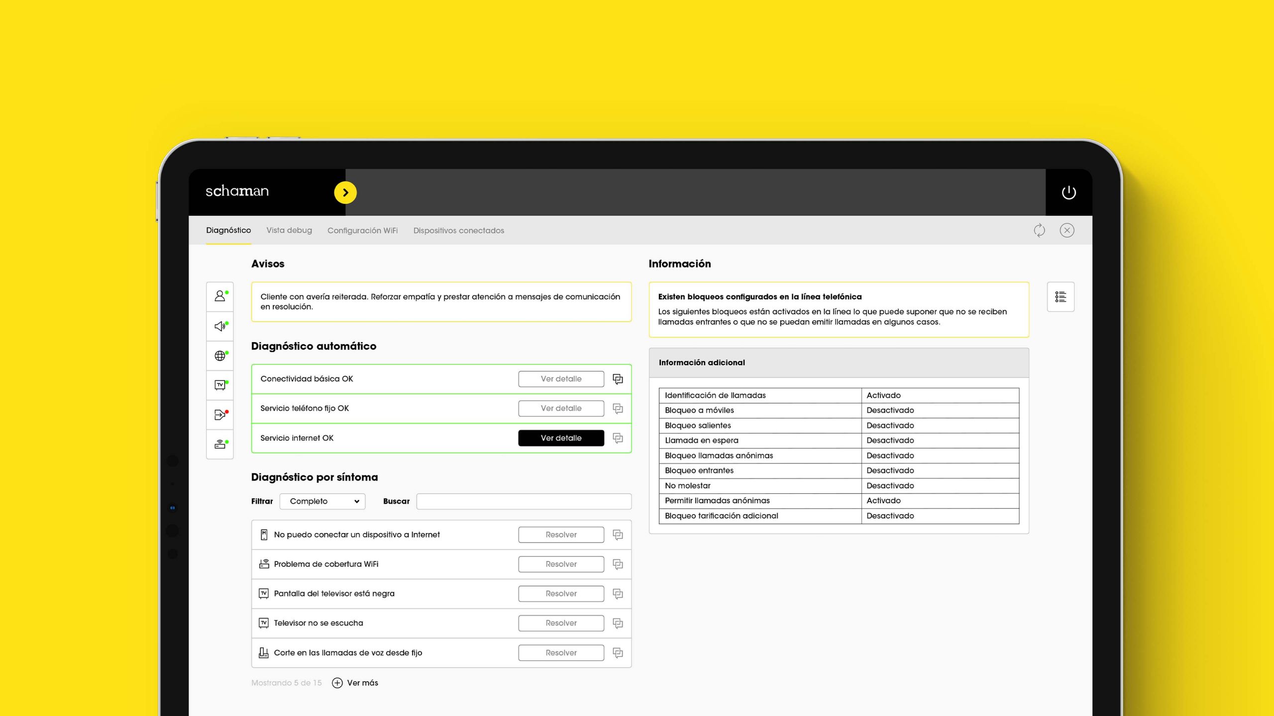
Communication is clearer and closer, and rejects the abuse of inaccessible technicalities. The new tagline is technical care, human spirit, which represents human condition through the contradiction between technology and human treat in the customer service sector.