Seabery
Leading industrial training
Seabery, a global pioneer in augmented reality technical training and the creator of Soldamatic, was entering a new stage of international growth and diversification. The challenge was to evolve its brand to reflect its technological leadership, integrate new business lines and build a strong, coherent global identity.
An in-depth audit of the brand ecosystem, product portfolio, existing architecture and perception across markets revealed three key challenges:
1- A brand too closely tied to Soldamatic.
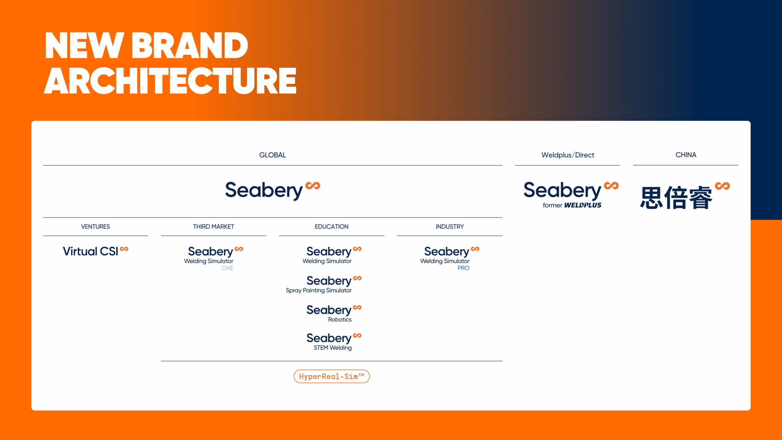
2- A fragmented architecture that was hard to scale.
3- An identity that reflected neither the company’s technological leadership nor its new ambitions.
Hyper Skilled Workforce: Seabery’s new way of understanding industrial training
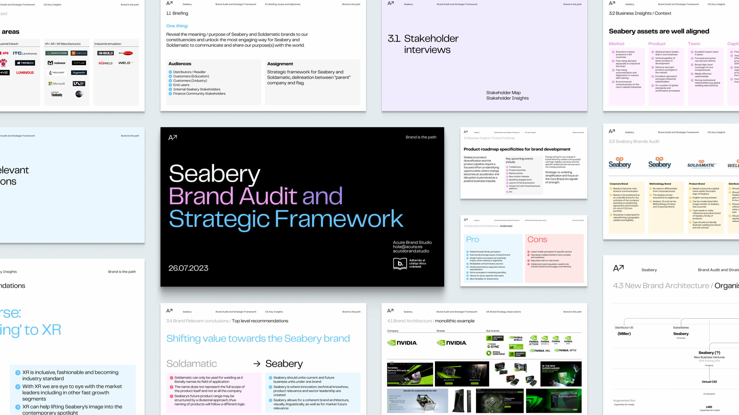
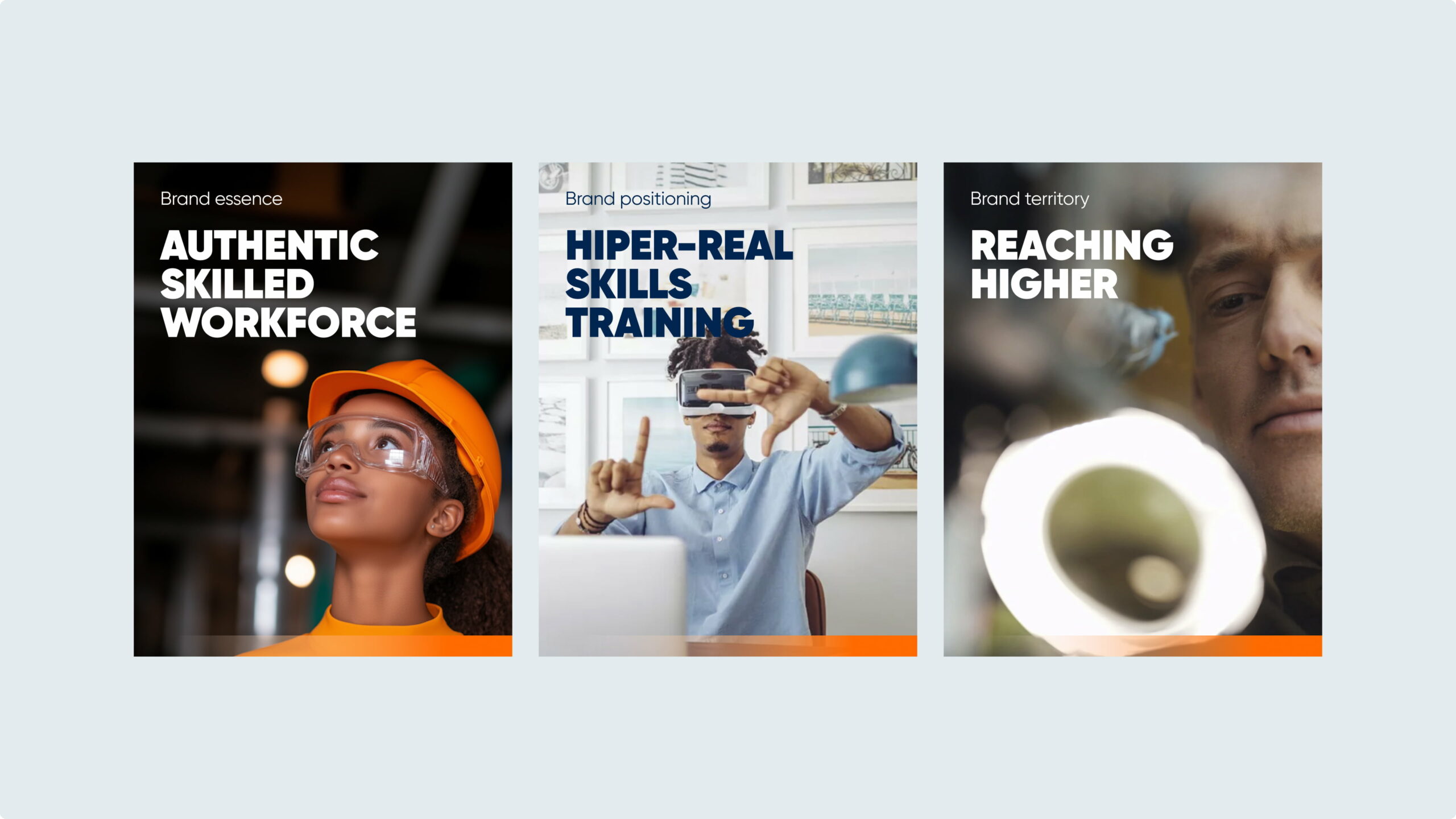
Competitive analysis, stakeholder interviews and a review of the company’s global positioning led to a clear strategy: move towards a monolithic model under the Seabery umbrella, transferring the equity built by Soldamatic to the corporate brand and establishing a new value proposition centred on the concept of “Hyper Real Skills Training”.
Its brand essence, Authentic Skilled Workforce, puts people and their development at the heart of the brand, highlighting Seabery’s contribution to a better-prepared, safer and more sustainable workforce.
Built on values such as excellence, curiosity, results orientation and a human-centred approach, the brand is committed to delivering efficient, safe and scalable training solutions that combine technological innovation with educational purpose.
Infinite improvement: the metaphor behind the new brand identity
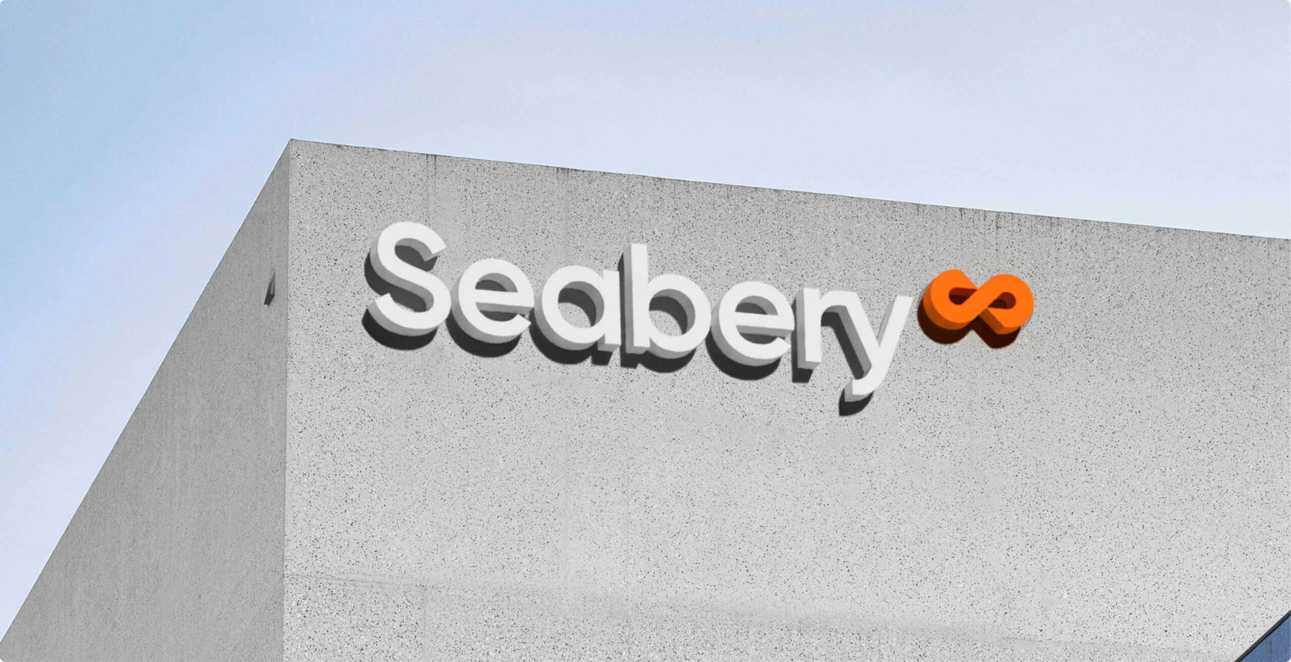
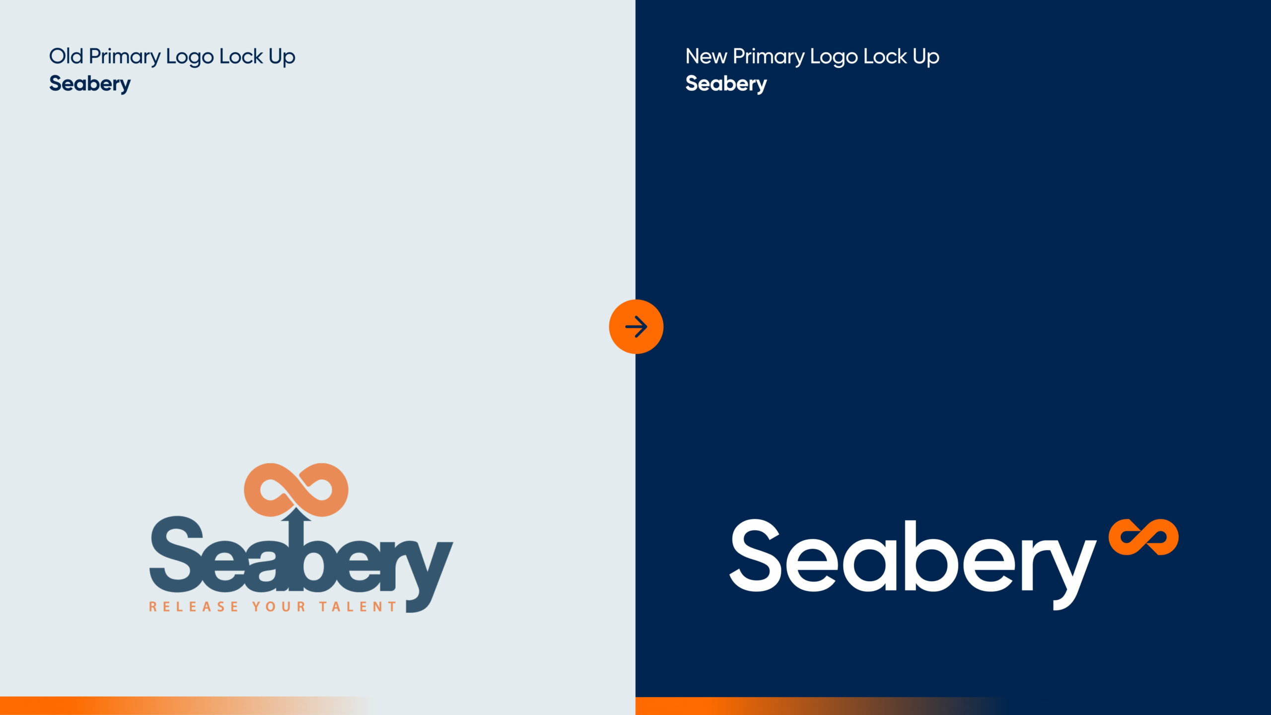
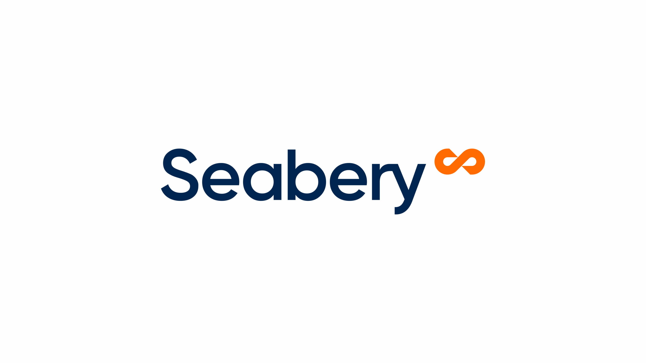
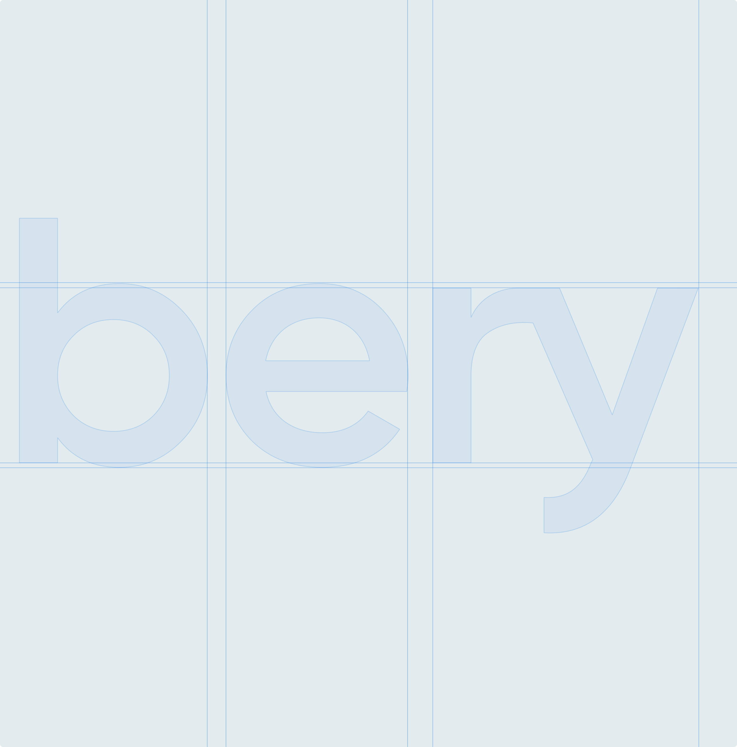
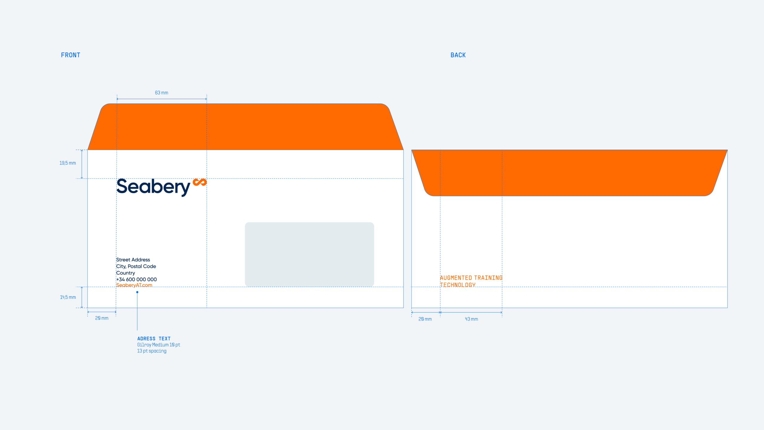
The redesign of the Seabery logo responds to the need to project a stronger, more technological and more global identity. We created a new lockup that pairs a more contemporary, legible wordmark with a proprietary symbol, the Hyper Icon, which represents continuous innovation and the connection between technology and learning.
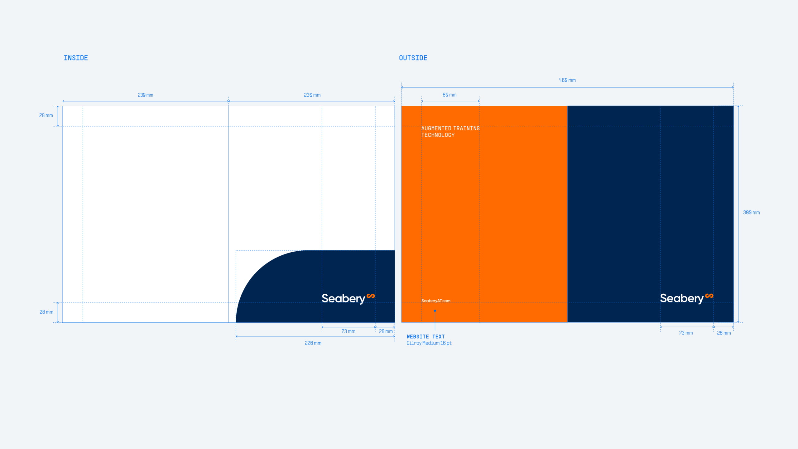
This visual system brings consistency and flexibility to every context, from corporate communications to digital applications and international markets, establishing Seabery as a monolithic masterbrand able to bring all its solutions together under a single visual language.

The visual universe of the new global Seabery brand
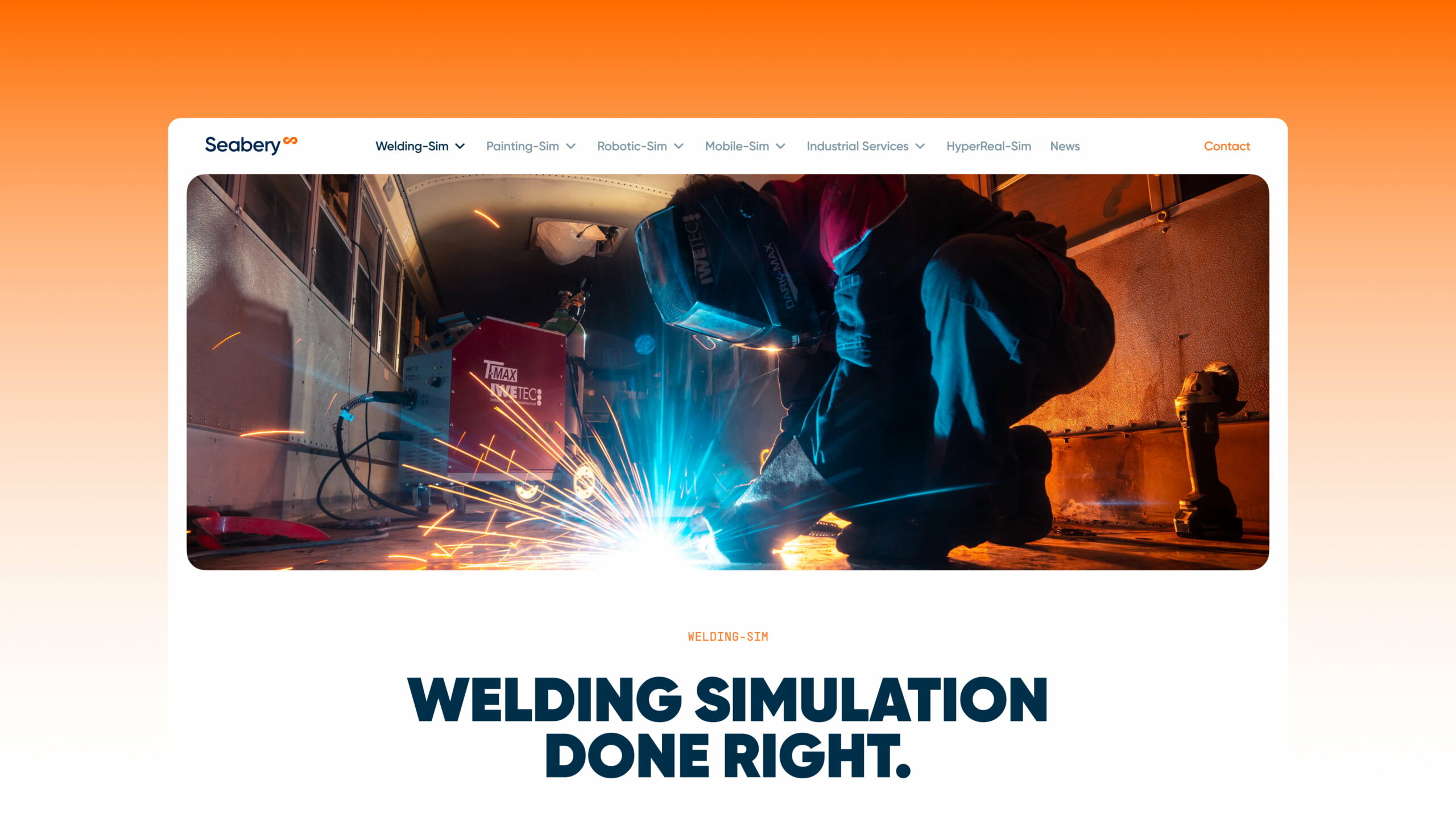
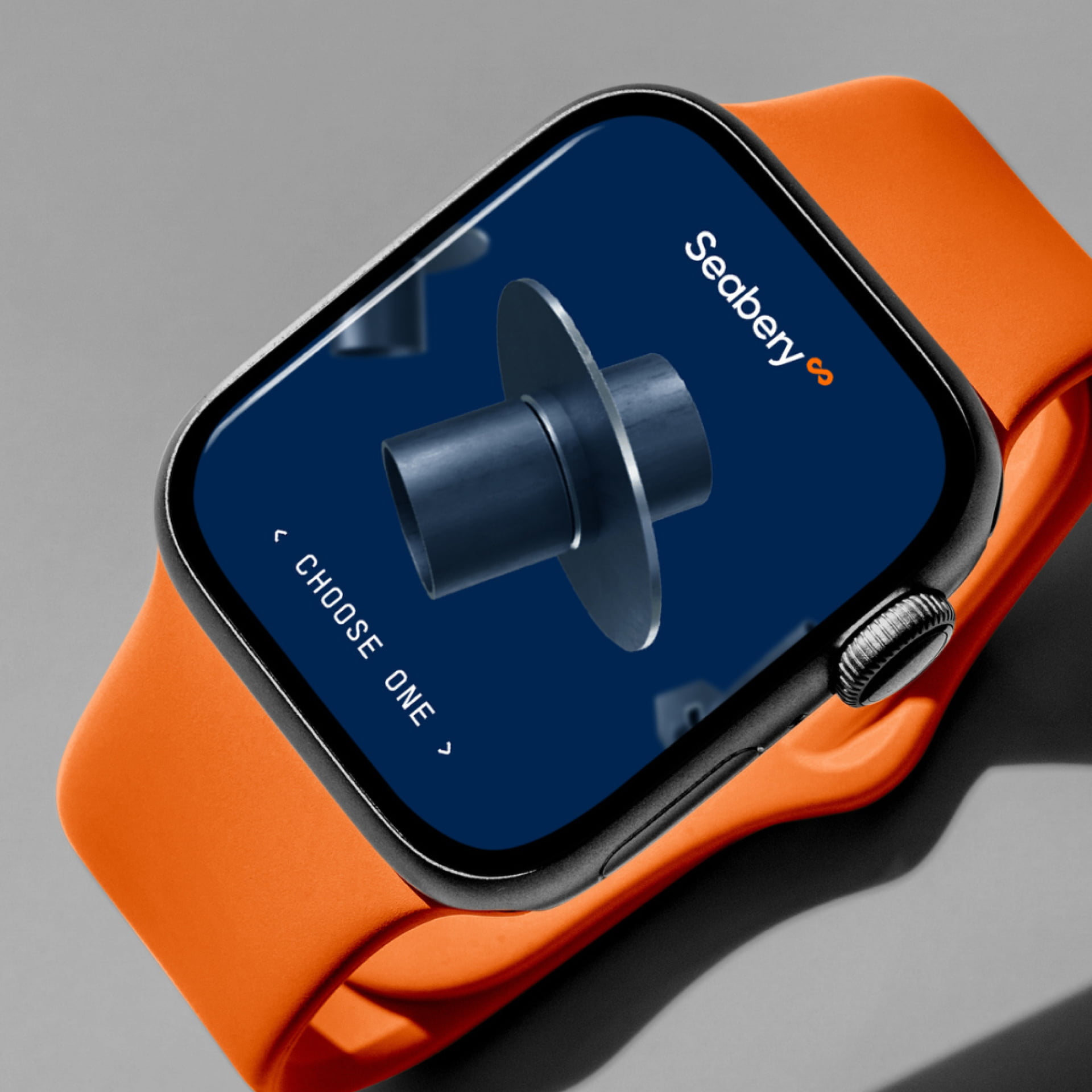
Seabery’s new graphic universe translates its technological and human vision into a more vibrant, contemporary and digital visual identity.
A deep blue that conveys strenght and trust, paired with an energetic orange that stands for innovation and approachability, together with a clean, precise typographic system, reinforces the idea of a brand that is advanced yet accessible.
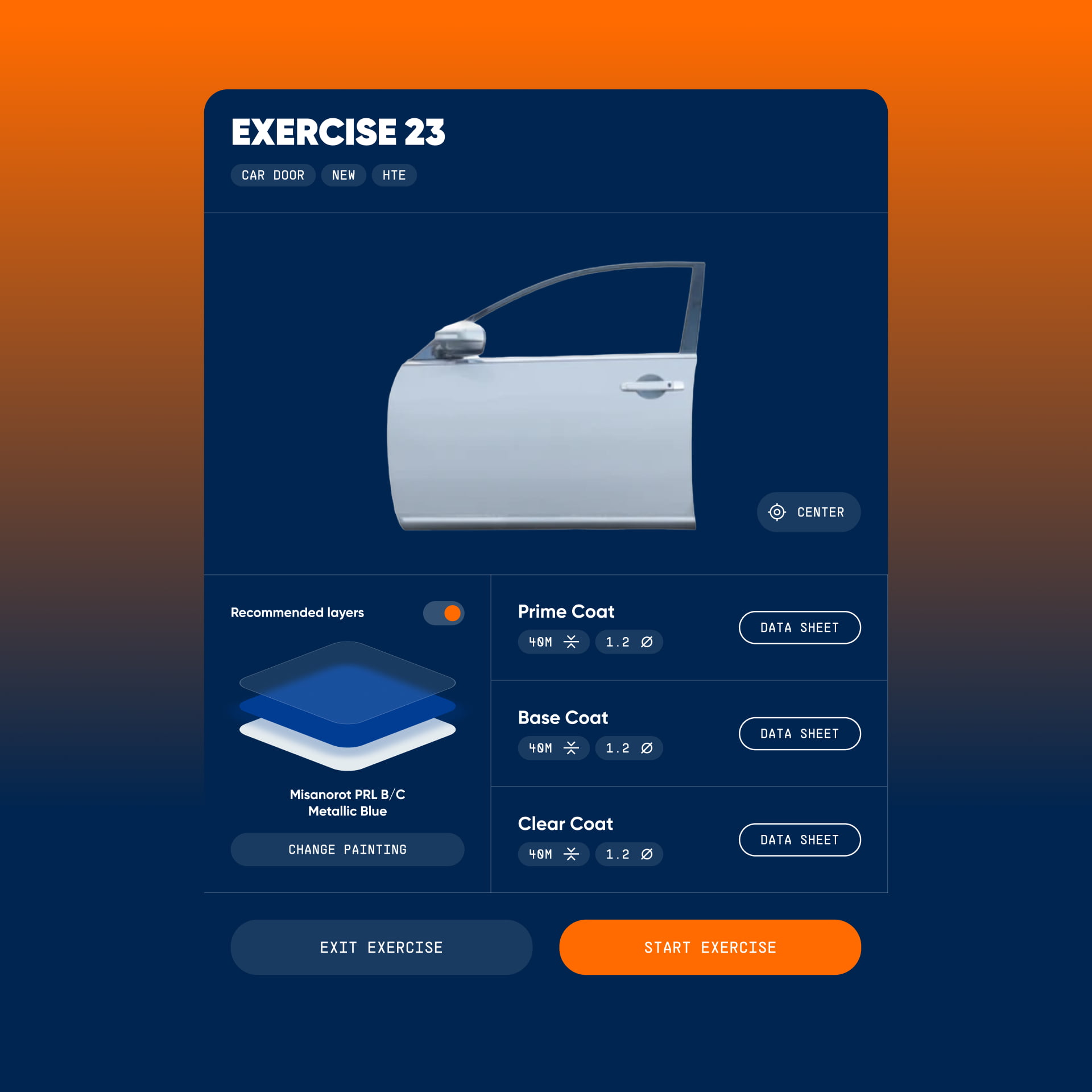
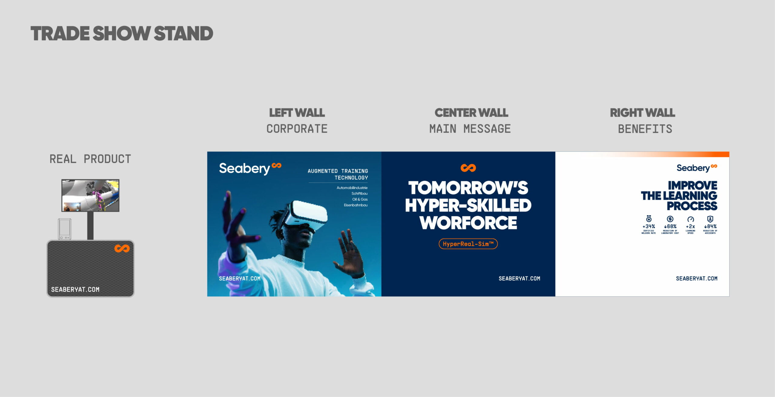
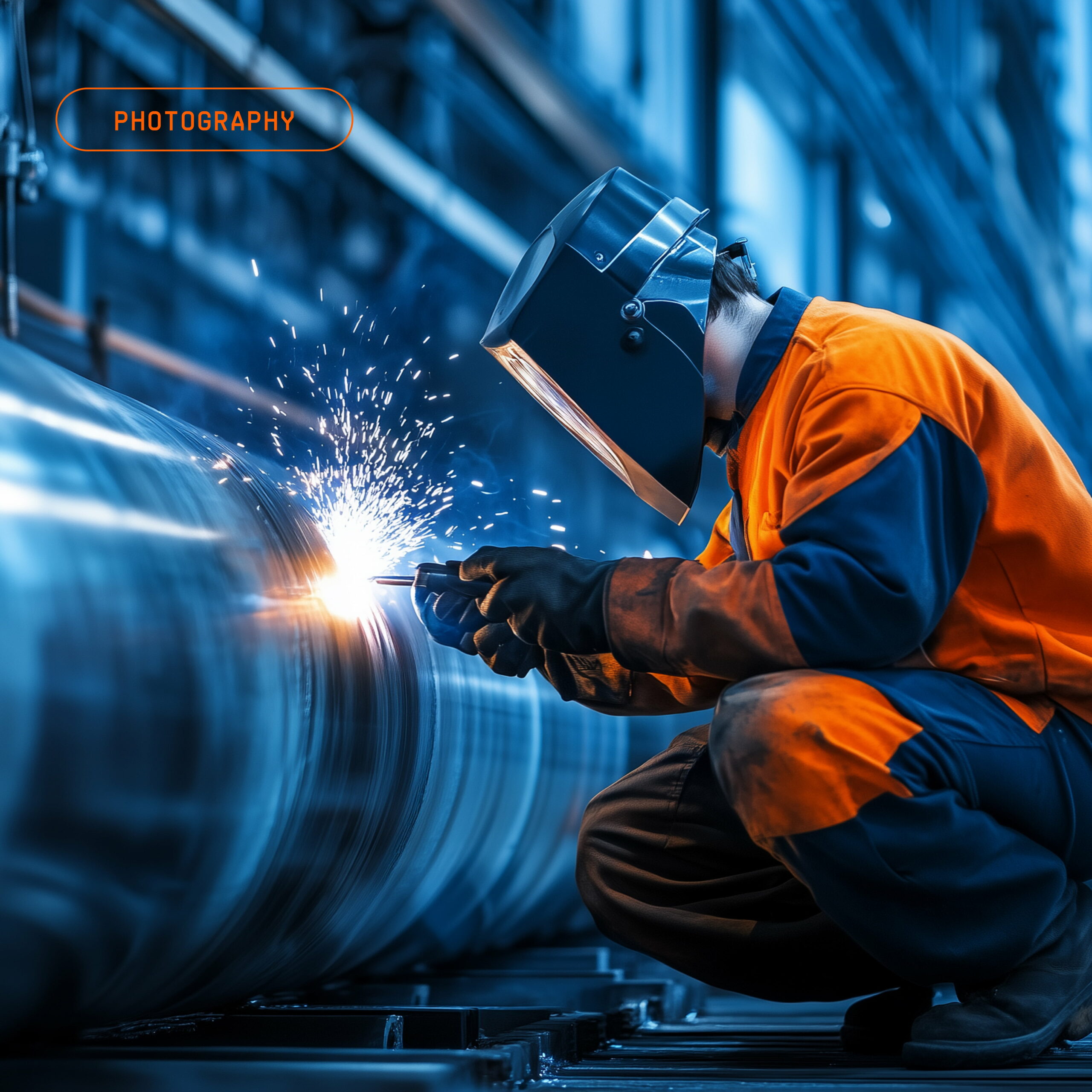
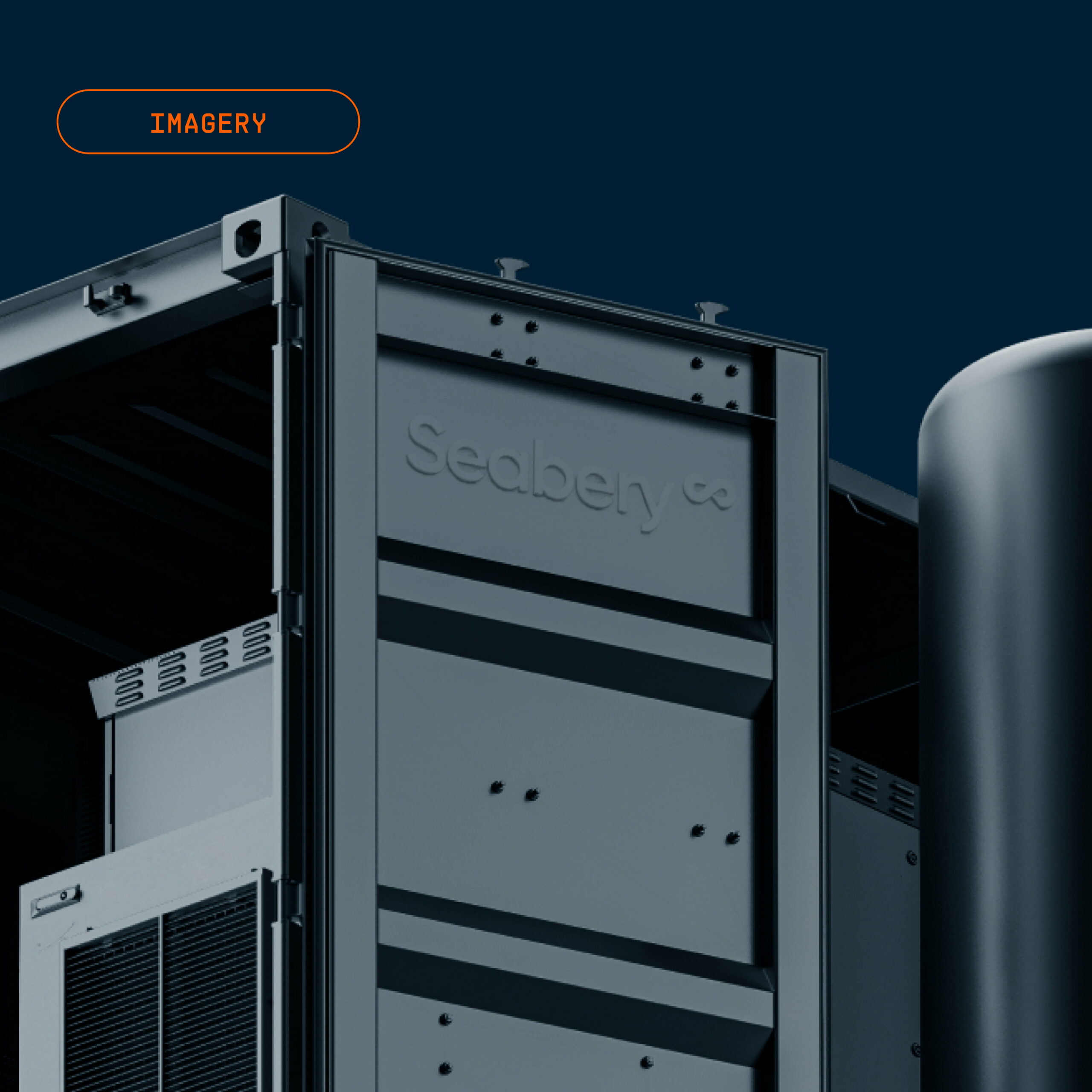
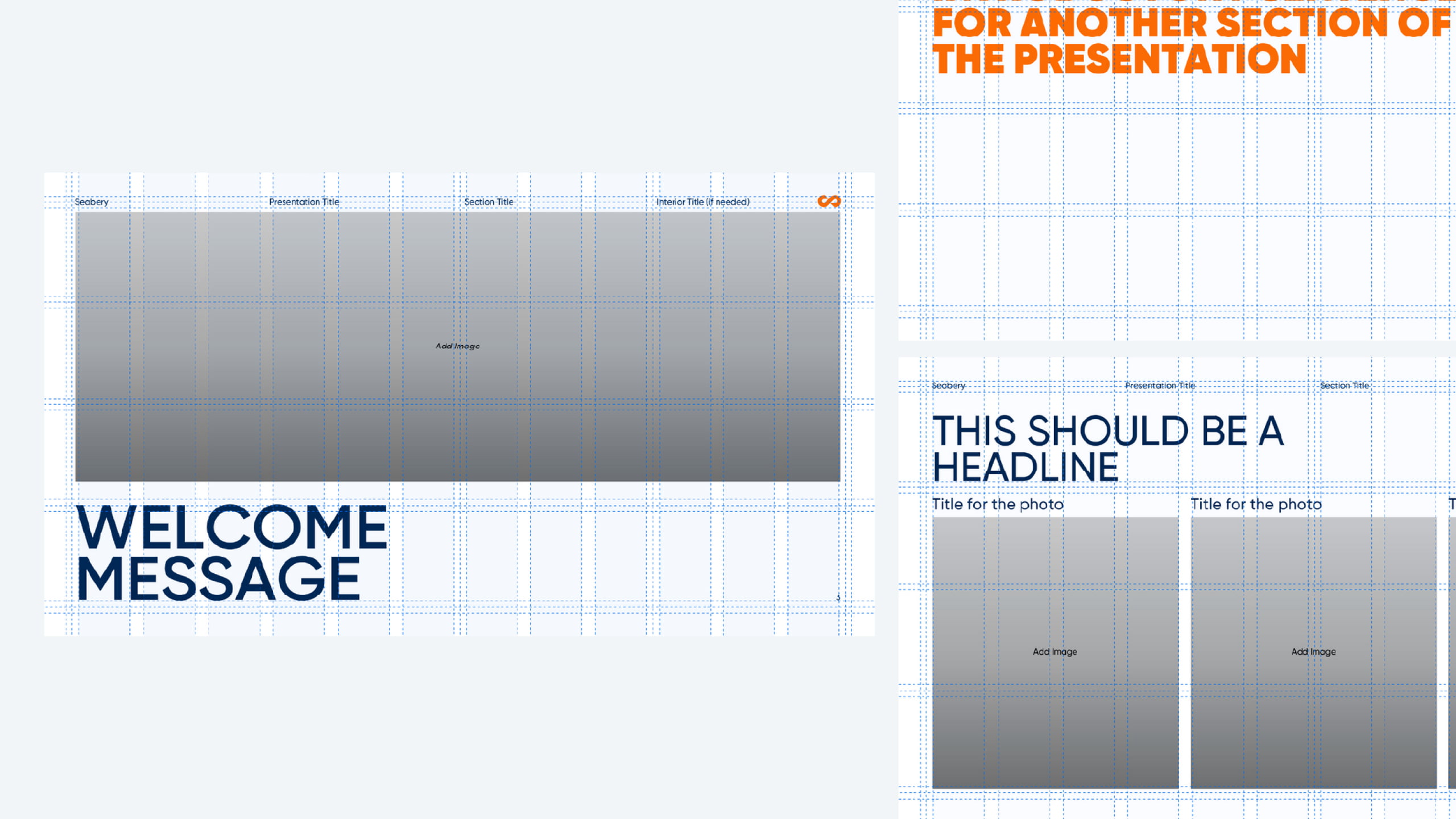
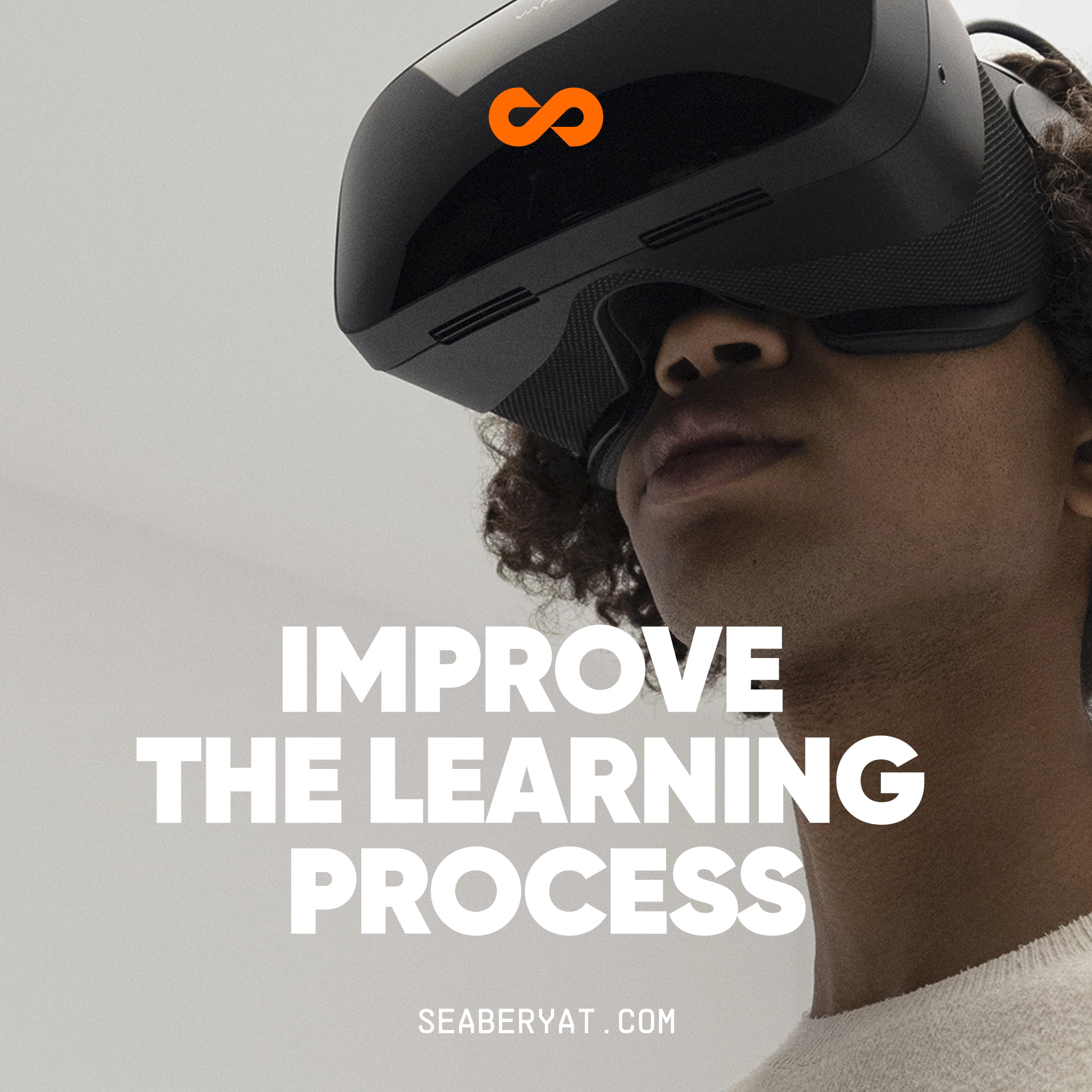
Gradients, hyper-realistic imagery and modular compositions bring dynamism and consistency to every touchpoint, from digital interfaces to presentations and sales materials.

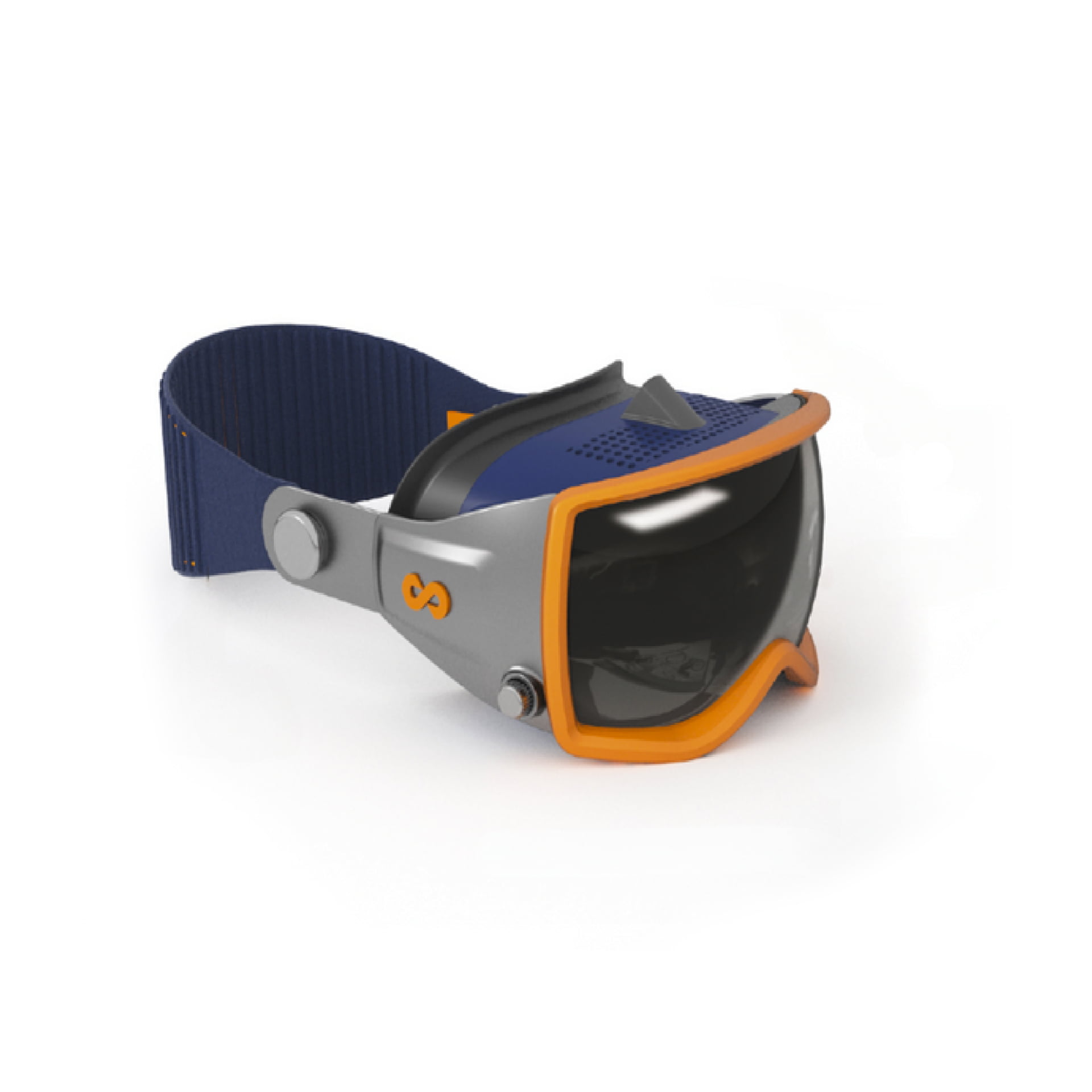
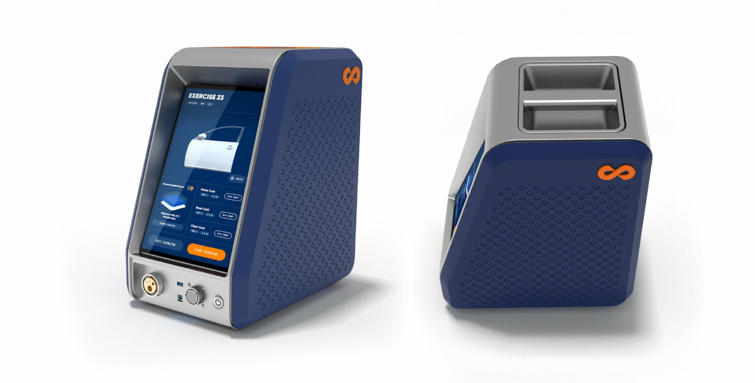
Concept design for the new Seabery Welding and Painting Simulator hardware
As the brand evolved, an opportunity arose to extend the new identity to the industrial design of Seabery’s flagship hardware: the simulation unit.
The goal was to translate the innovation, precision and modernity of the new visual universe into an iconic physical product, one that would strengthen brand perception and deliver a consistent experience from the very first touchpoint.
To do so, we ran a collaborative workshop with Seabery’s industrial design team to explore conceptual directions aligned with the new visual narrative and the device’s technical requirements.
From this joint work, we developed 3D concept design proposals, assessing materials, ergonomics and brand presence.
The result was a final model featuring clean lines, technological details and a distinctive formal language, presented to the company as a vision for its flagship product across future hardware generations.