Leroy Merlin Empresas
Transforming places together
Leroy Merlin's enterprise construction projects division came to us to redesign their brand and serve as a pilot project throughout Europe. As Leroy Merlin is the most recognized brand in Europe in the DIY and refurbishment category, this assignment was a challenge in many dimensions, especially in its positioning as a B2B brand in this already well established business category.
Our work starts when a new business plan is delivered by a large business consulting firm. This work identifies four factors that clients of construction and renovation companies consider most important, in order of relevance:
1. Versatility of supply
2. Agility and delivery times
3. Product and service quality
4. Brand recognition
Therefore, there is a need to generate a specialized B2B brand recognition, differentiated from B2C and of medium-high quality.
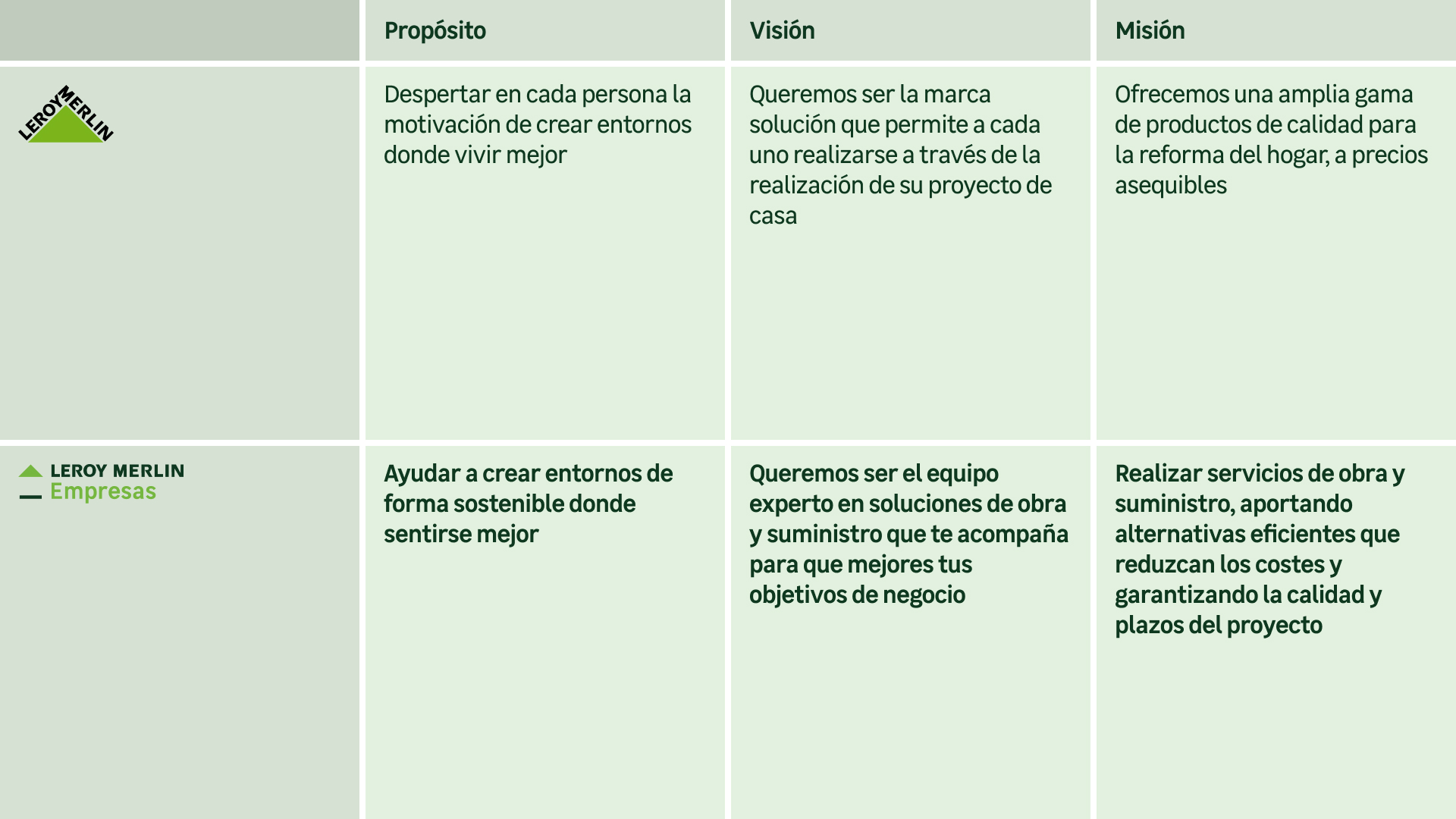
A new brand essence that works internally and externally
Leroy Merlin’s business division has no recognition in their category due to its short history.
Together with the management team of Leroy Merlin companies, we decided not to create a completely new brand, since the value of the Leroy Merlin brand was very high and would be a key factor when competing in the business renovation market.
So the strategic work consisted of balancing what had been consolidated by the brand to date in B2C, adding nuances that would make it the owner of relevant meanings in B2B.
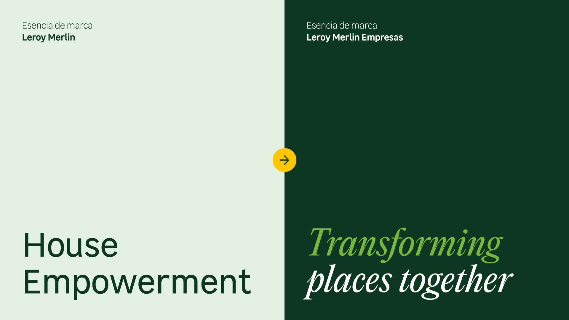
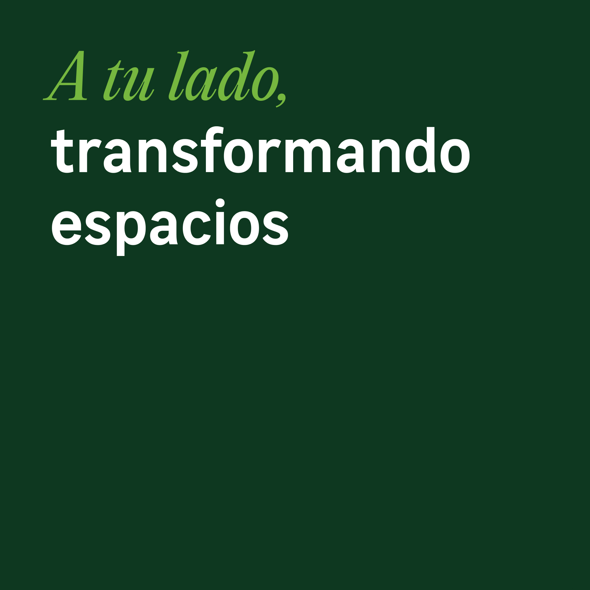
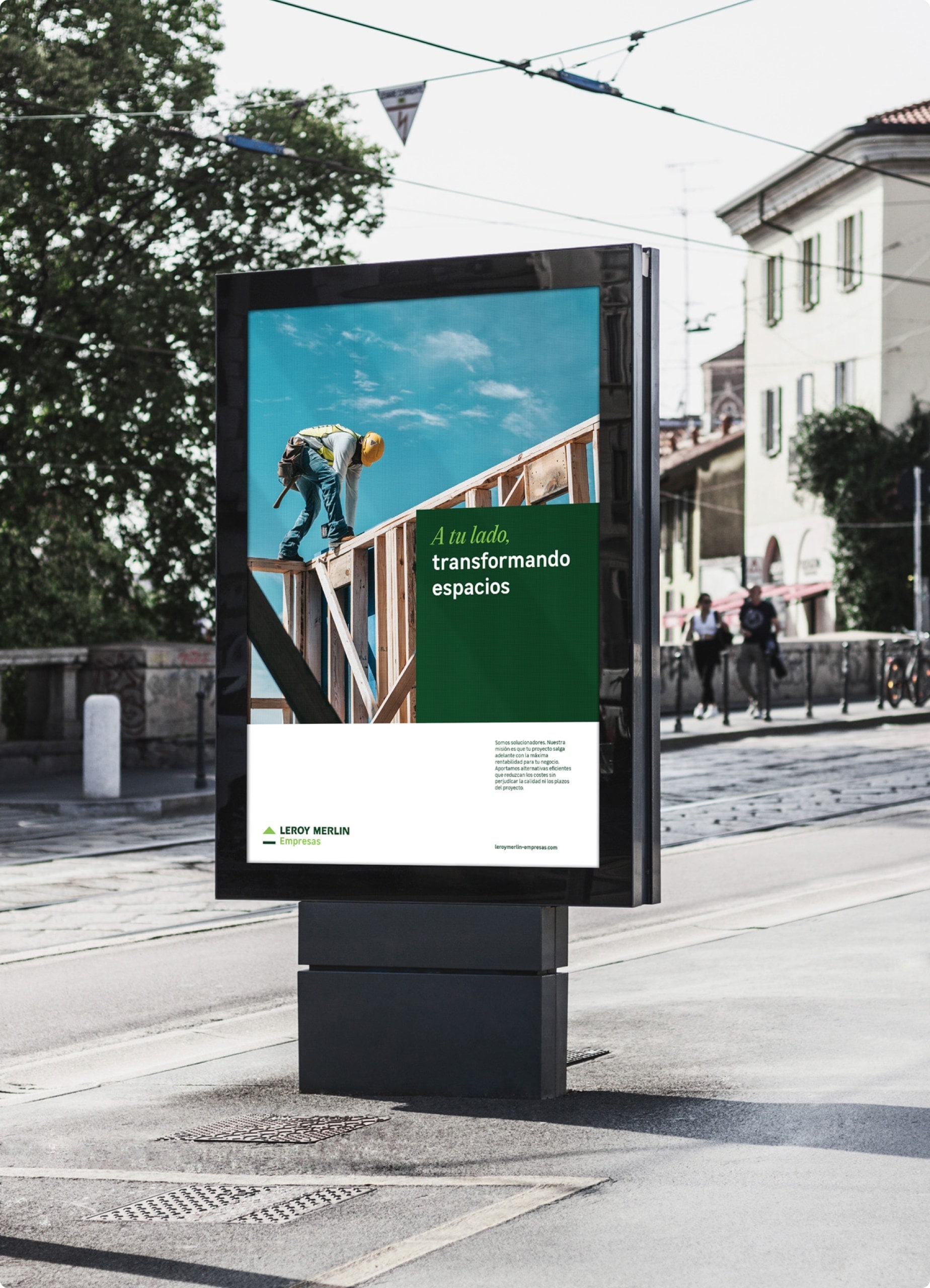
The key concept was to redefine the brand essence, moving from Home empowerment (B2C) to Transforming places together (B2B).
We adapt the existing brand personality to a new professional environment.
In this strategic microsurgery work, the personality and brand values had to maintain what had been built so far, so they were not modified.
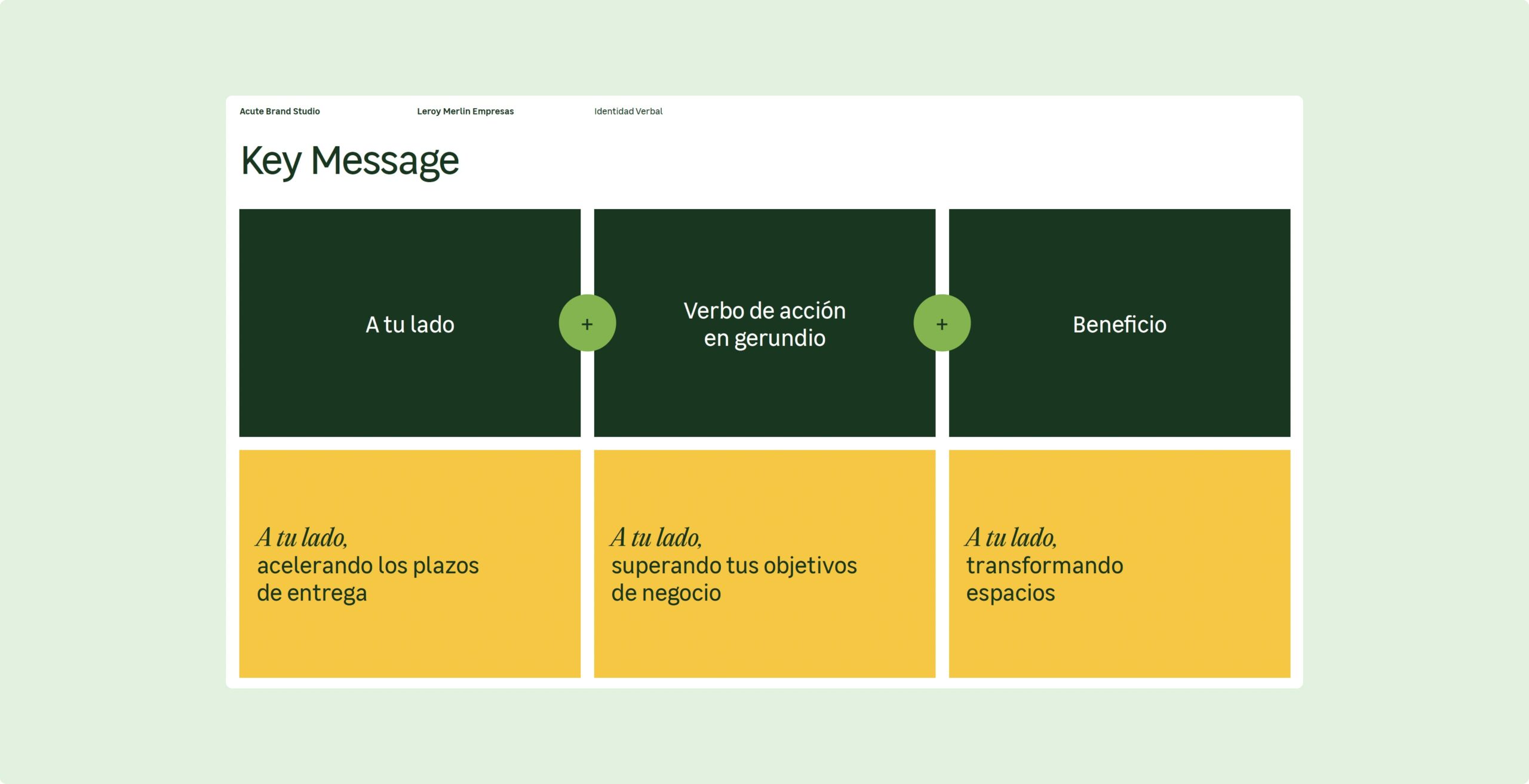
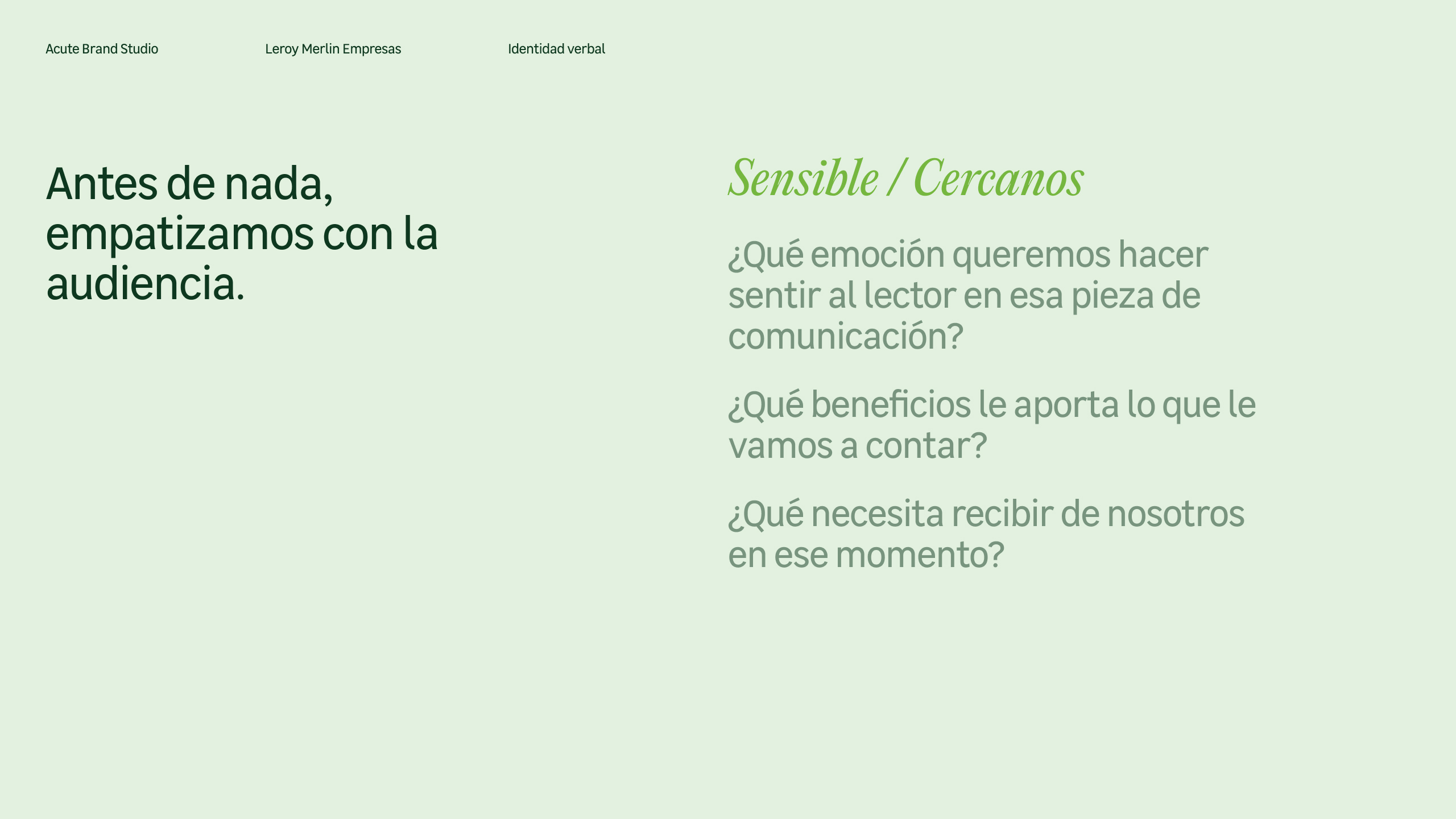
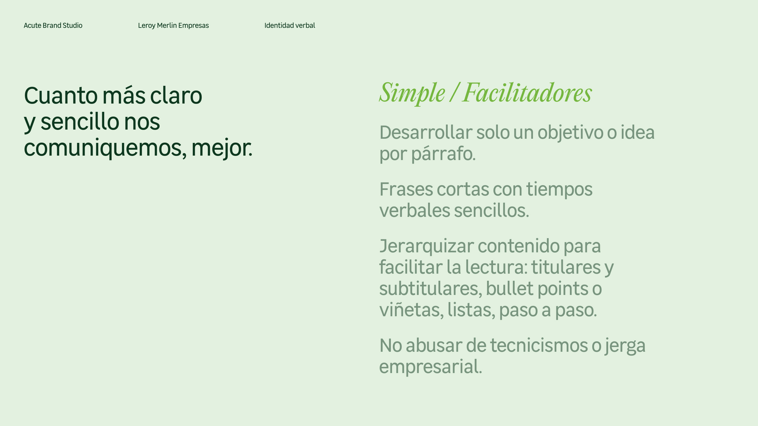
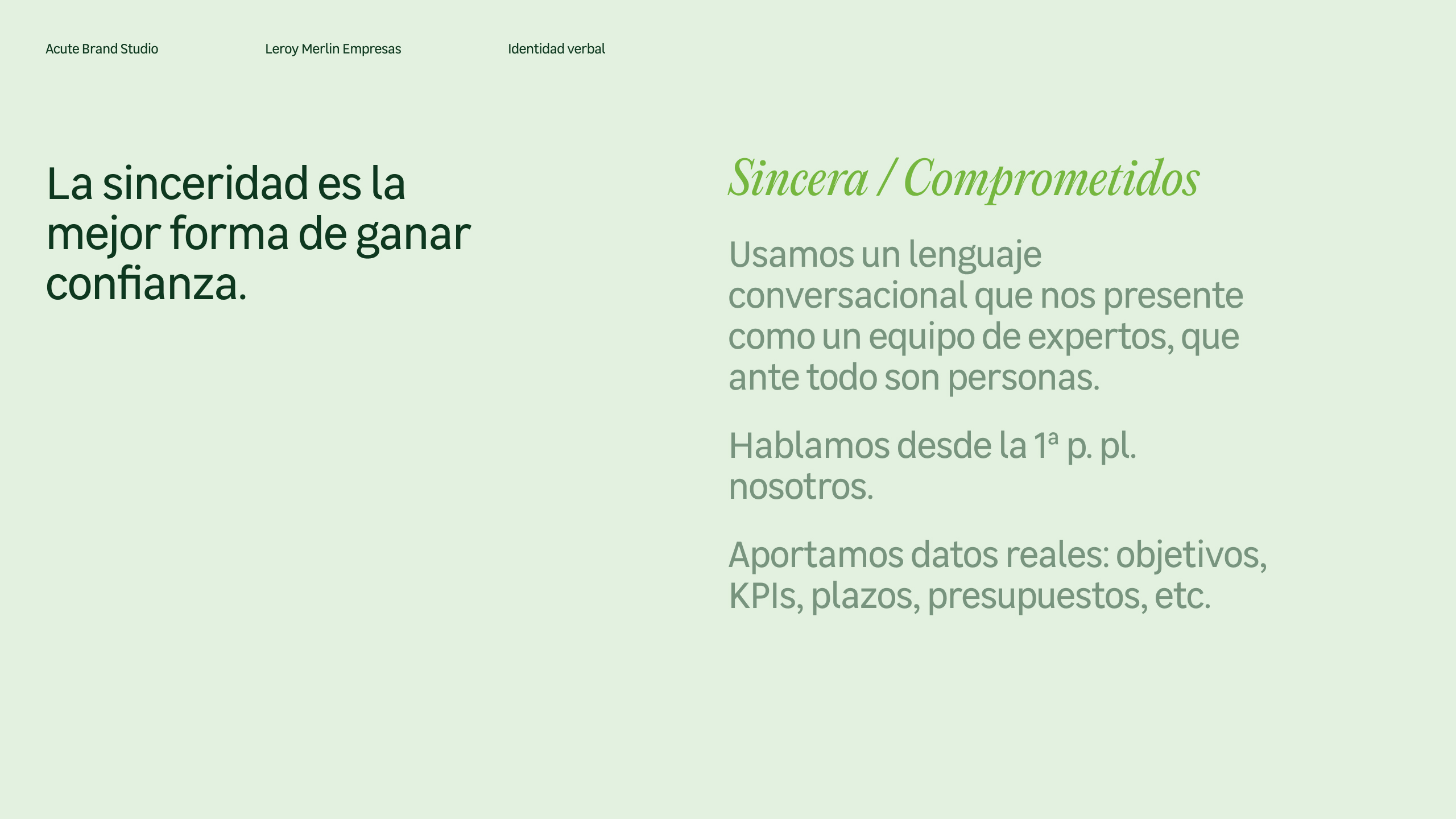
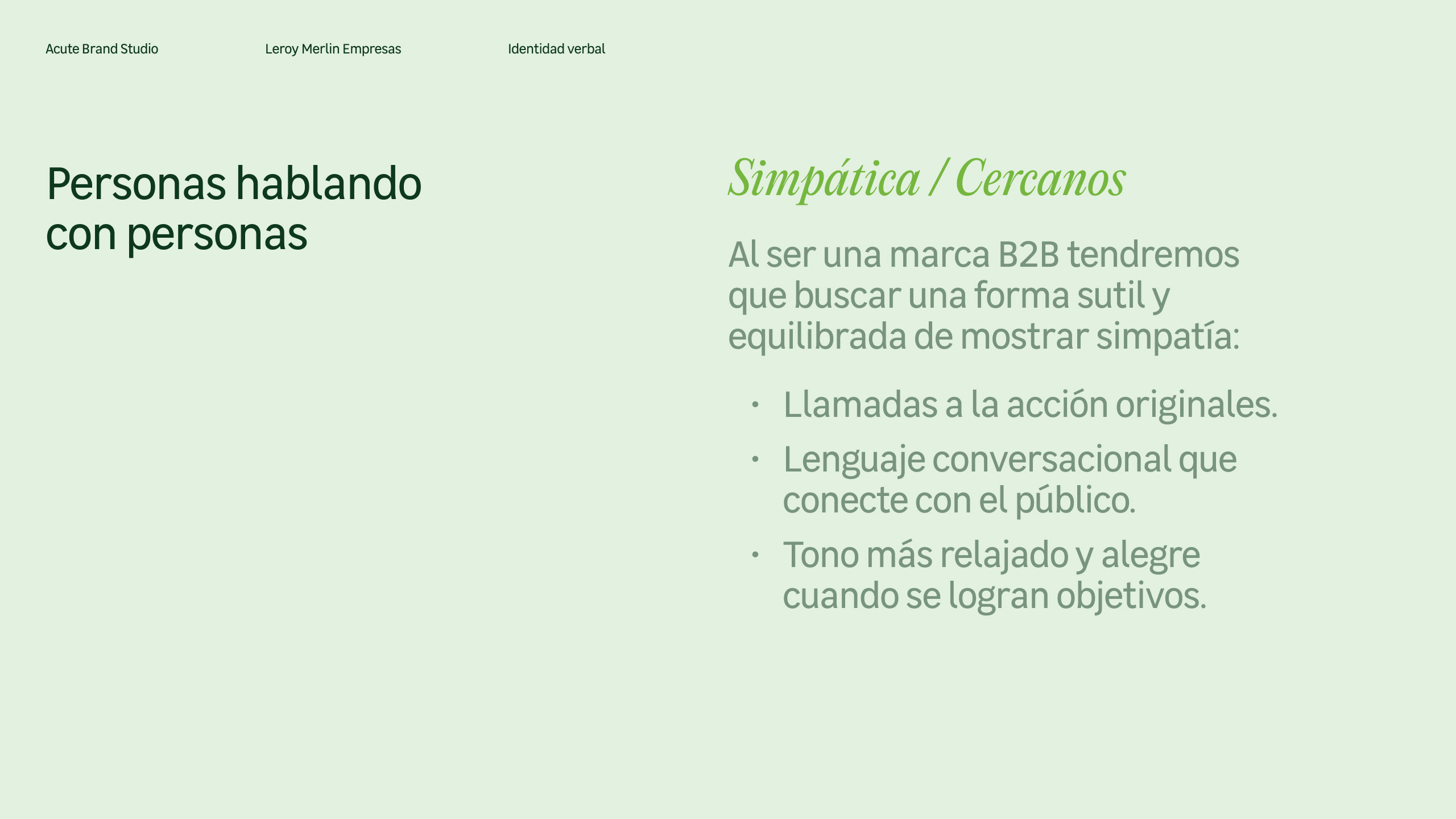
However, the obligation to relate to a new public in the business environment generated a new need for a new tone of communication.
For this purpose, we defined some essential aspects such as key brand messages and rules of verbal expression.
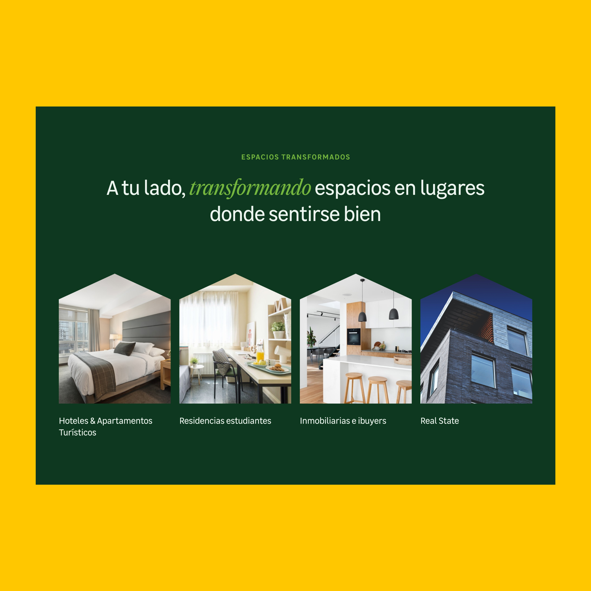
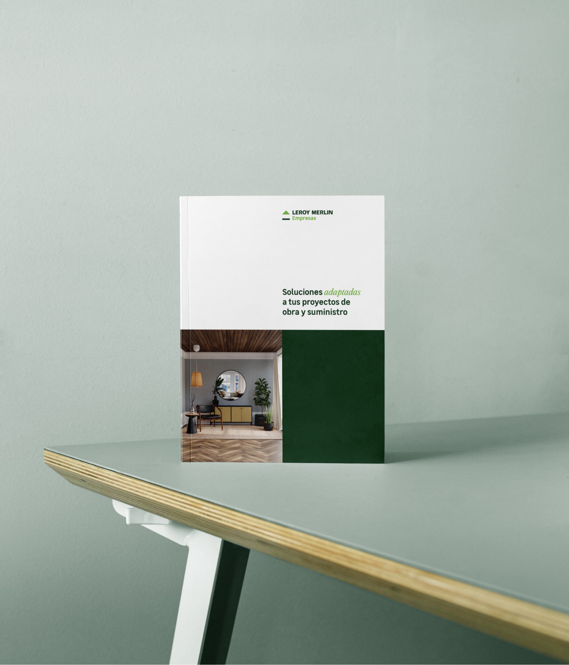
A new visual universe that builds on the existing to give a totally renewed air.
On a visual level, the idea at all times was to transmit the essence of Leroy Merlin but to make it stand out as a different brand.
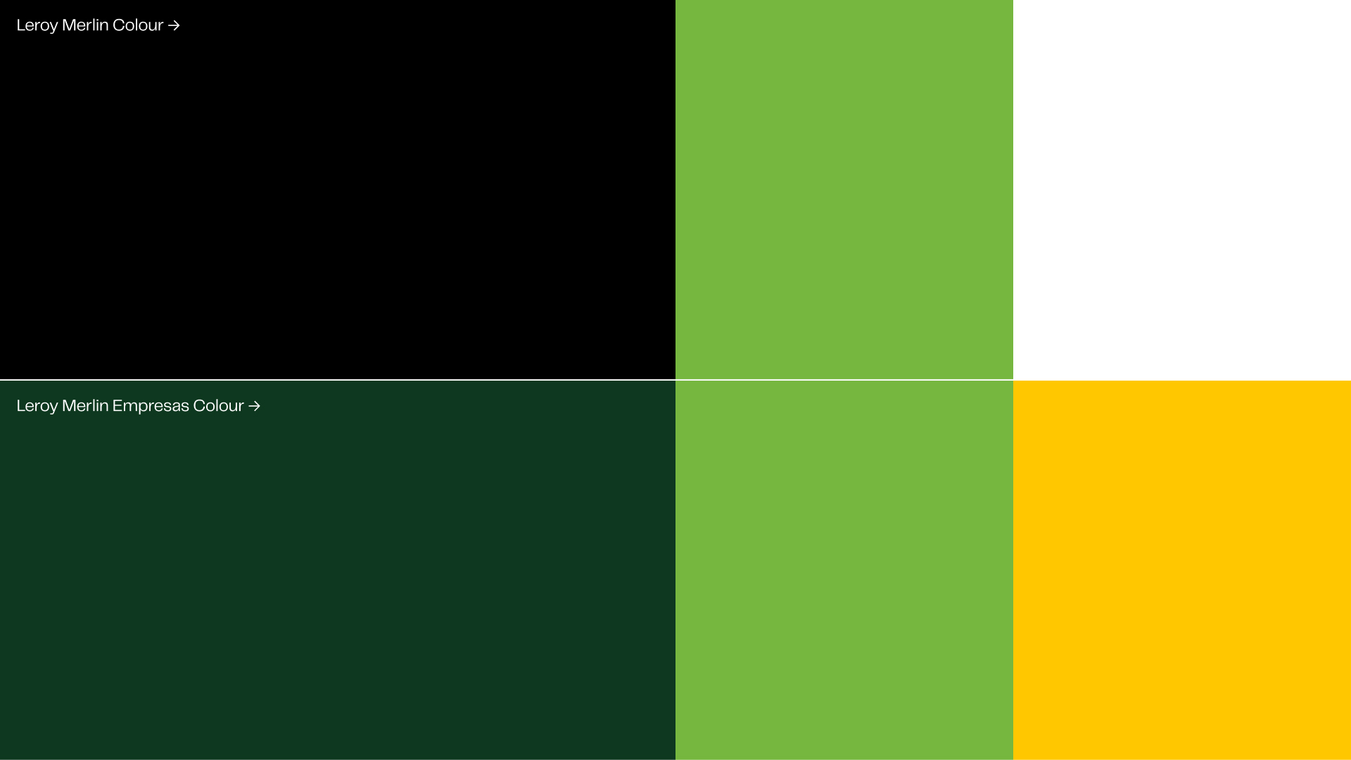
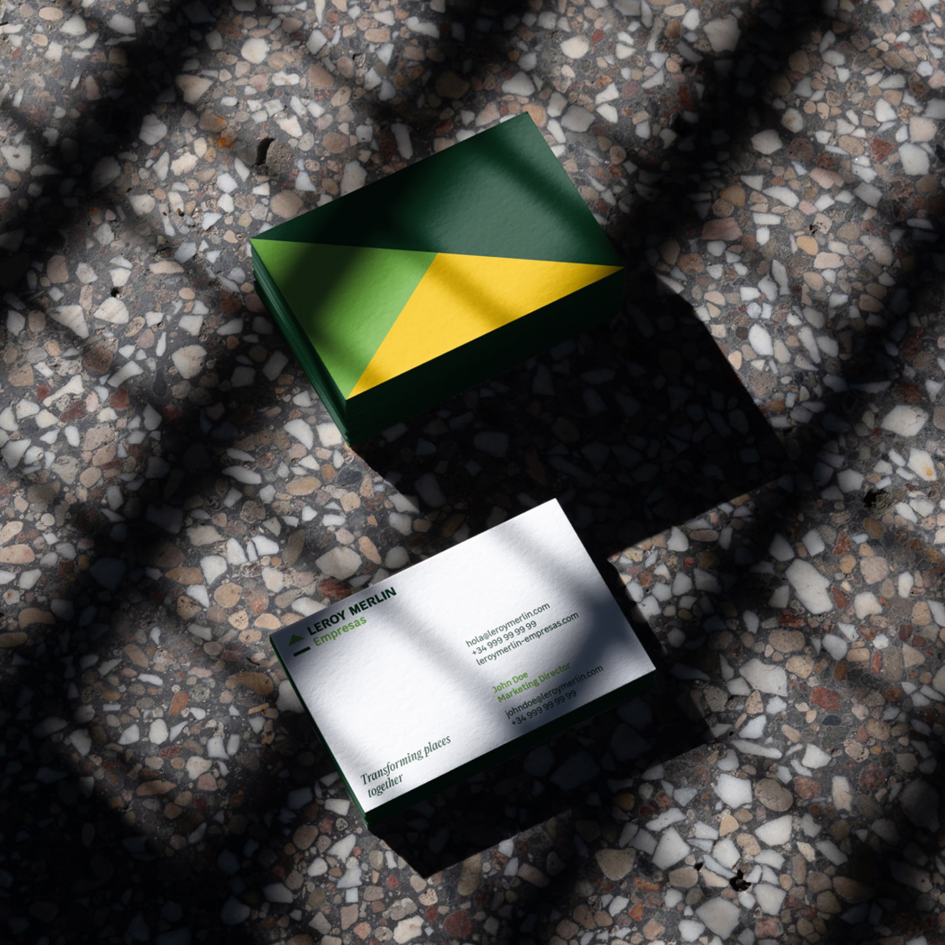
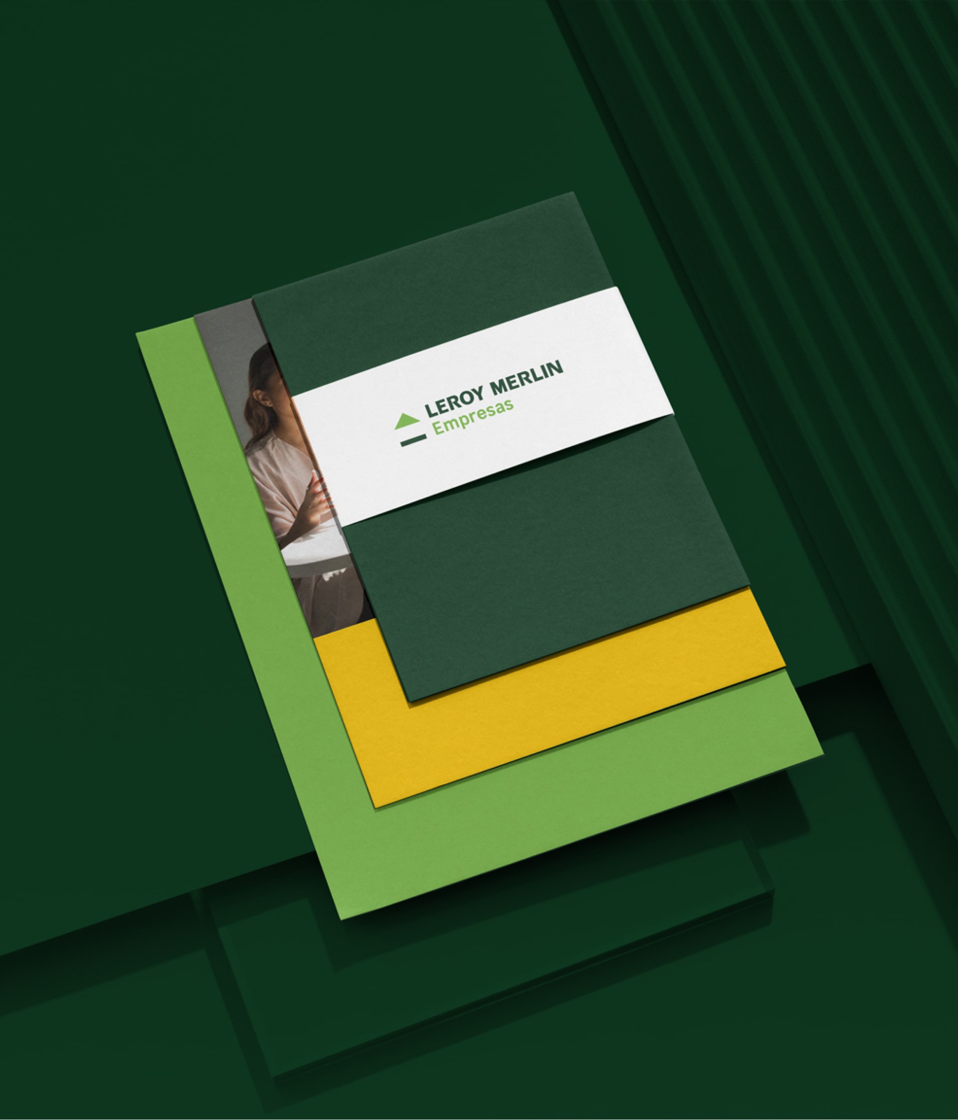
We adjusted the color palette, eliminating the black, replacing it with an elegant dark green and adding the yellow. The goal was to elevate the sobriety contrasting it with a modern touch.
Don't call it reforming, call it transforming together.
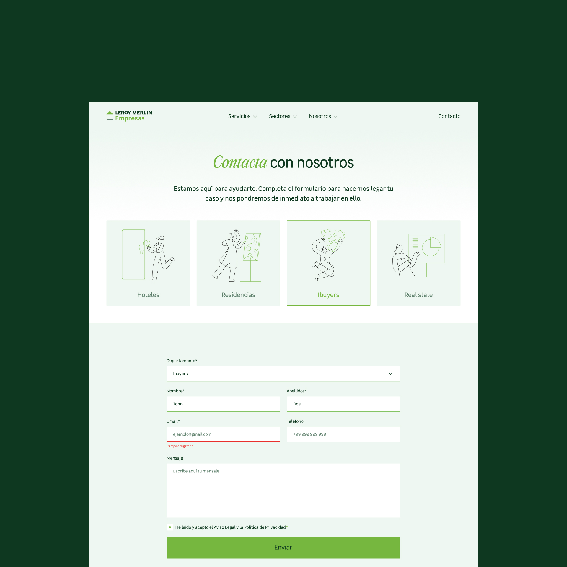
This idea of transformation (movement/change) is represented through various elements of the visual identity.
Brand pictograms built with two strokes and two different colors (before/after).
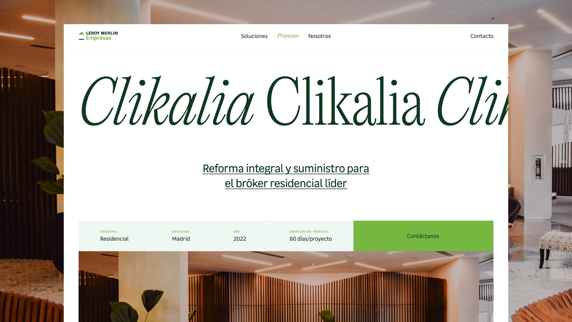
A different typography to complement the corporate typography Leroy Merlin Sans in certain prominent messages.
A system of geometric shapes based on the triangle and rectangle of the Leroy Merlin corporate logo to define the different graphic layouts and represent the idea of simple and effective construction.
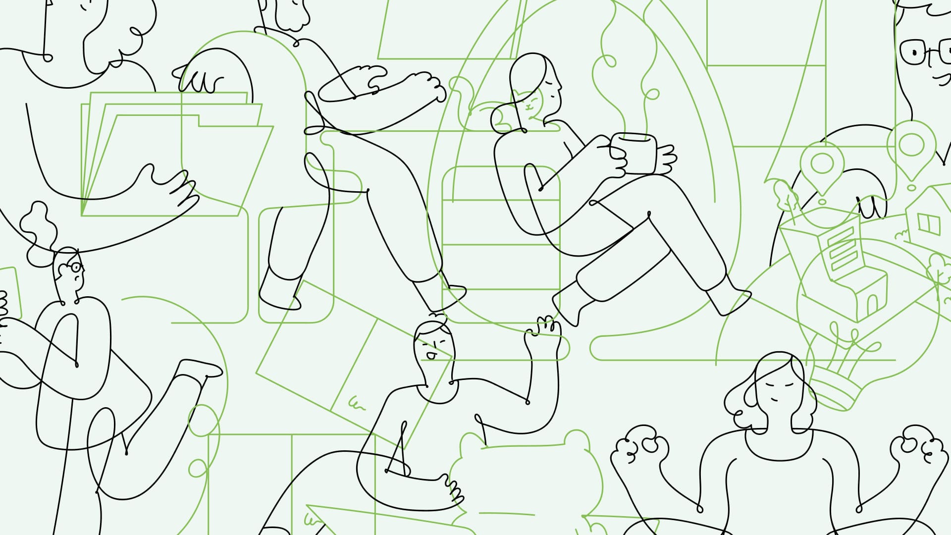
And finally we bring a counterpoint of closeness with an illustration of loose stroke to represent the “together” of its new essence.


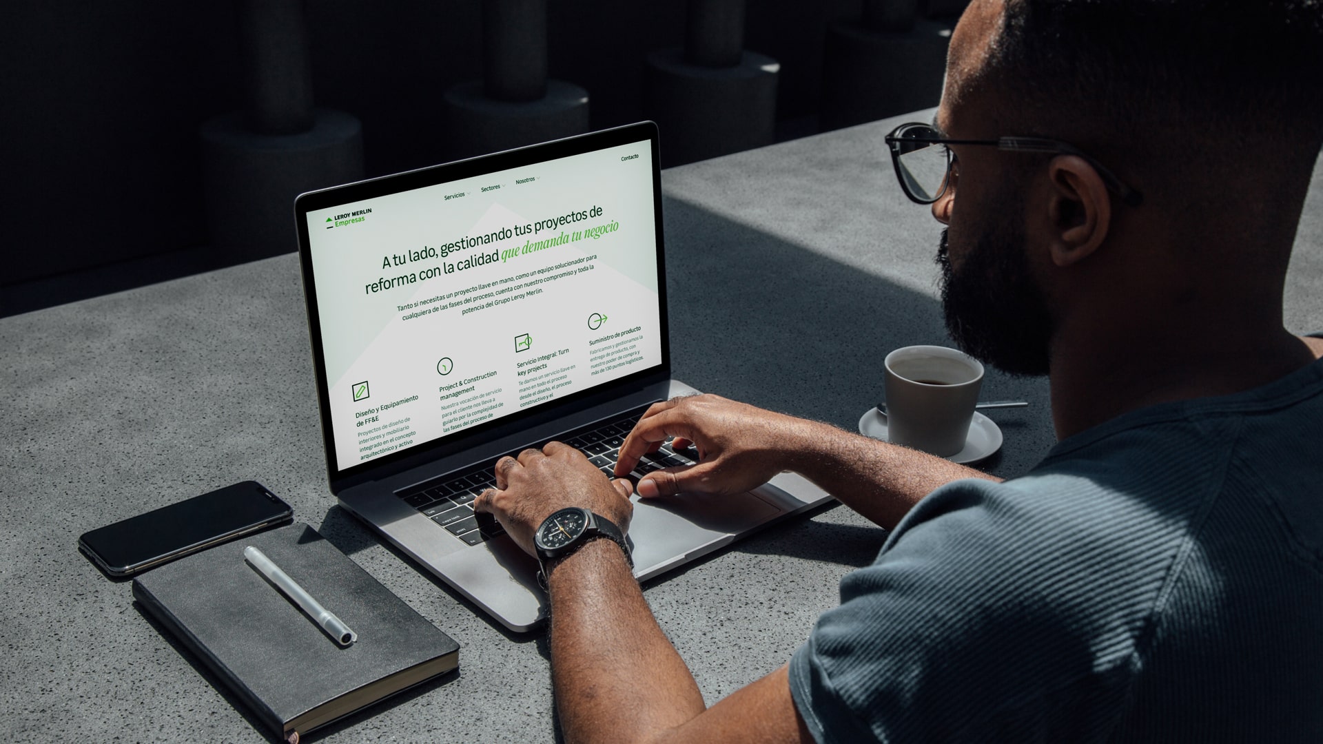
The key brand touch point: Leroy Merlin's new corporate website for businesses
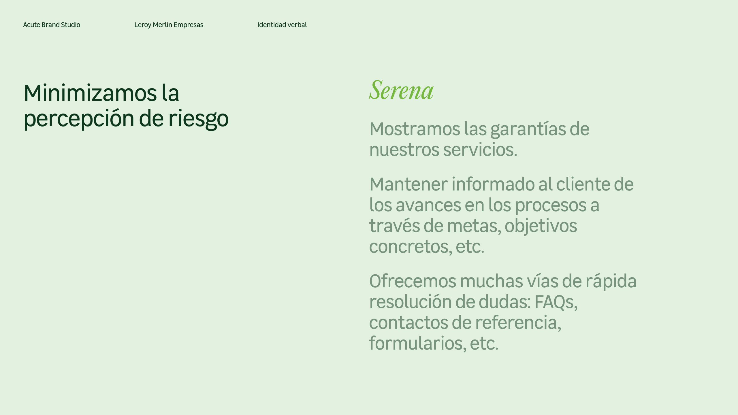
From the initial assignment arose the need to activate the new brand on the corporate website. A digital experience focused on generating a perception of quality and closeness for customers of business reforms.
In several sessions with the client we co-created the content of the new site as well as the new commercial offer and then we designed all the interfaces and interactions for the delivery to web development by the technological area of the company.