Metropolis
Transforming the global network of major cities.
Metropolis the global network of major cities and metropolitan spaces that brings together the governments of 141 urban agglomerations worldwide contacted us at the beginning of 2022 to help them professionalize their visual identity. We felt honored and proposed them to put on their shoes and walk the path together, starting with a consultancy job focused on reworking the design.
The challenge was clear: to raise their visual identity —and consequently their brand— to the level of the impact that they generate as an association in the great metropolises of the world. All this, of course, without losing the essence of its 35-year of existance.
A vibrant color palette
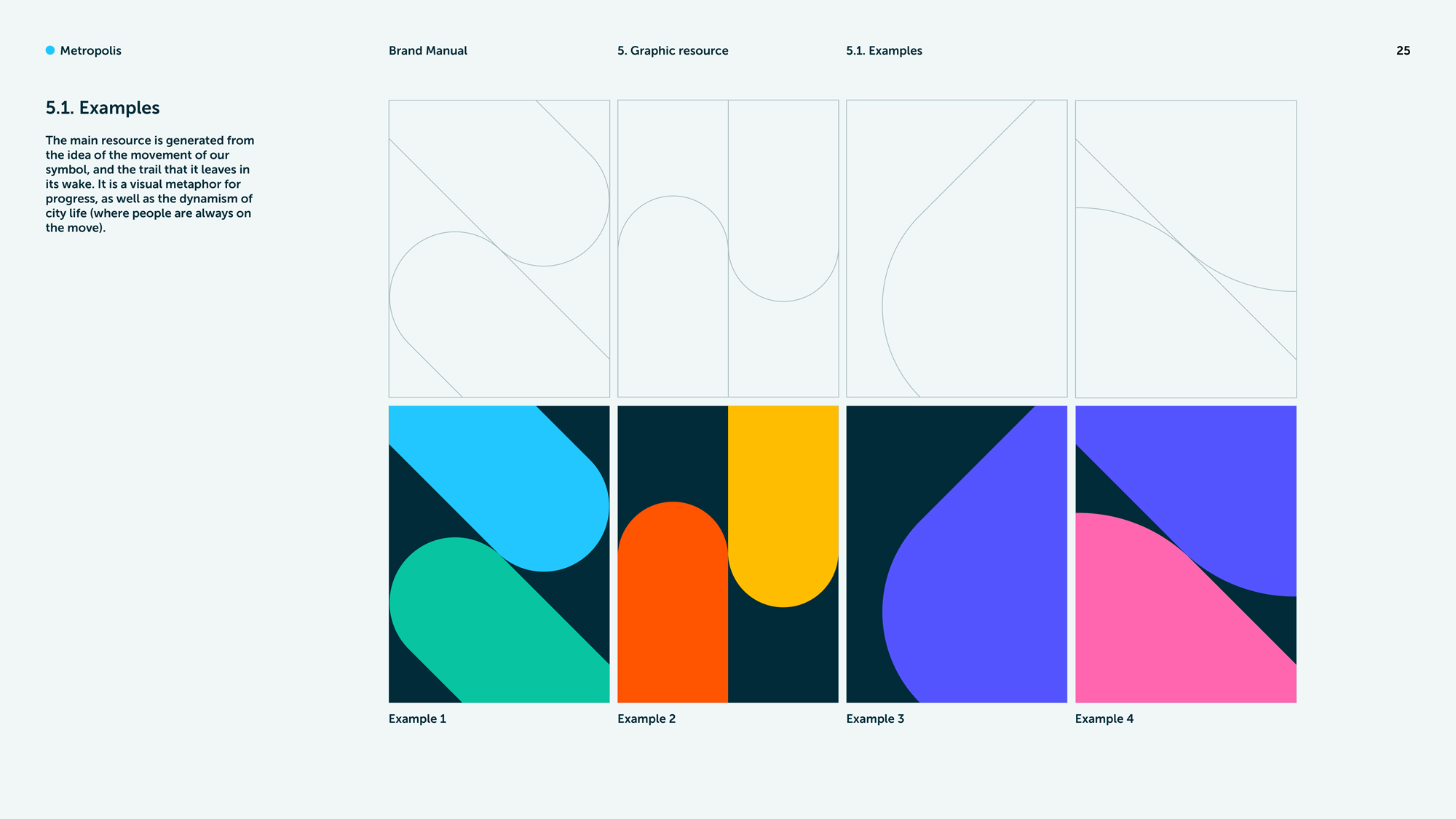
The new corporate identity helps differentiate the association from other organizations similar to it. Its bright and vibrant color palette represents the energy and cultural richness of the great member cities. On the other hand, the trail generated by the sphere symbolizes the dynamism of life in the great metropolitan areas of the world.


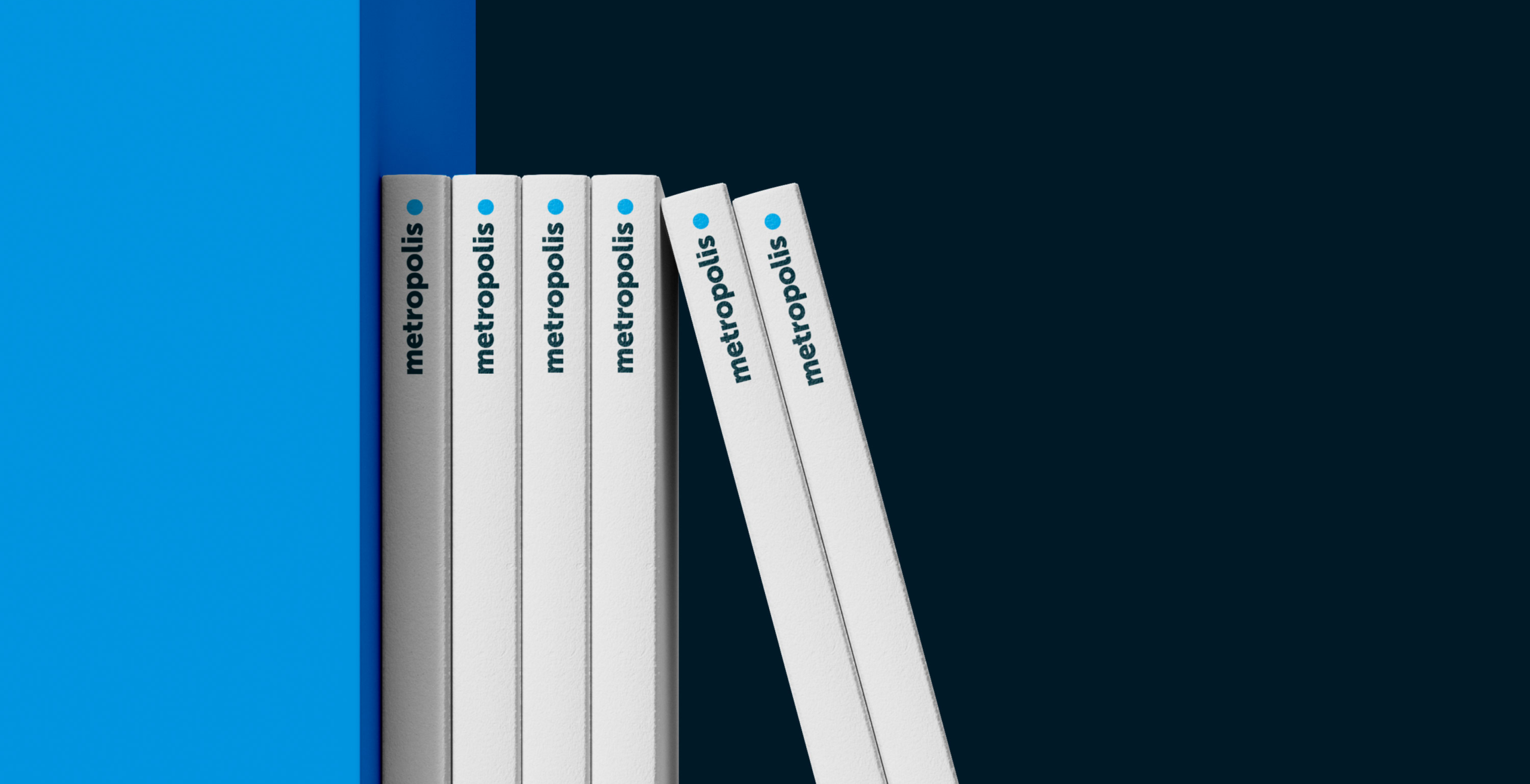
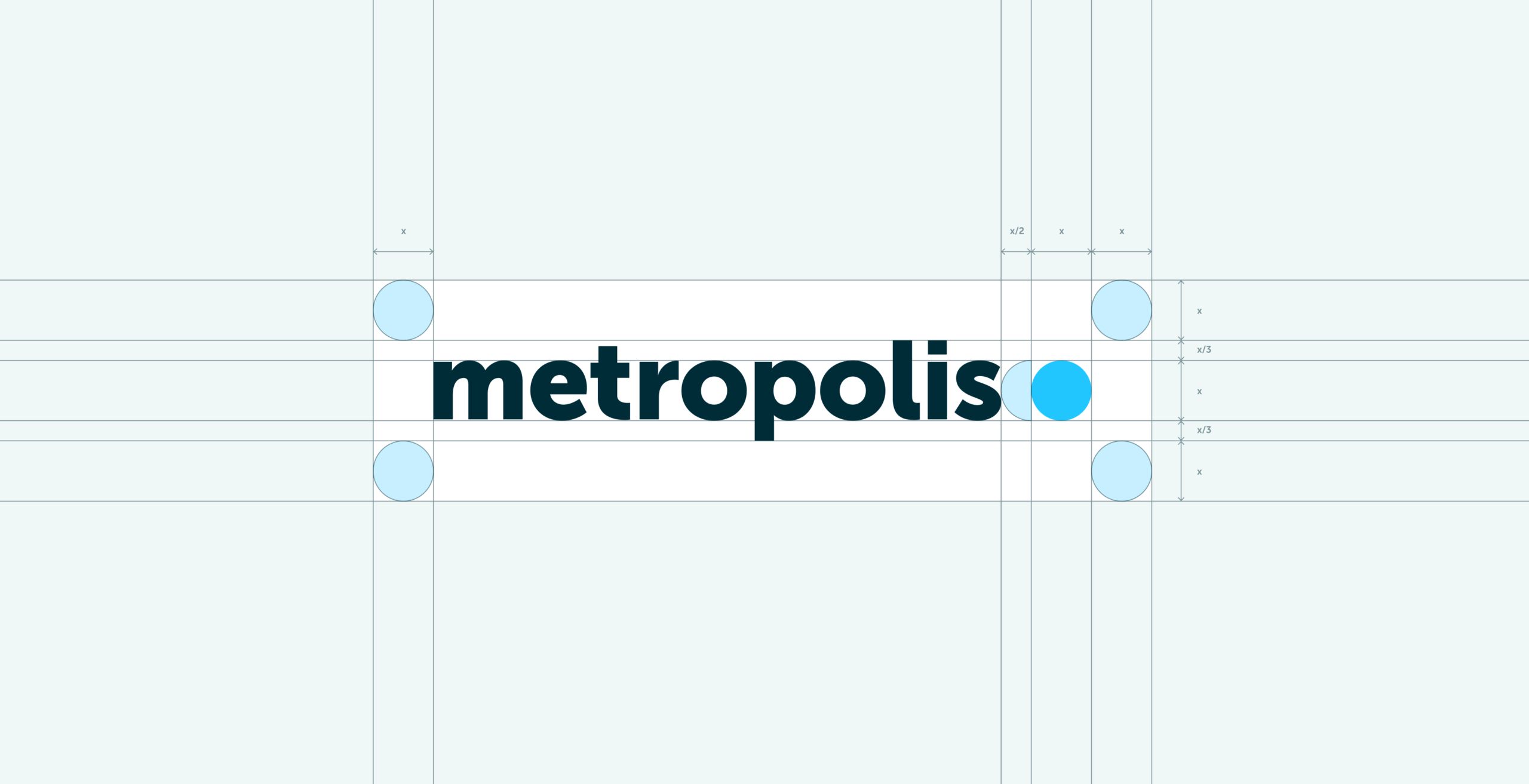
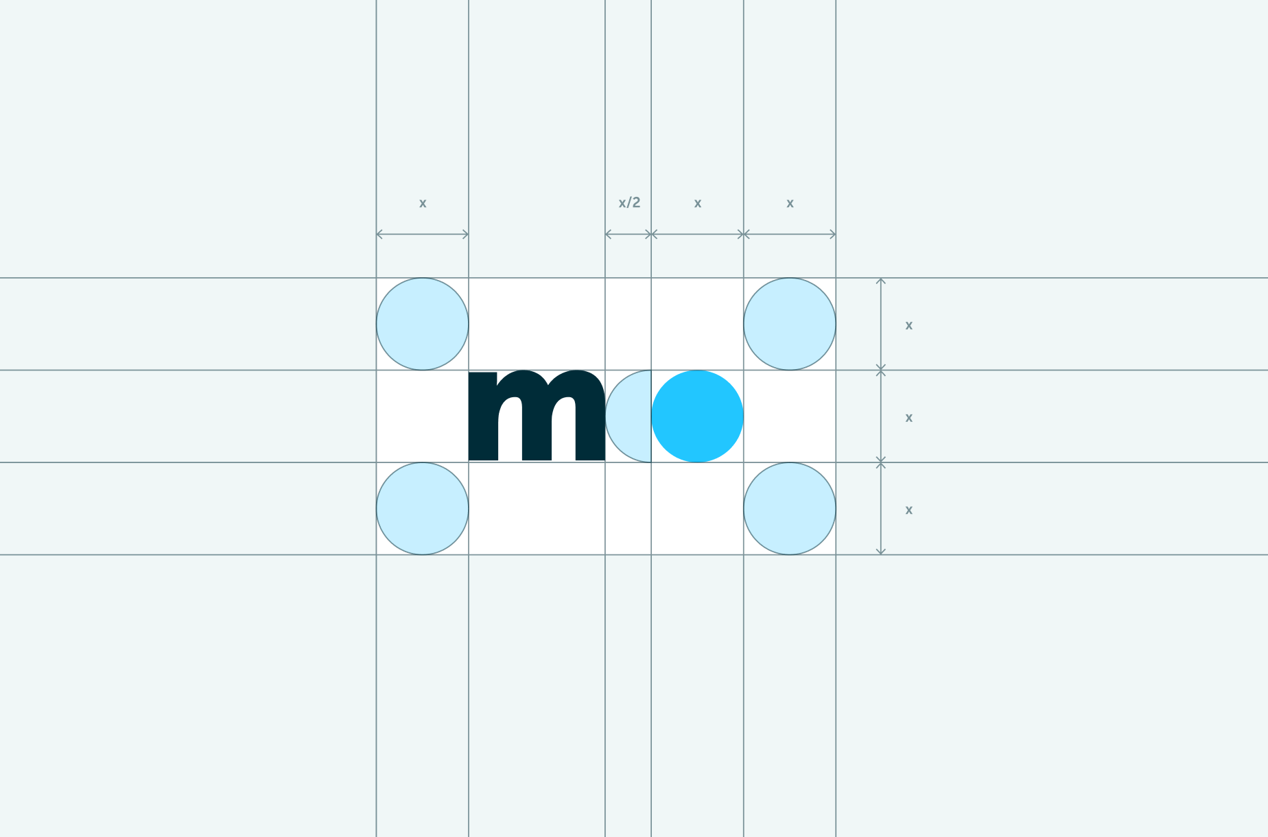
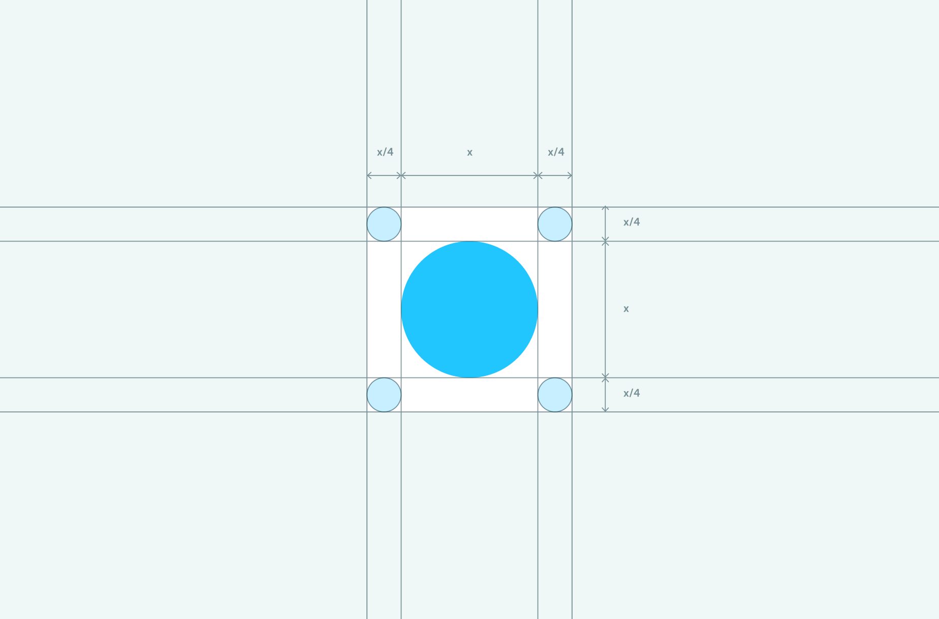
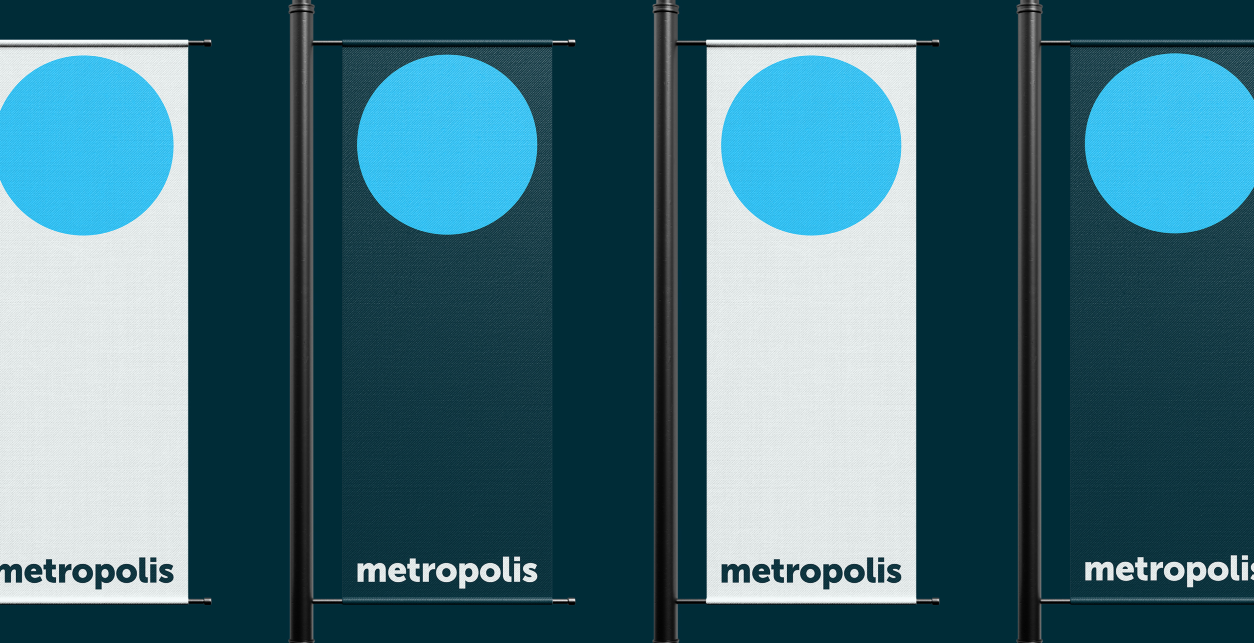
La esfera, el recurso de marca clave
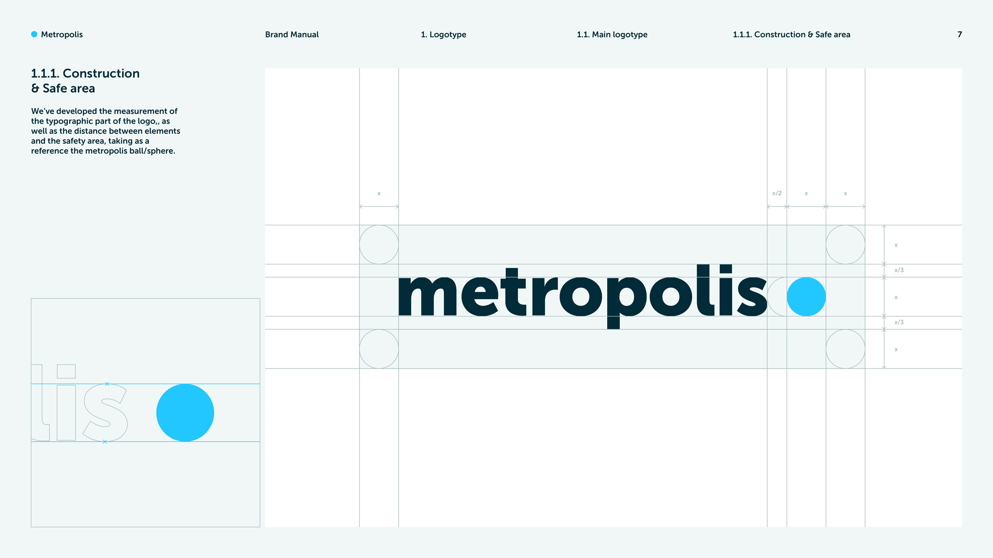
The starting point was an in-depth analysis of all the corporate and sub-brand existing materials. One of the most significant conclusions of the analysis was that the sphere that accompanies the logo would become the key brand asset on which to build the rest of the identity.

Manual de marca
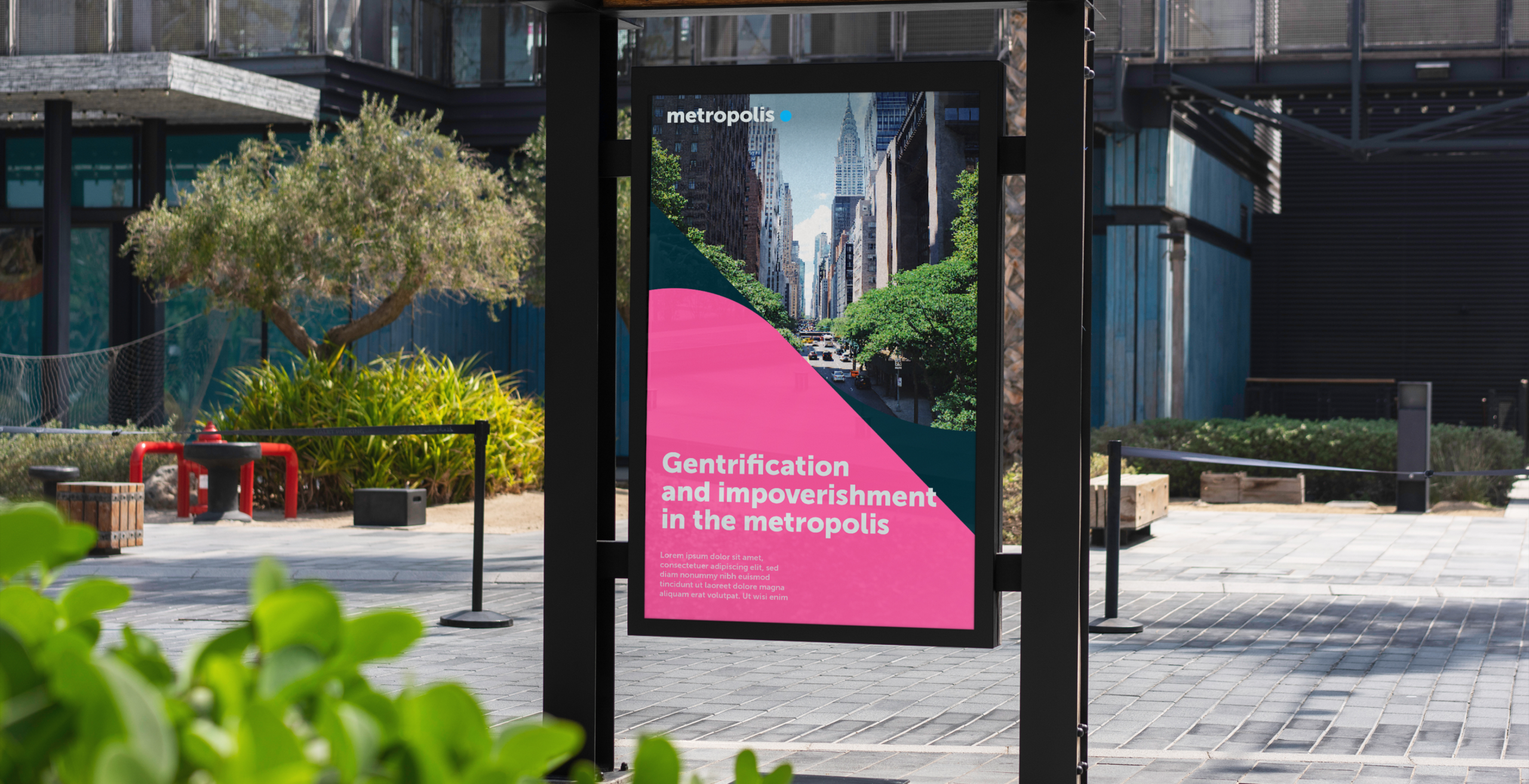
The main deliverable of the assignment was the creation of a brand manual with which to consistently apply the new identity at the different brand points of contact (social media profiles, favicon, editorial materials, roll-ups, communication post, newsletter, etc. ). The manual will help Metropoli team members stay on track and maintain a unified brand.