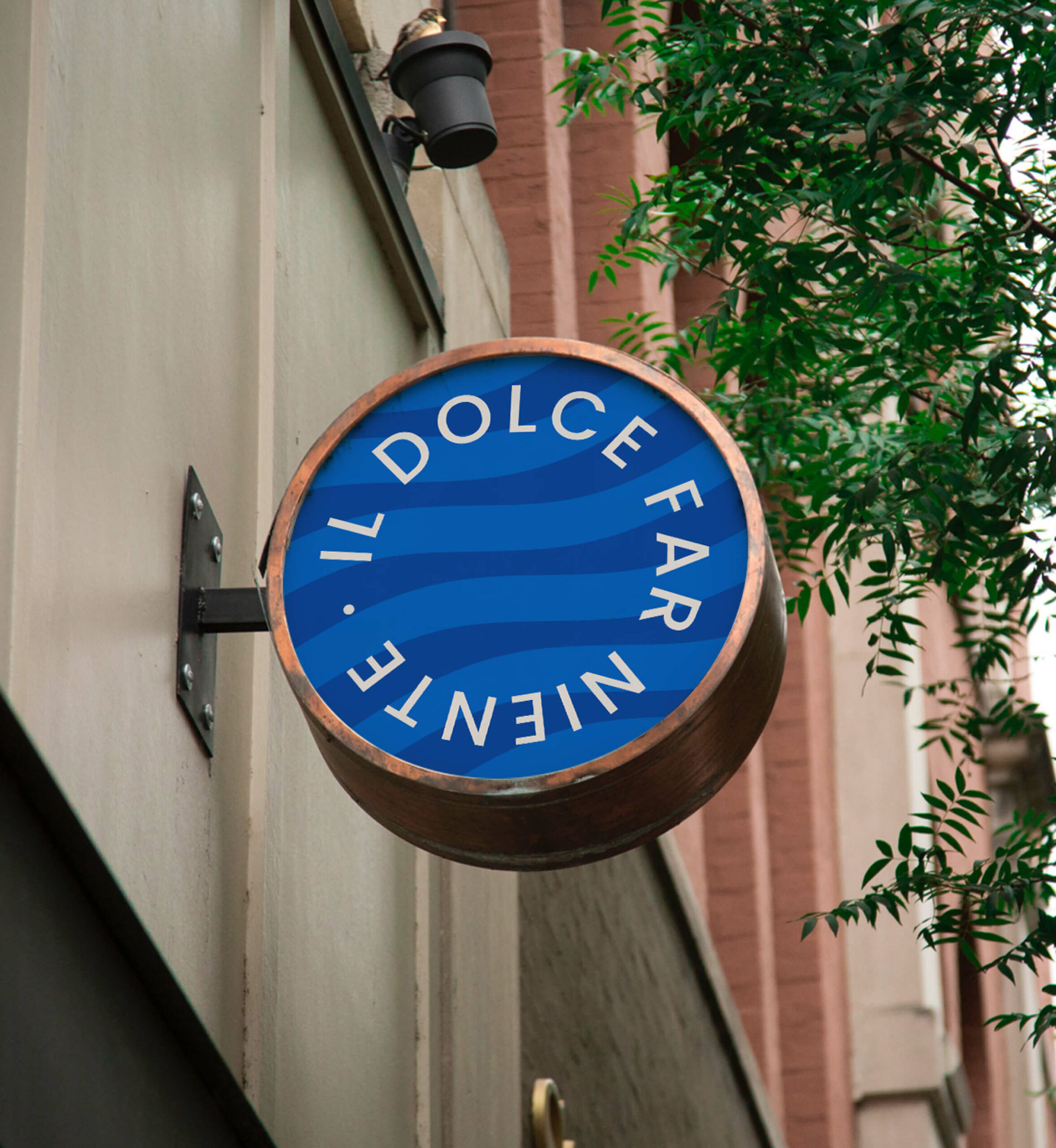
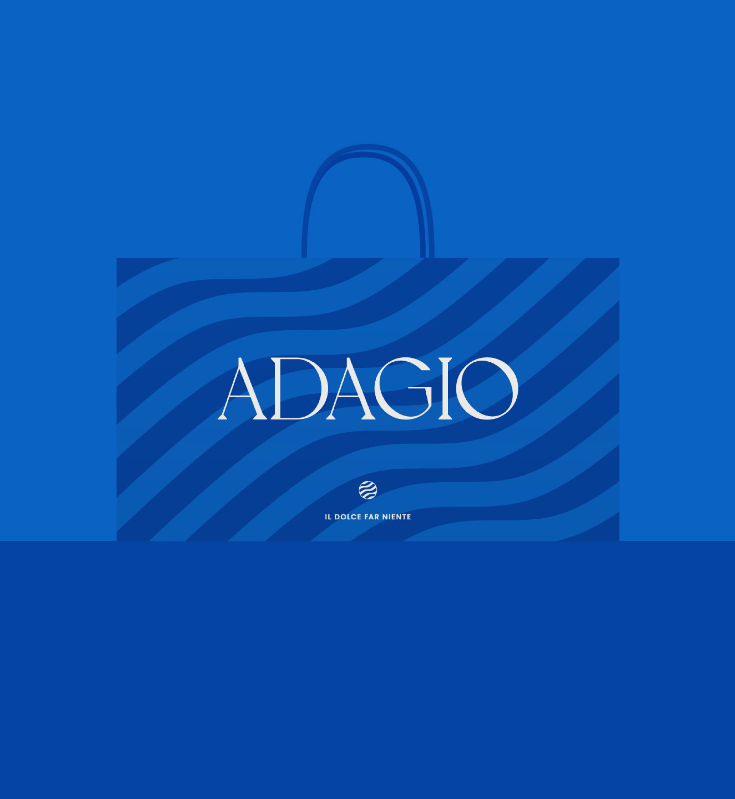
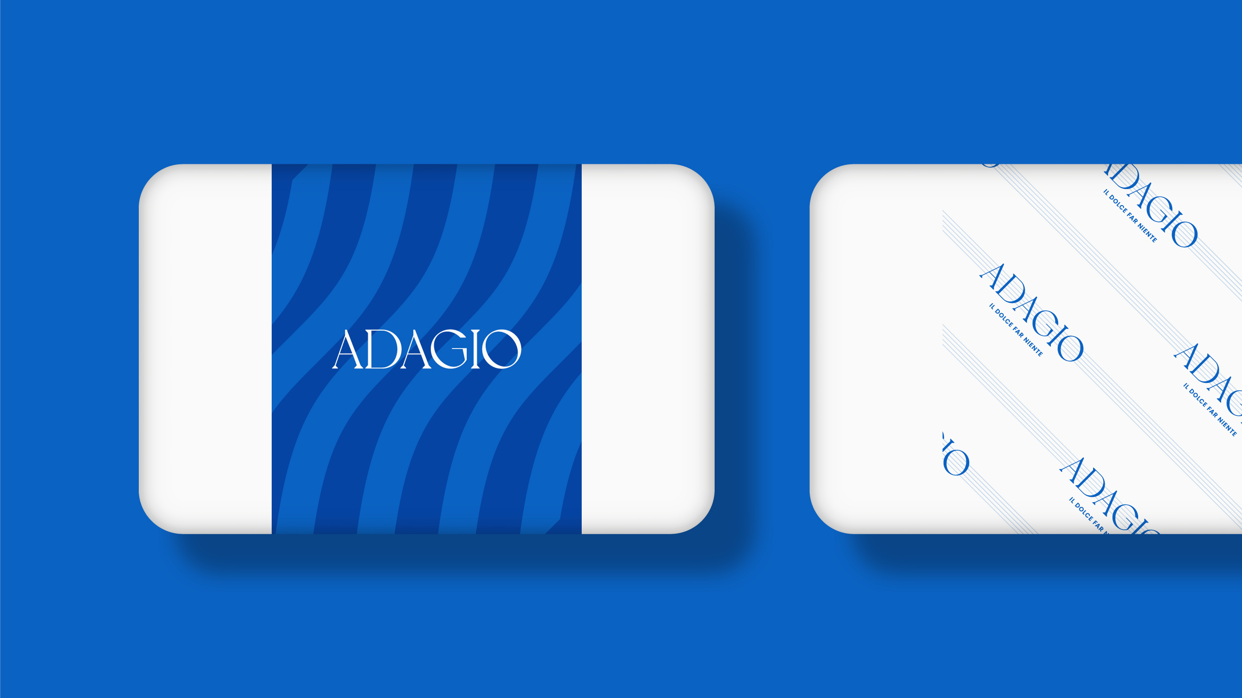
Yes, we like good Italian ice cream! No matter the time of year, good artisanal ice cream always suits you well. Being inspired by those moments of peace with a summer flavor is how we came up to define the brand’s tagline: “il dolce far niente”: the pleasure of doing nothing. Adagio offers the world a pause with a natural Italian flavor, its ice cream will make you forget your worries for a while.

Adagio or, as we say here in Spain, "despacito"
How to convey our brand philosophy of peacefulness along with Italian tradition in a name? Italian conquers musical scores with its expressions: alegríatto, stacatto, forte… Well, it turns out that adagio means “slowly”. Just the right concept that we want to evoke.
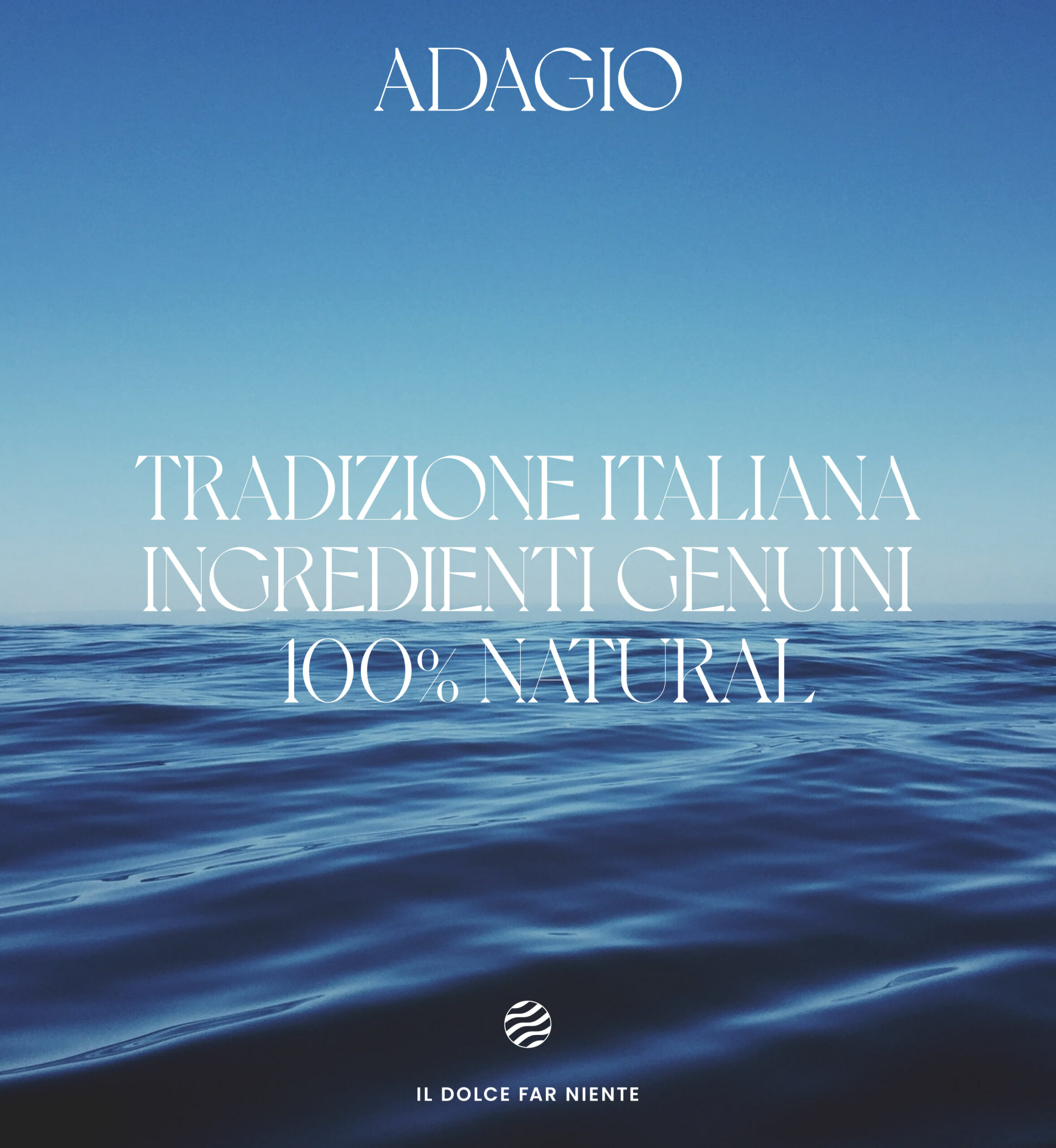
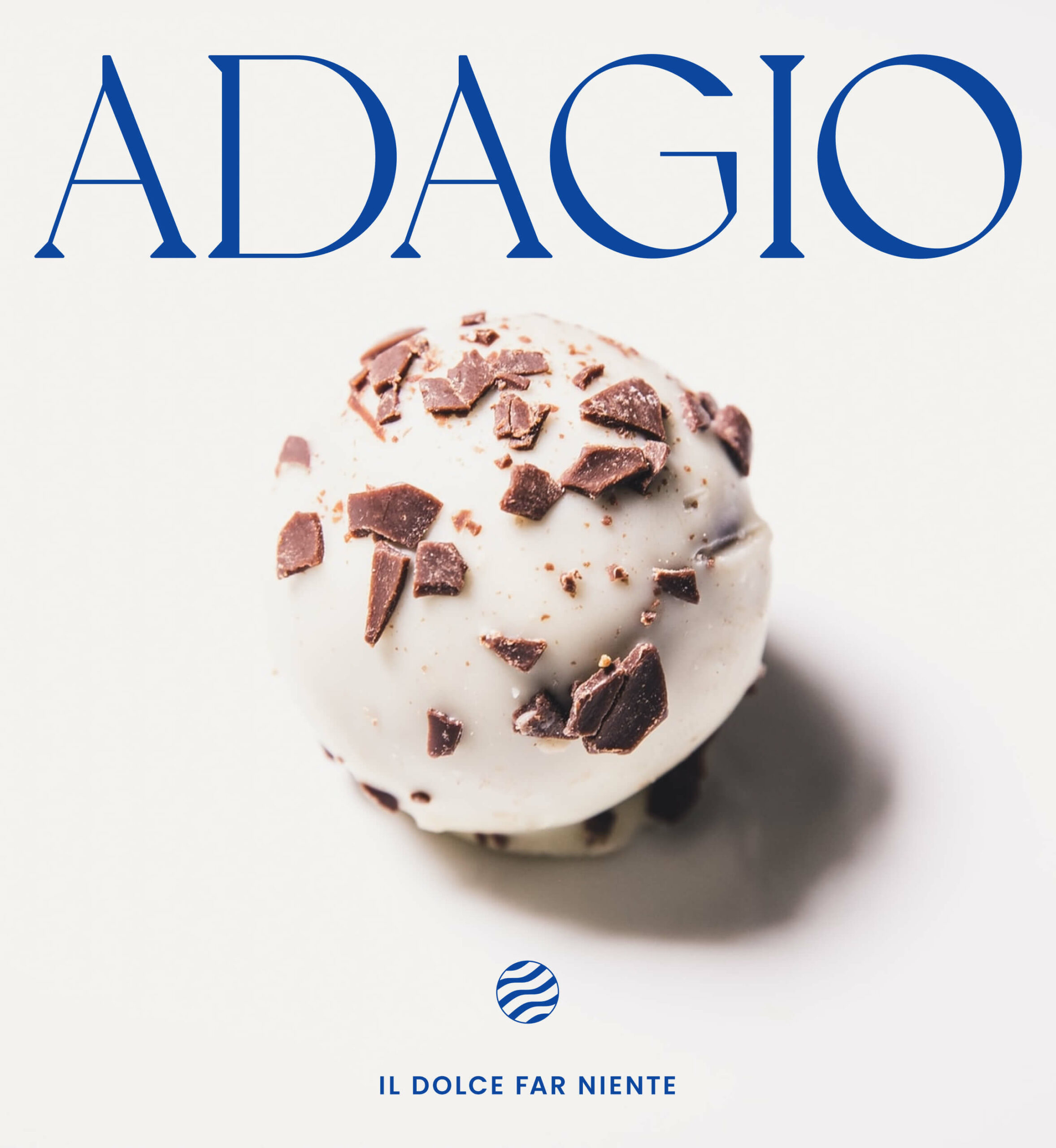
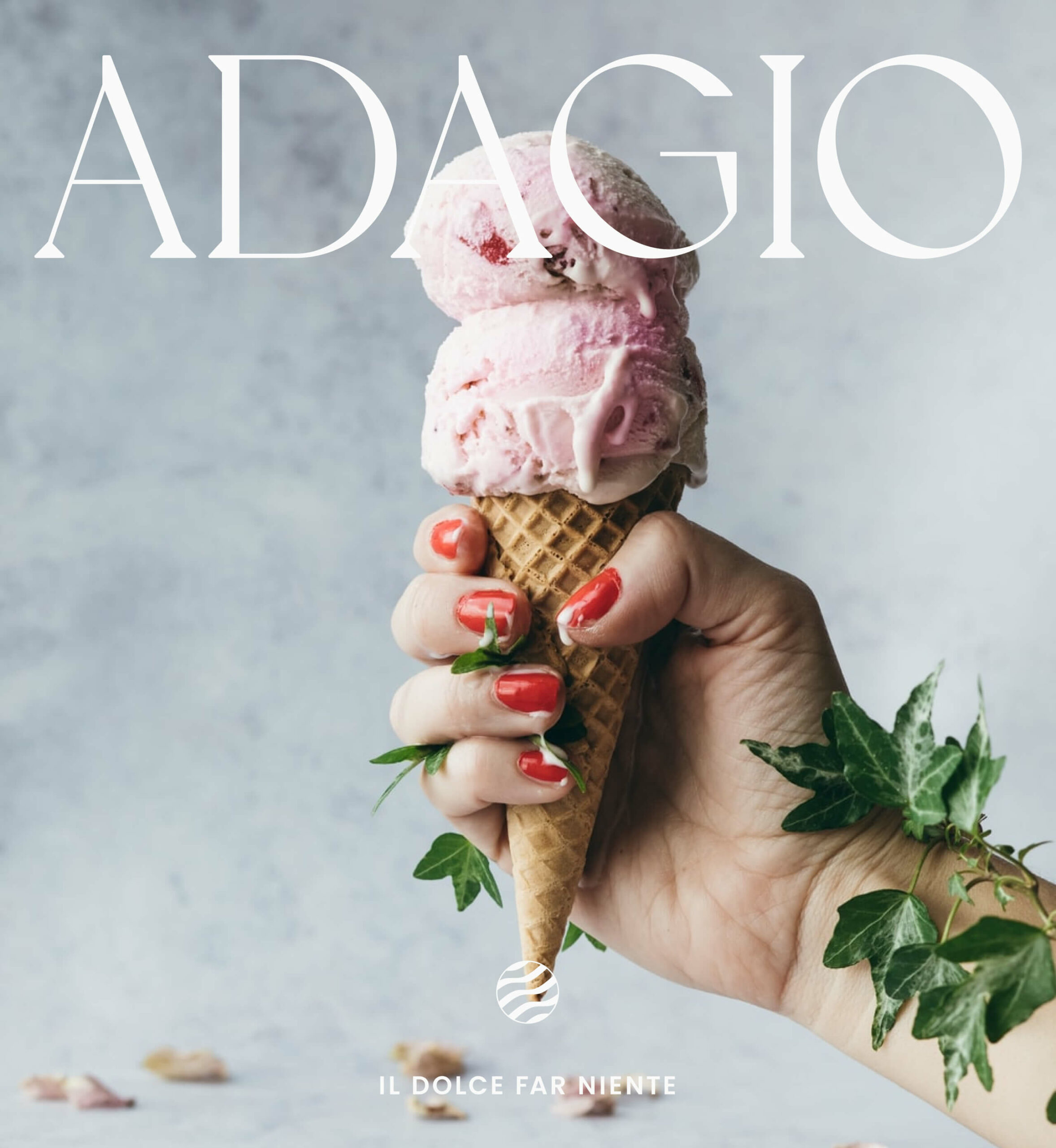
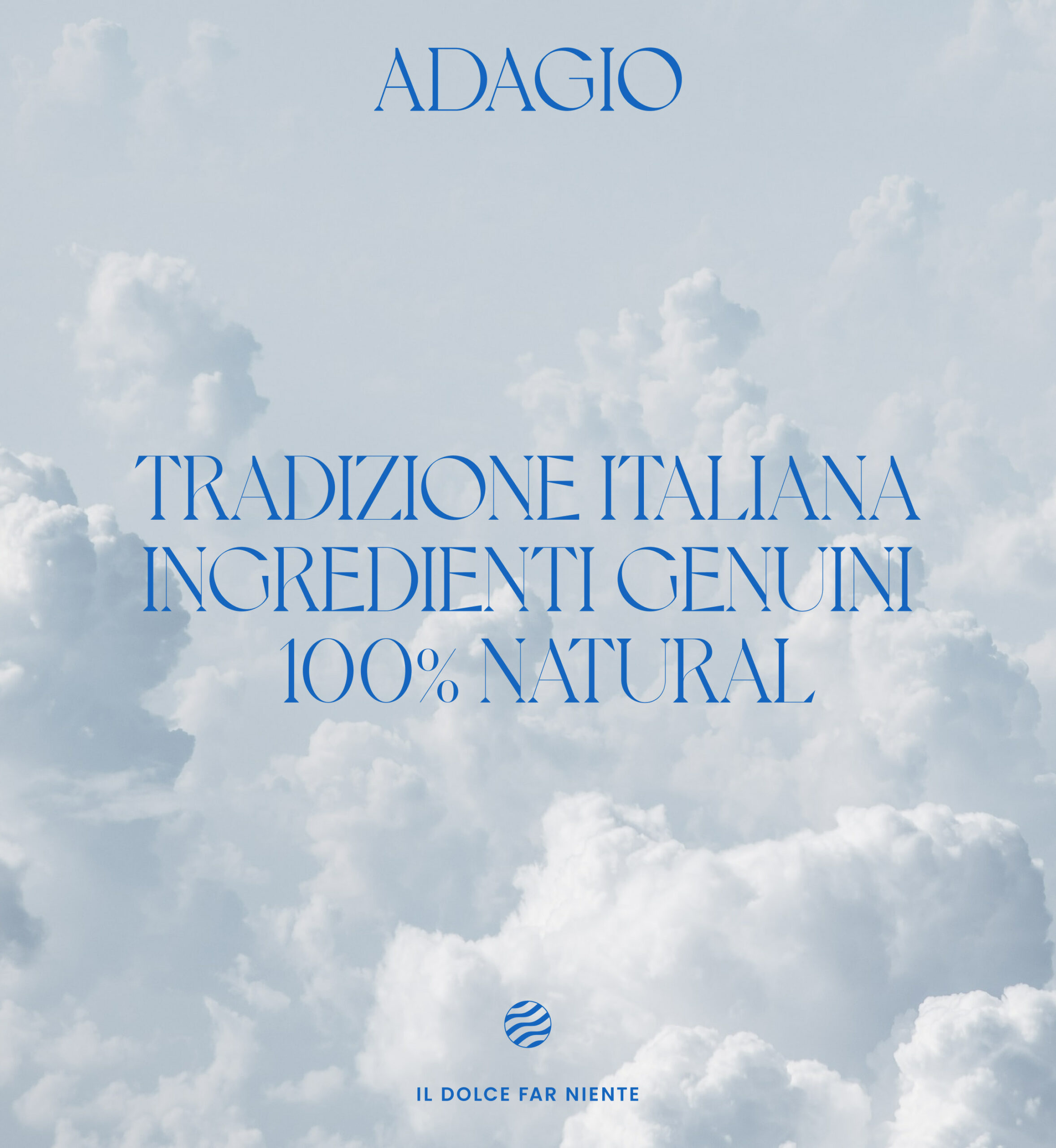
Harmony, textures, and elegance
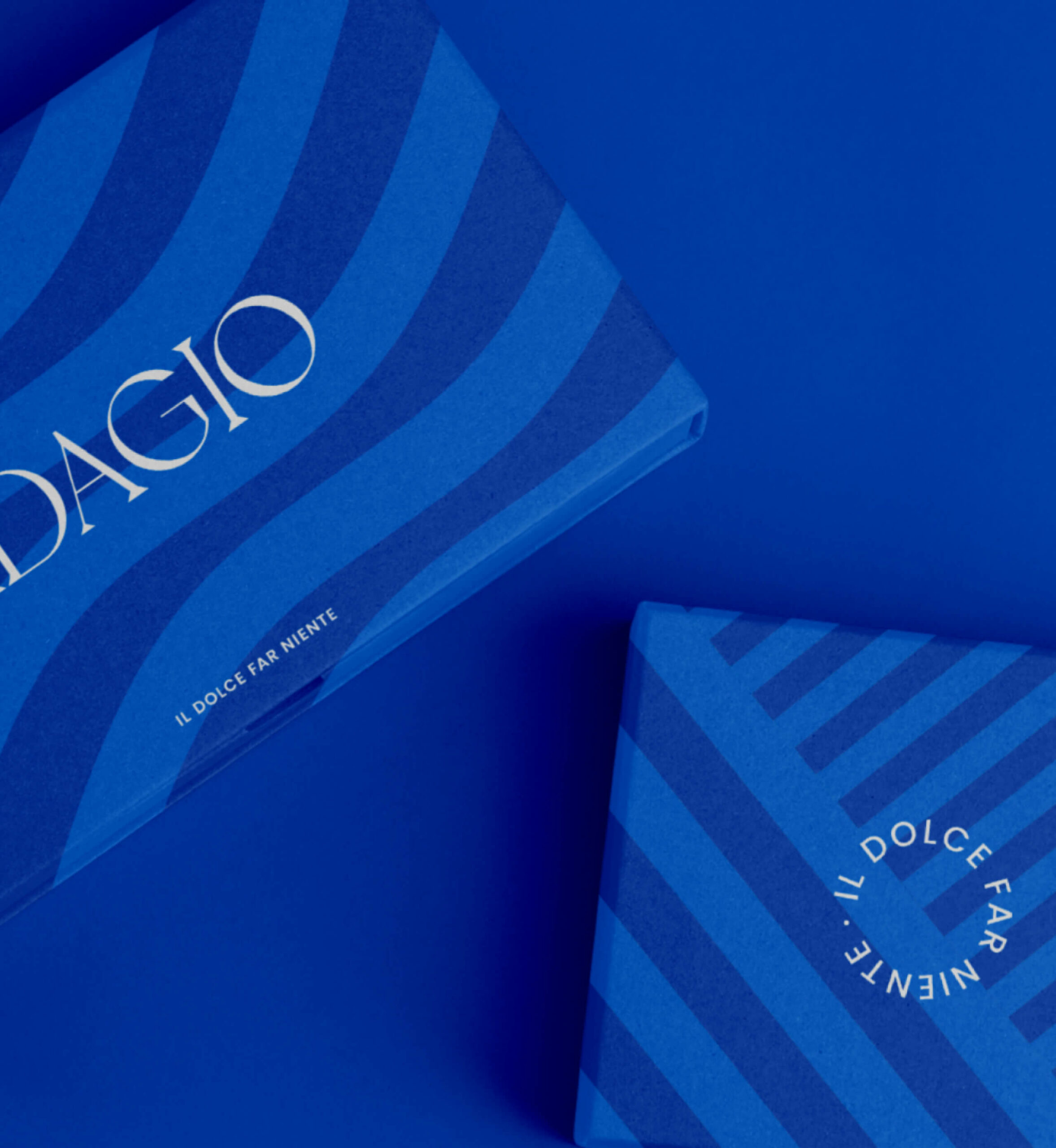
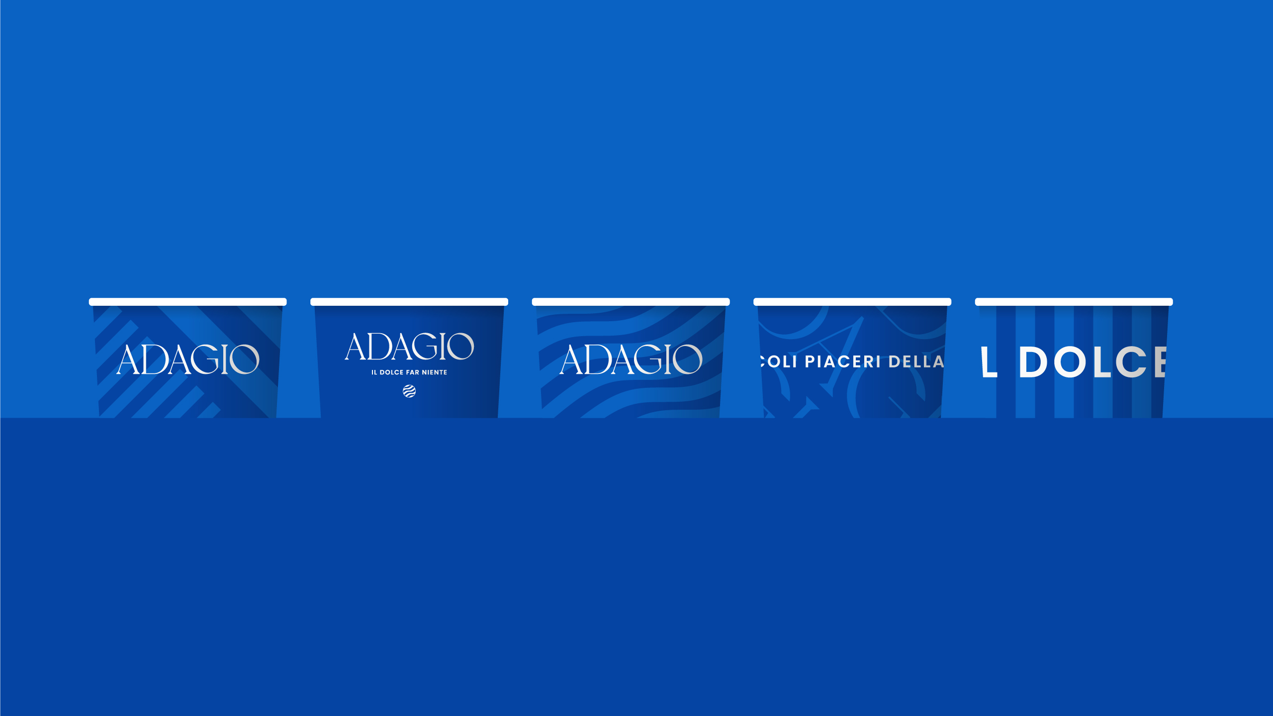
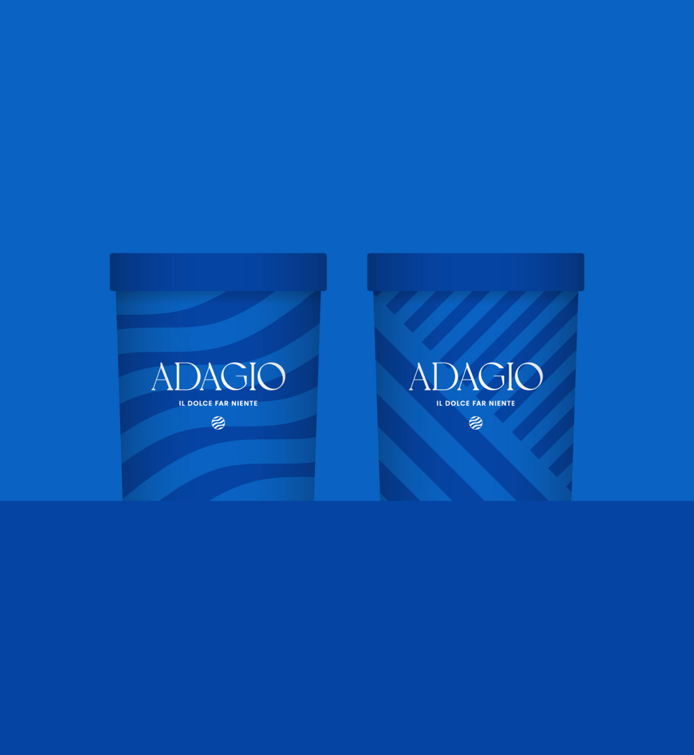
Adagio’s visual identity is also inspired by the music, harmony, and order of the staves. In order to represent the idea of taking a pause and enjoying your senses, we chose 3 key elements to make up the visual identity: the blue color, a color rarely used by the competitors which help to differentiate us from the rest; voyage headline typography with elegant and sinuous lines, with much prominence in graphic compositions; and geometric patterns that evoke different states of calm, harmony and relaxation.

