Lycée Français de Madrid
140 years of humanist education
The Lycée Français de Madrid is one of Spain’s most historic educational institutions. Founded in 1884, it now spans two campuses, thousands of families and a community shaped by French tradition and an international outlook. Yet its visual identity no longer reflected this reality. Our task was to design a complete brand system — one that could give the LFM the presence its history deserves.

Before designing anything, we listened.
The LFM had strong internal clarity about its mission. To educate autonomous, critical thinkers open to the world. But that clarity wasn’t reaching the outside with the same strength. The existing visual identity simply didn’t match the ambition of the educational project.
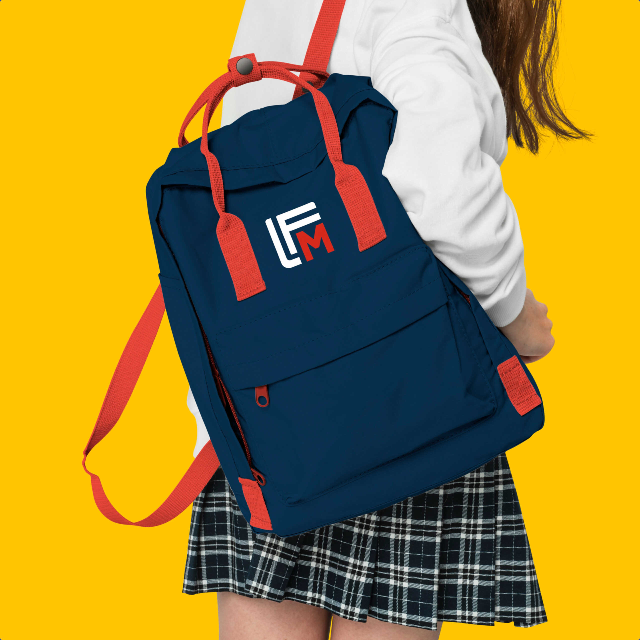
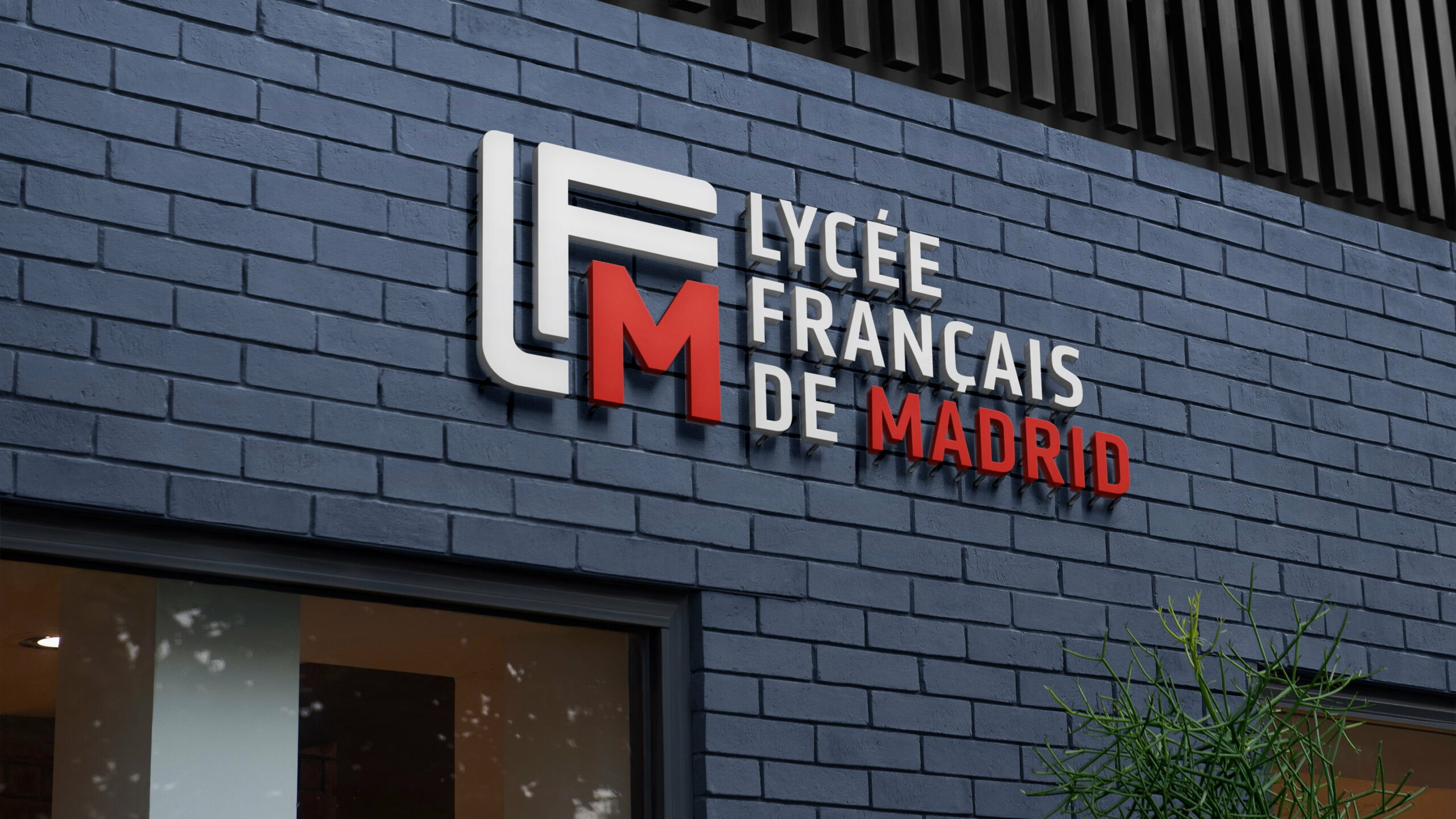
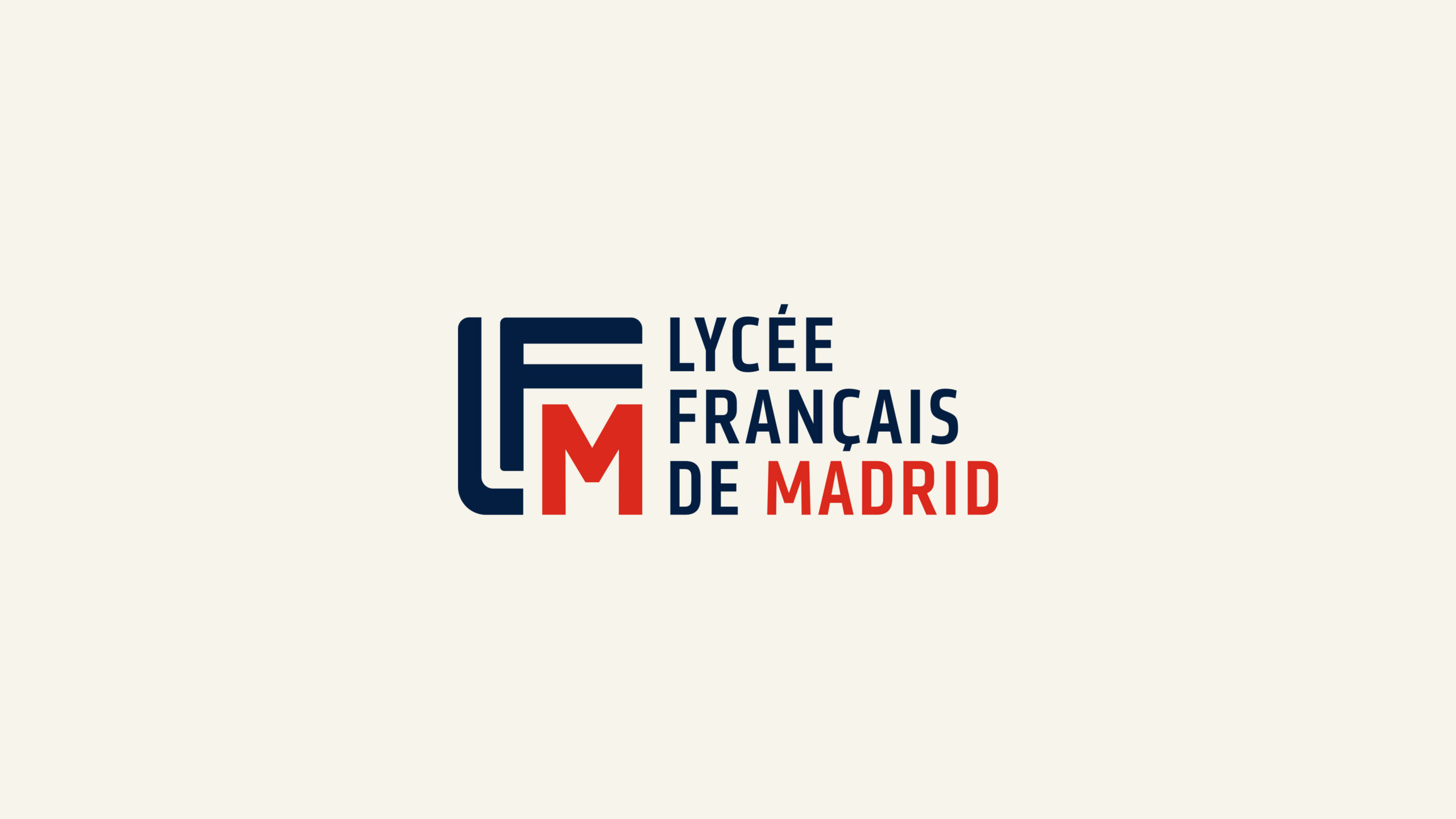
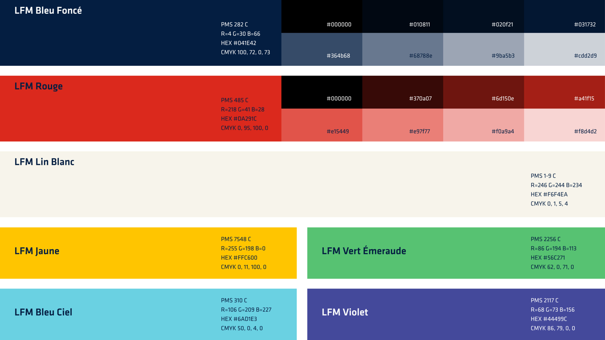
The new logo is built around the institution’s three initials, structured with an architectural logic. The L and F create a framework that contains the M, highlighted in red as a nod to Madrid.
Order, solidity and a distinct character.The colour palette (midnight blue, red and warm white) brings the French tricolour into the 21st century with authority and contemporary energy.


Architecture as a design language
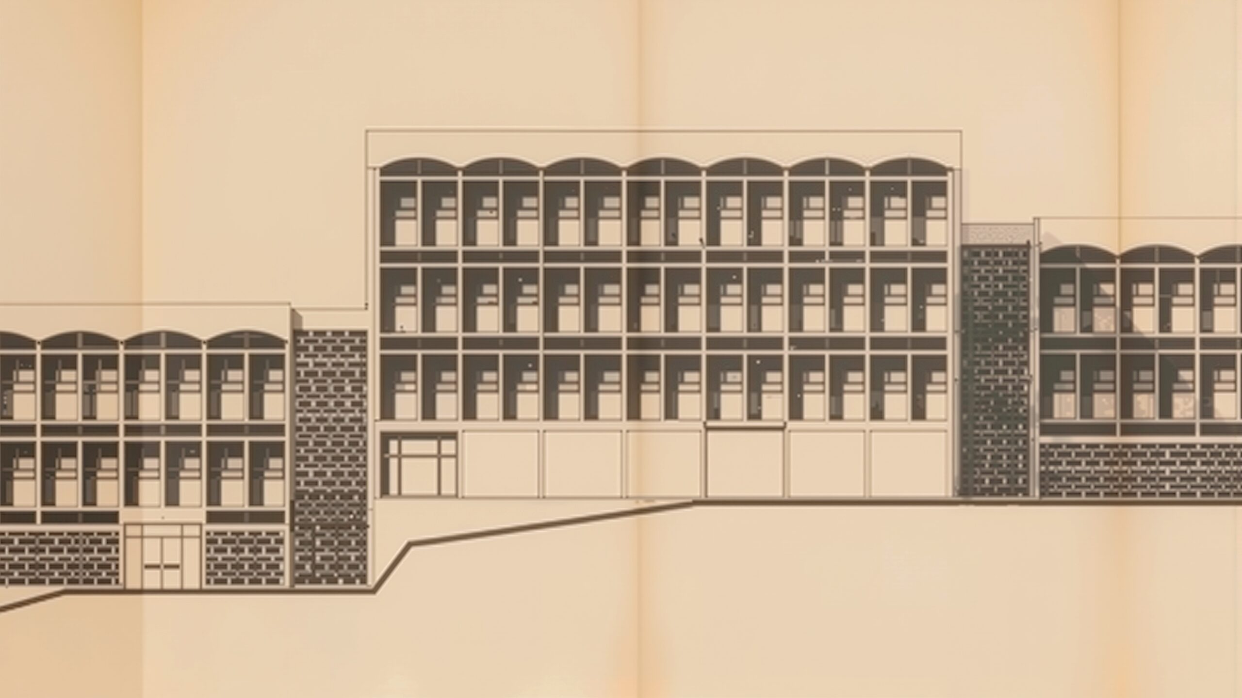
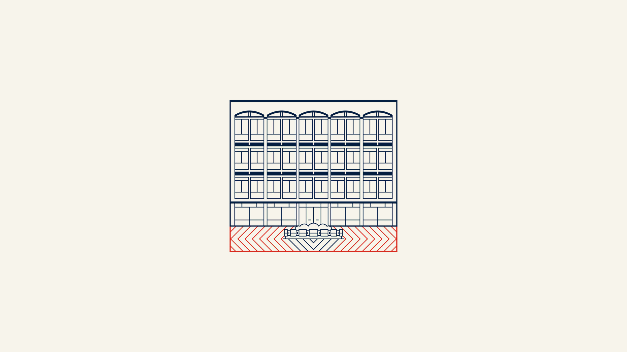
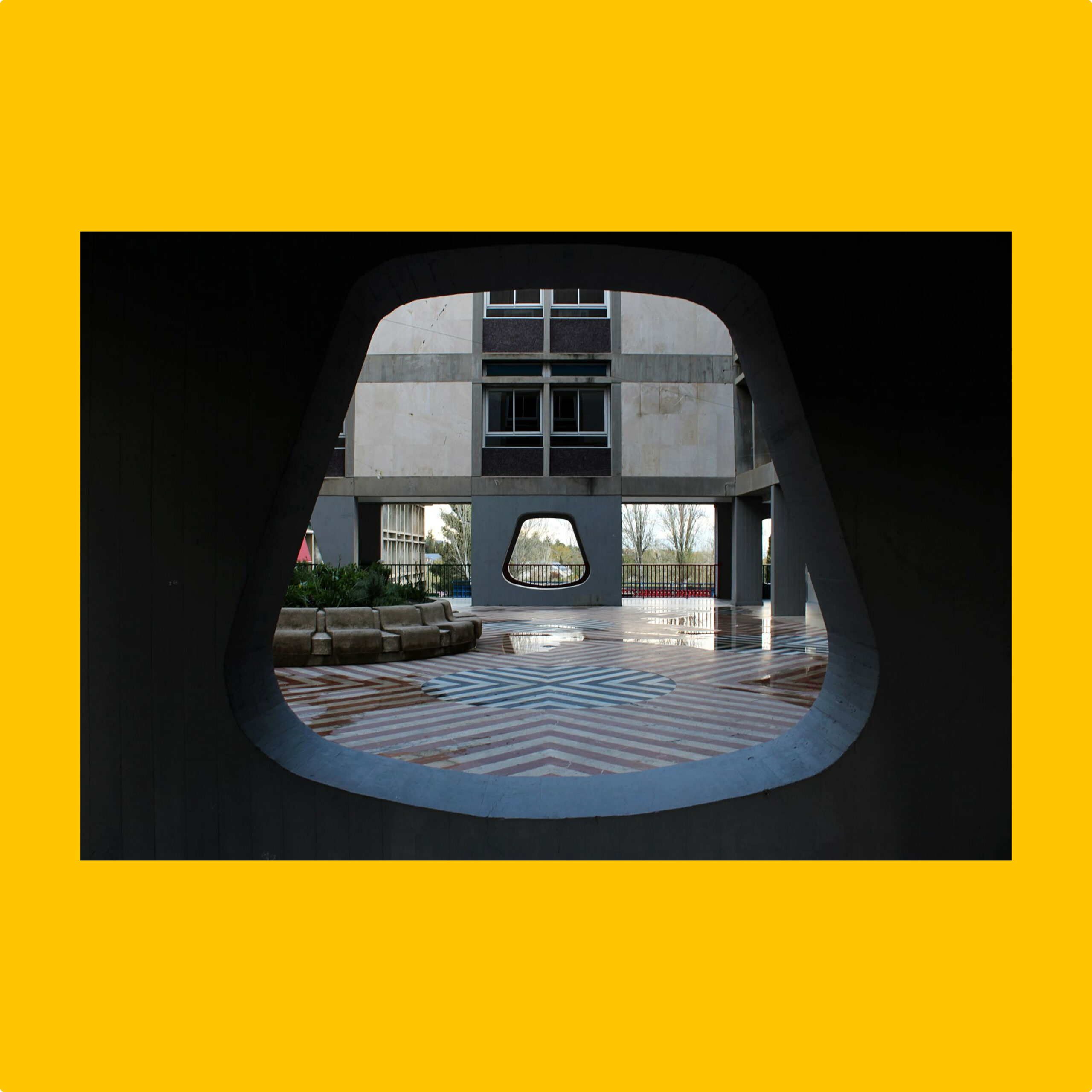
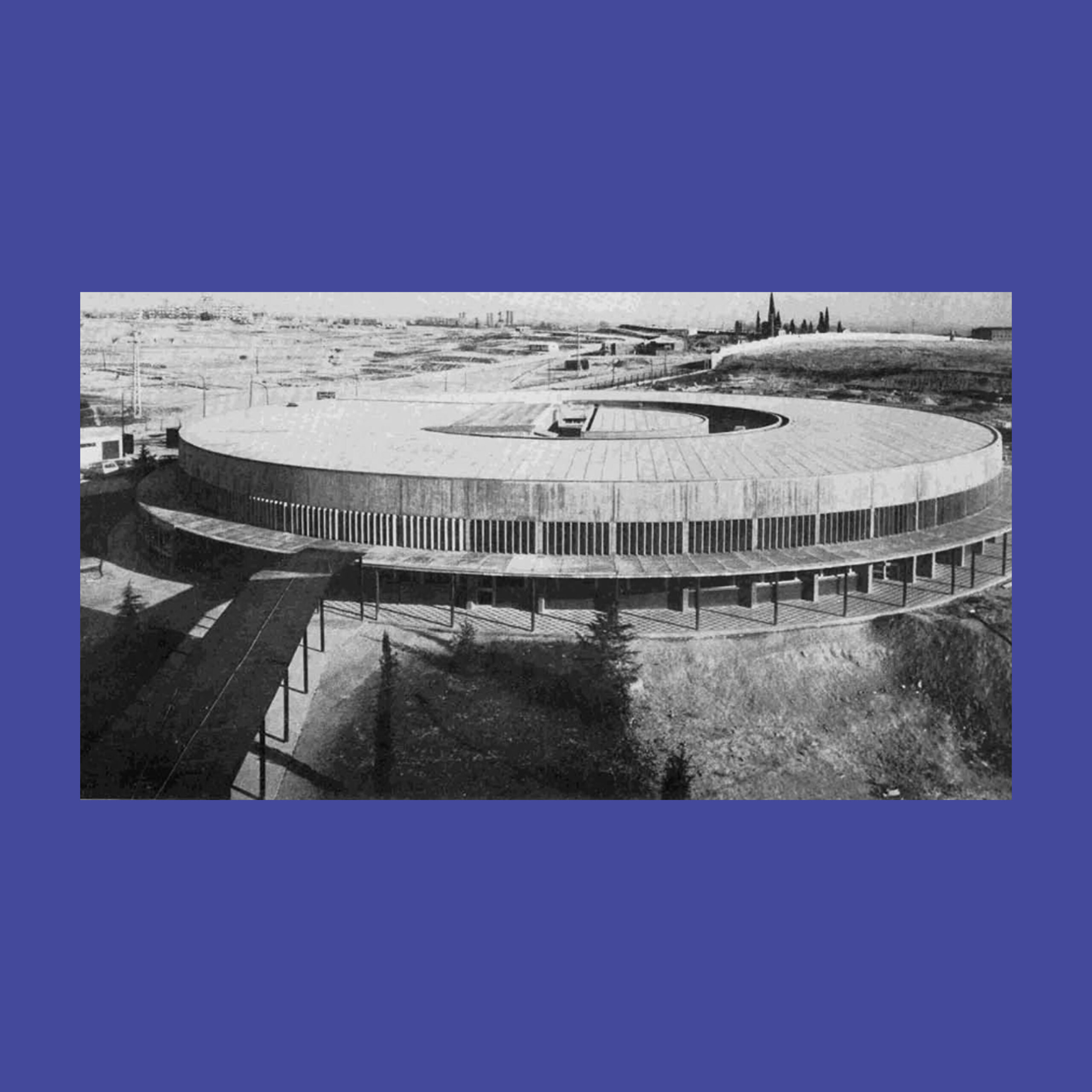
The LFM has something few institutions can claim: a distinctive architectural heritage.
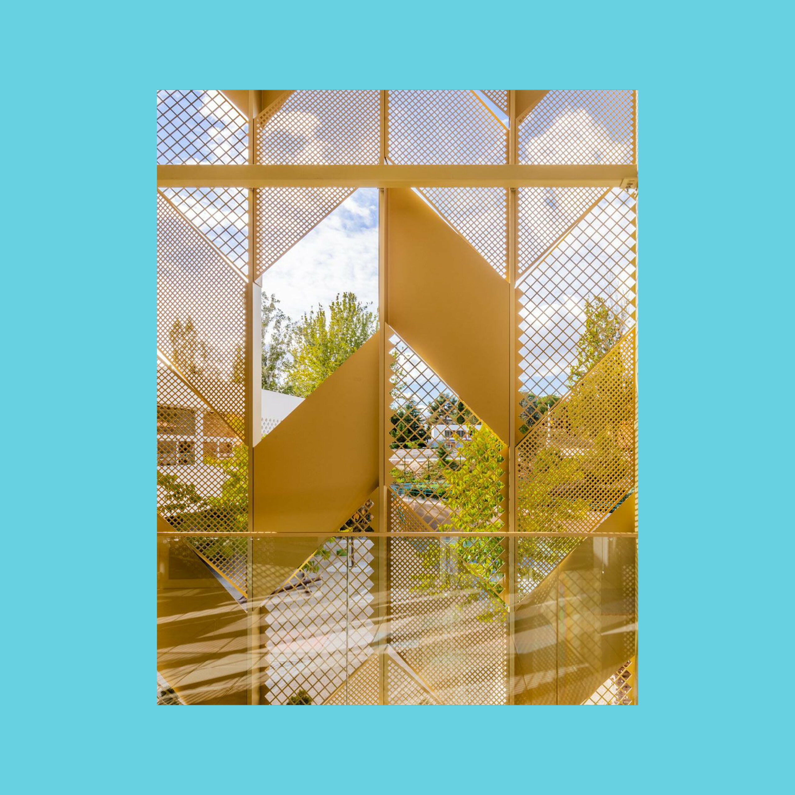
The geometric forms of its brutalist buildings became graphic elements of the visual system: patterns, image containers and textures that are not decorative but biographical.
This architectural language also informs the visual collages allowing the LFM to communicate with richness and coherence across formats.
The result is a visual system with strong roots and real flexibility: institutional when needed, approachable when the context calls for it.


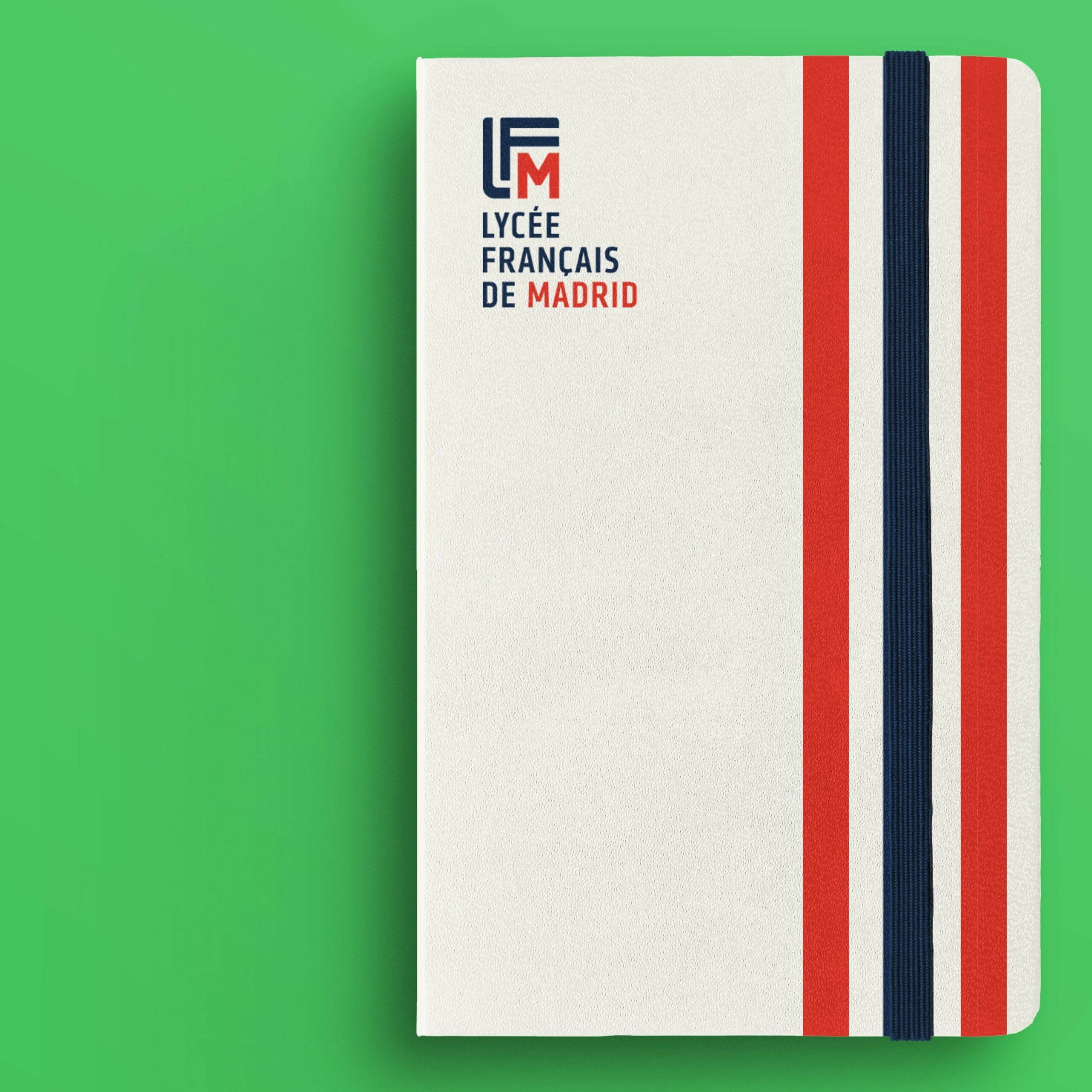
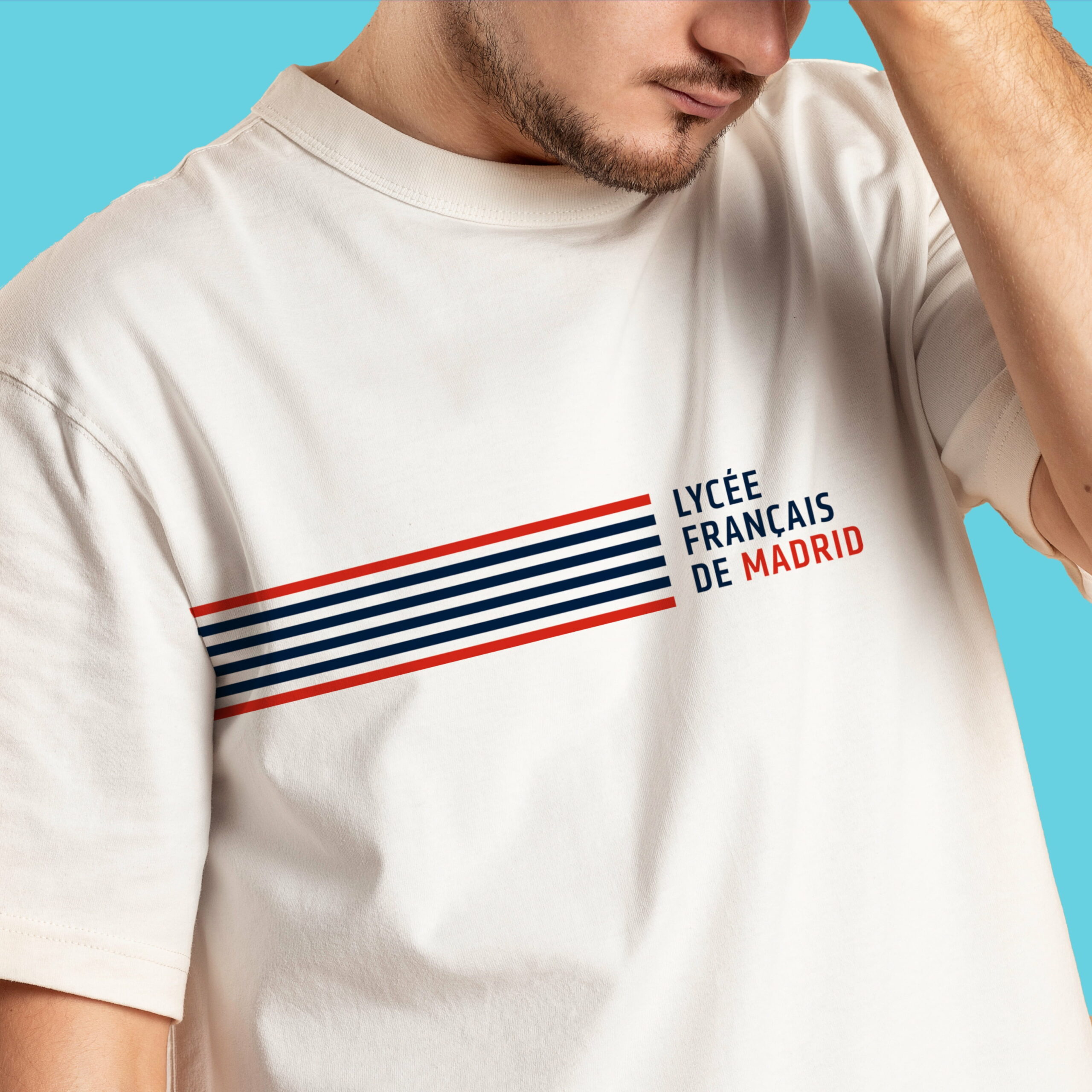
French origin, Madrid character
La Marinière is the most distinctive graphic element of the system. Inspired by the iconic French sailor stripe and constructed from the structural lines of the LFM symbol itself.
In its new form, La Marinière follows clear rules, defined proportions and a flexible logic of use. It works as a background, a texture or a graphic accent.
And wherever it appears, the LFM becomes instantly recognisable.