Spark Island
Ignites what unites
In the growing immersive entertainment sector, Spark Island needed a brand capable of unifying very different experiences under a single identity and conveying the energy and connection experienced within its facilities.
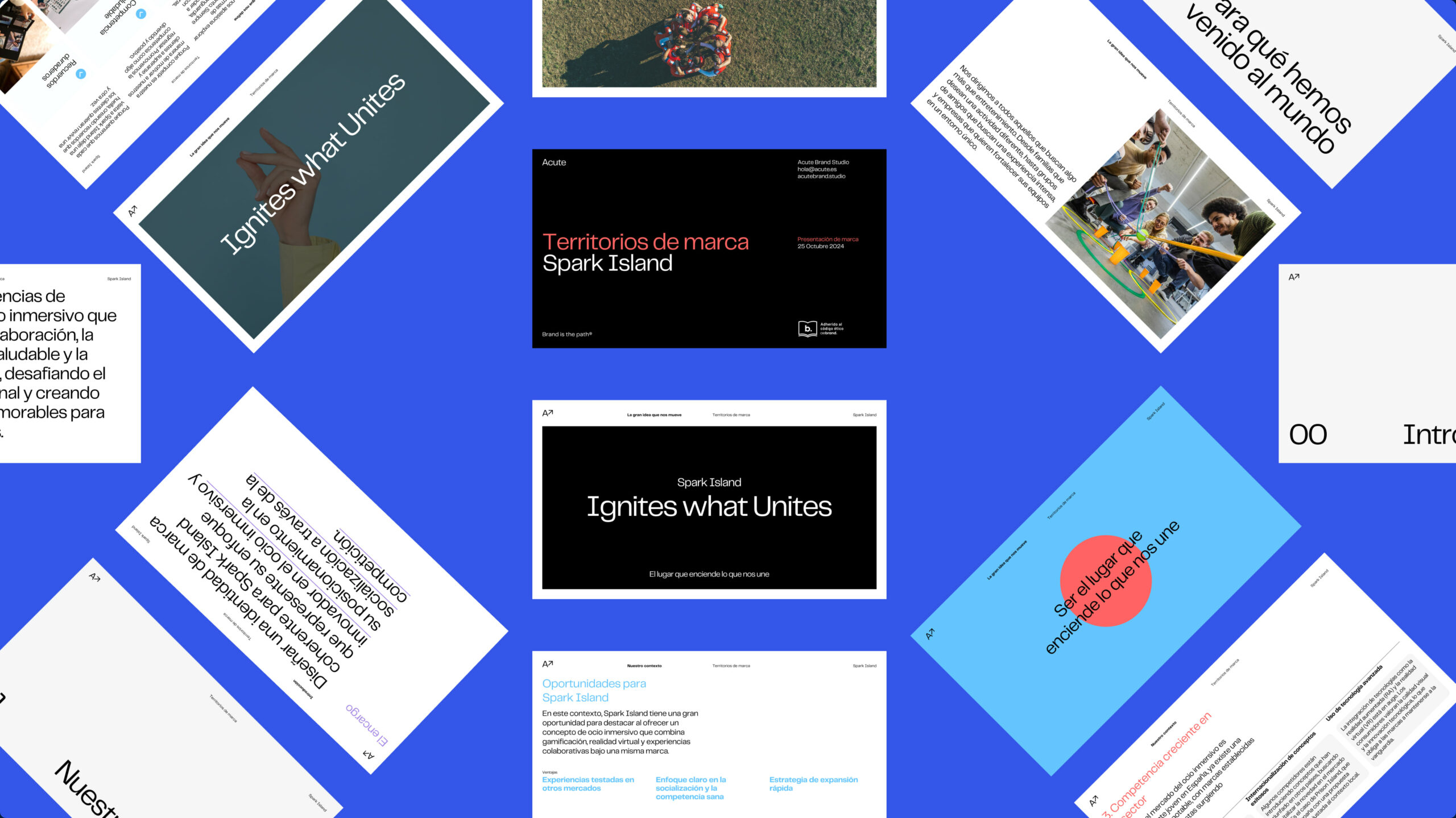
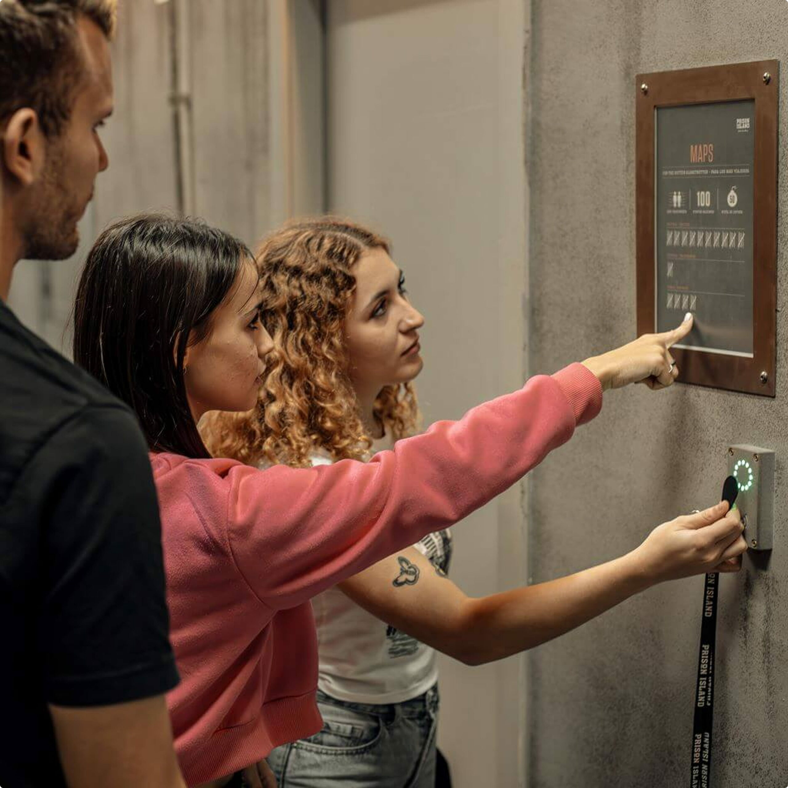
Spark Island was created as an umbrella brand to bring together, under one roof, leisure experiences designed to be enjoyed in groups: next-generation escape rooms, immersive virtual reality, and augmented car races, among others.
The assignment is to build a brand identity from scratch, with the strength needed to serve as the foundation for an ecosystem of sub-brands and to support the company’s growth in each new city.

Festival Season: Shared Celebration as a Brand Universe
Before designing anything, we asked ourselves what need Spark Island truly fulfills: the need to get together and have fun as a group, with no other reason than simply being together.
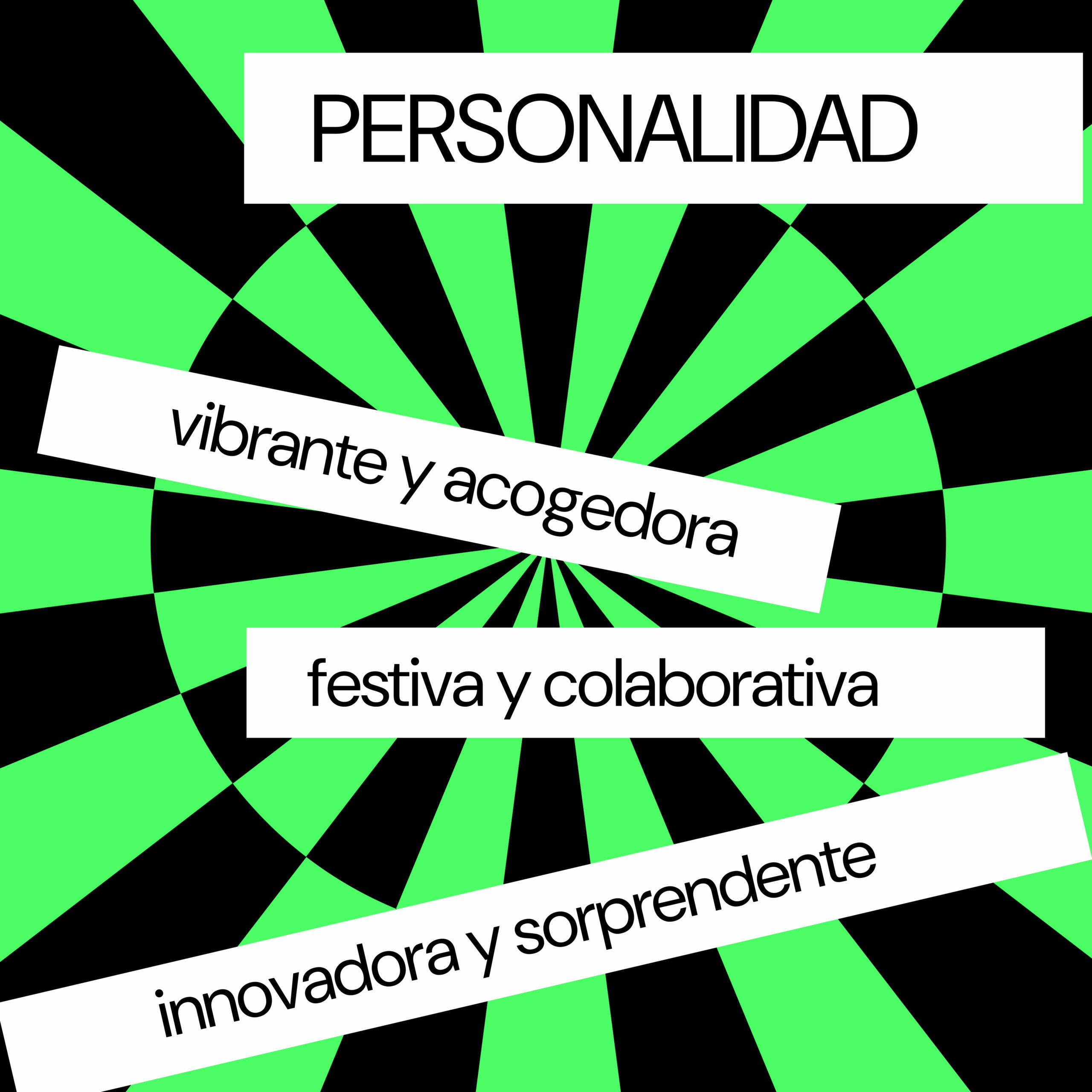
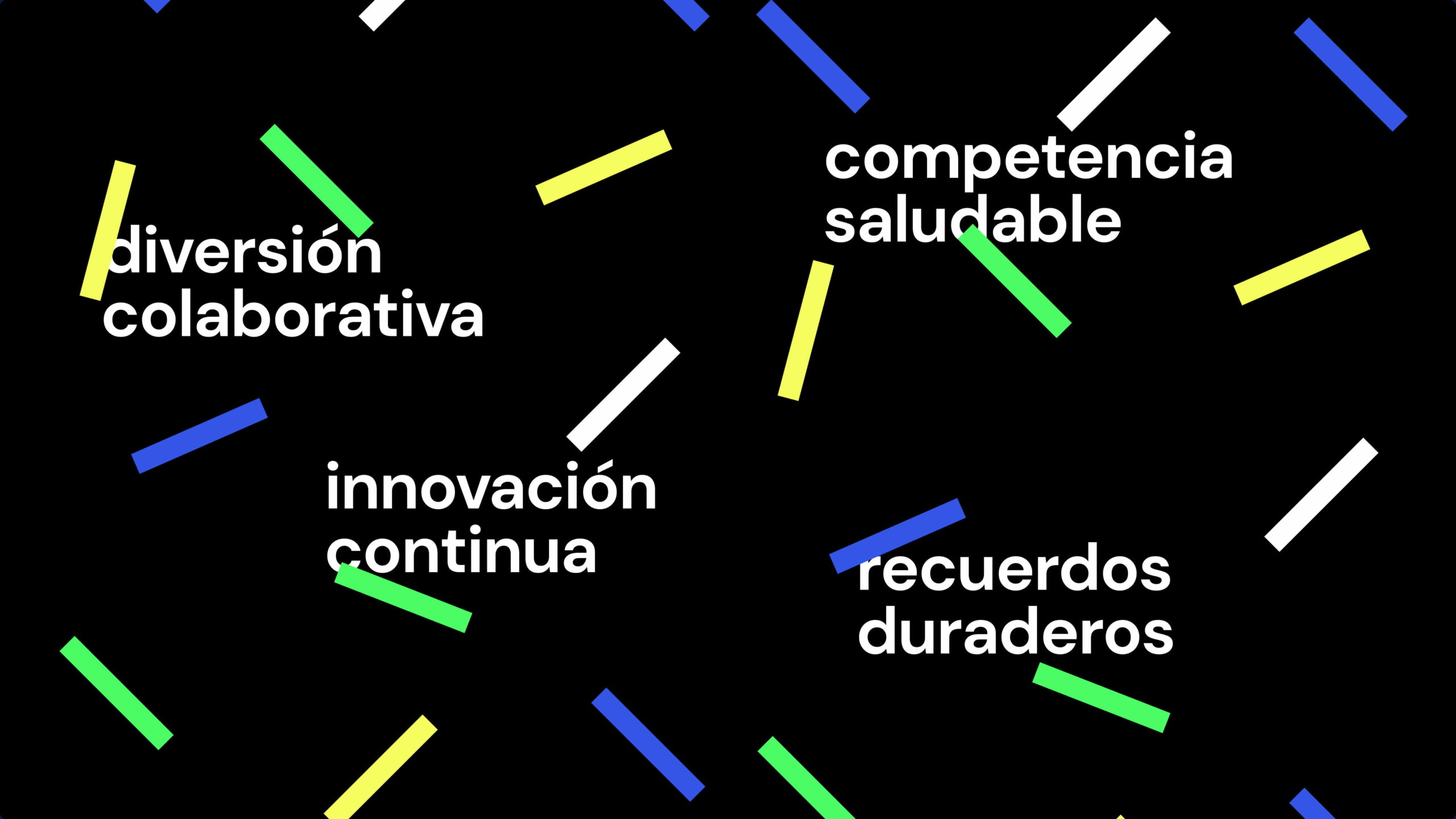
That’s where its brand territory, “festival time,” comes from: that moment of freedom, joy, and community experienced at a popular festival. Spark Island positions itself as the place to celebrate by sharing—a world of fun, lasting memories, and innovation.
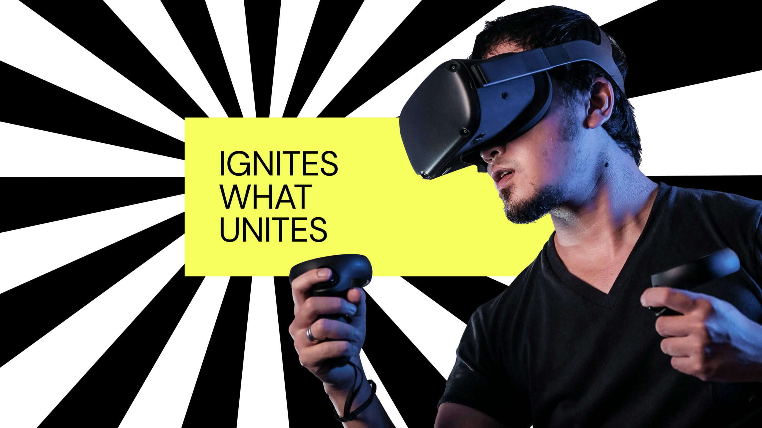
Igniting the brand identity
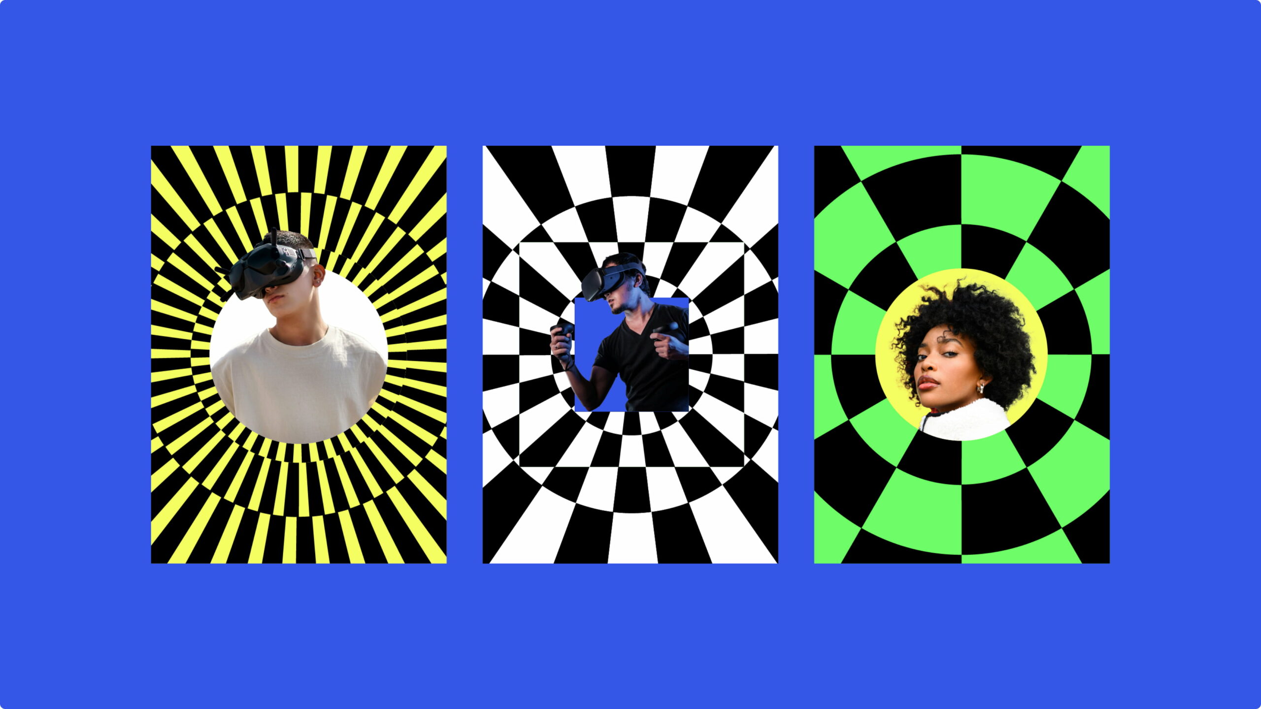
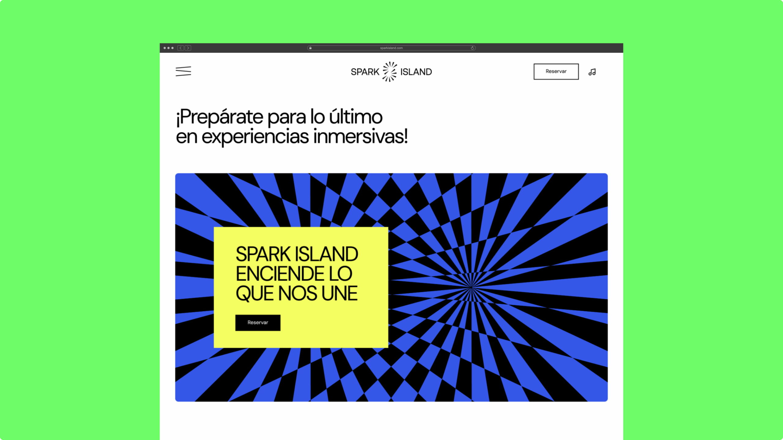
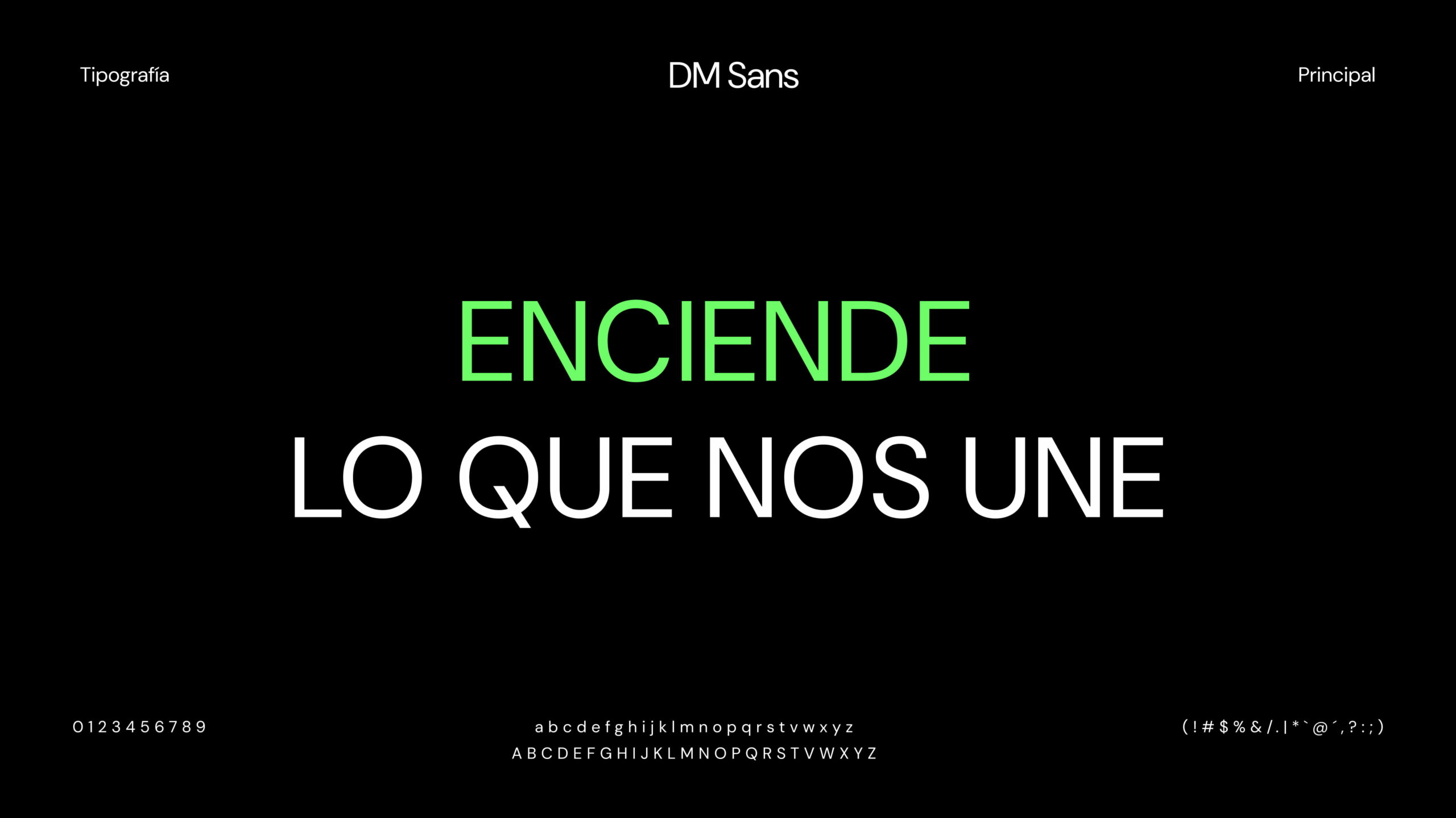
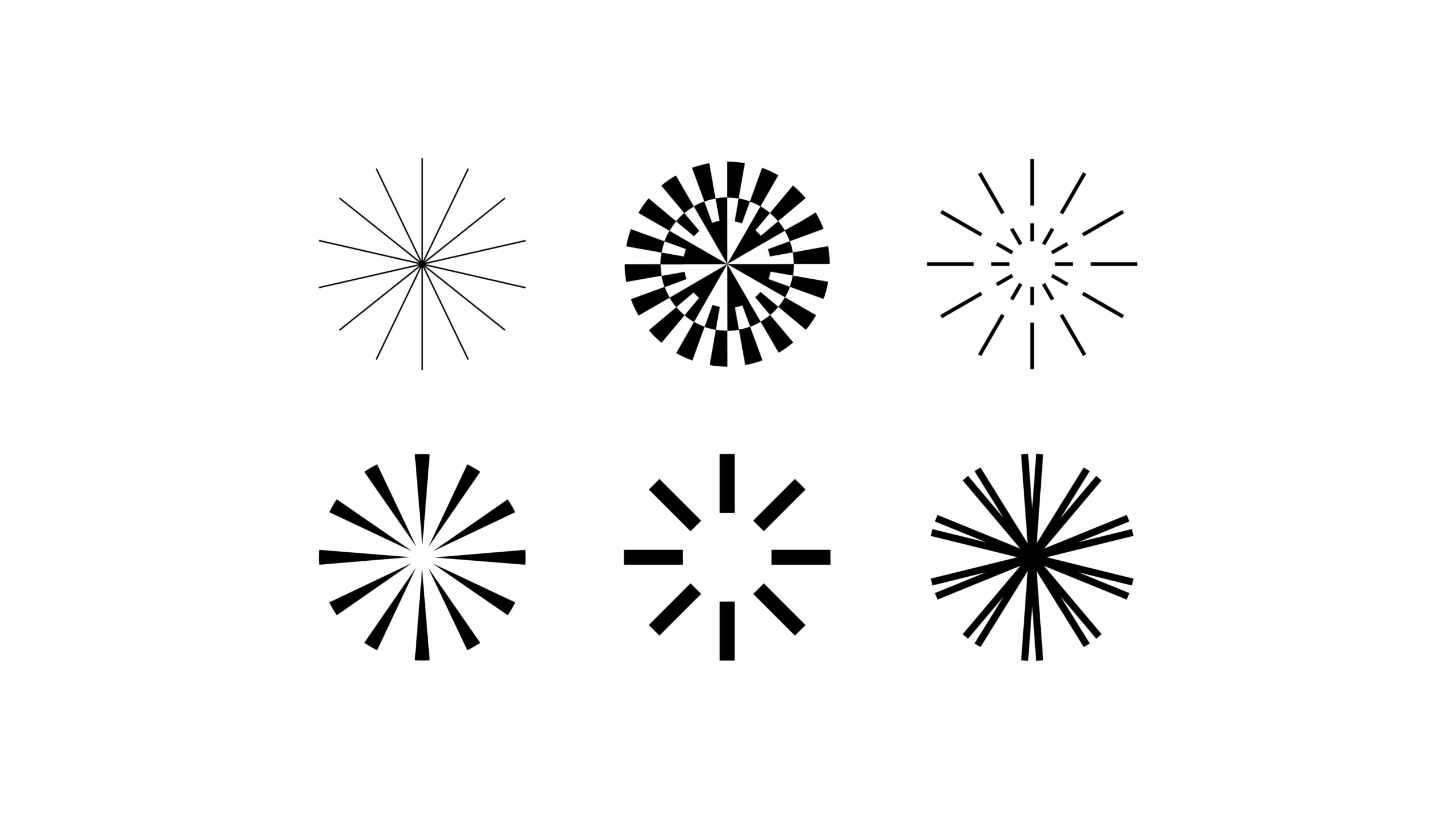
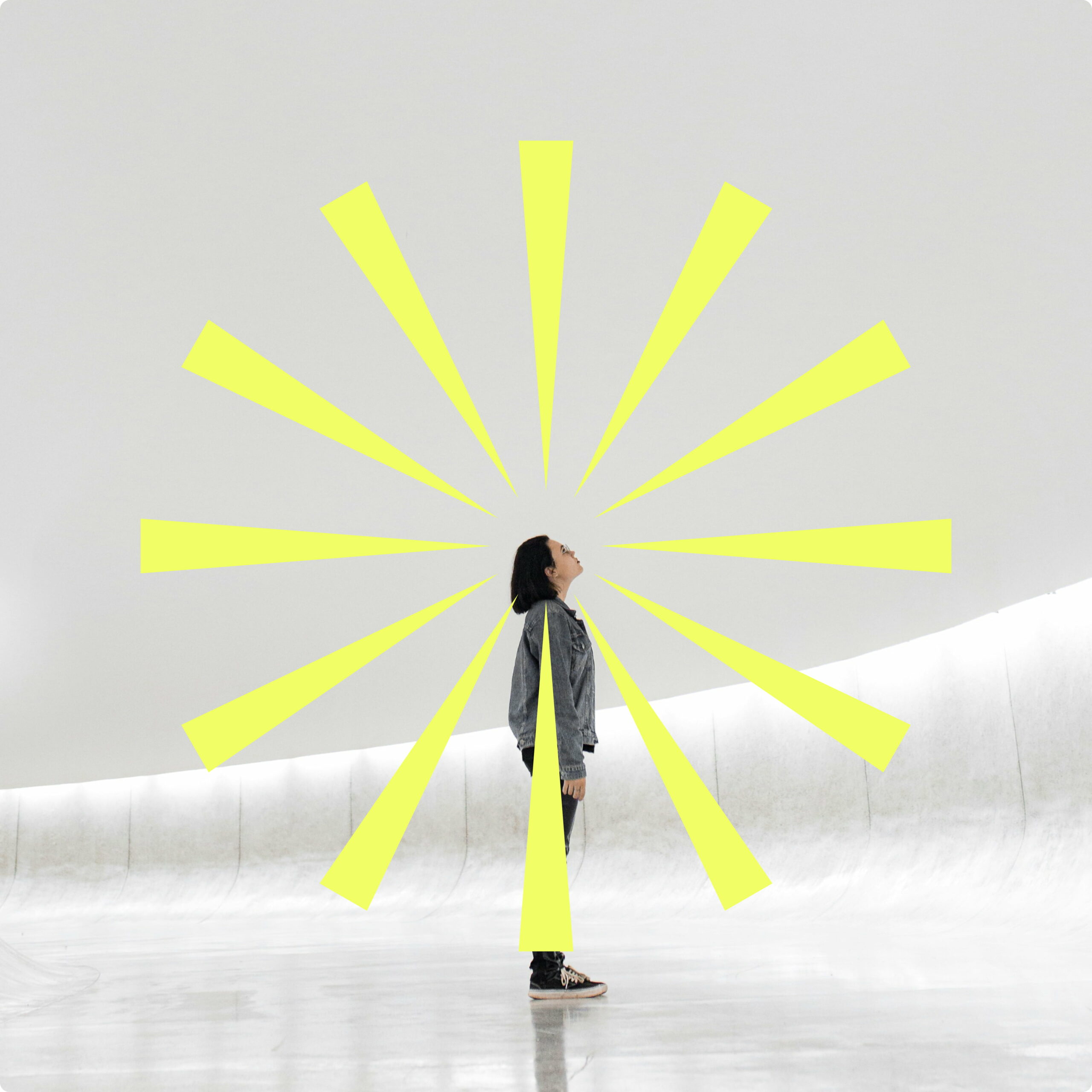
With the scope defined, the challenge is to translate it into a unique and recognizable visual language. We took the word that gives the business its name “spark” as our starting point and reduced it to its simplest graphic form: a flash made up of simple lines, capable of serving as the common thread throughout the entire identity, from the logo to the sub-brands.

A “sparkling” visual system
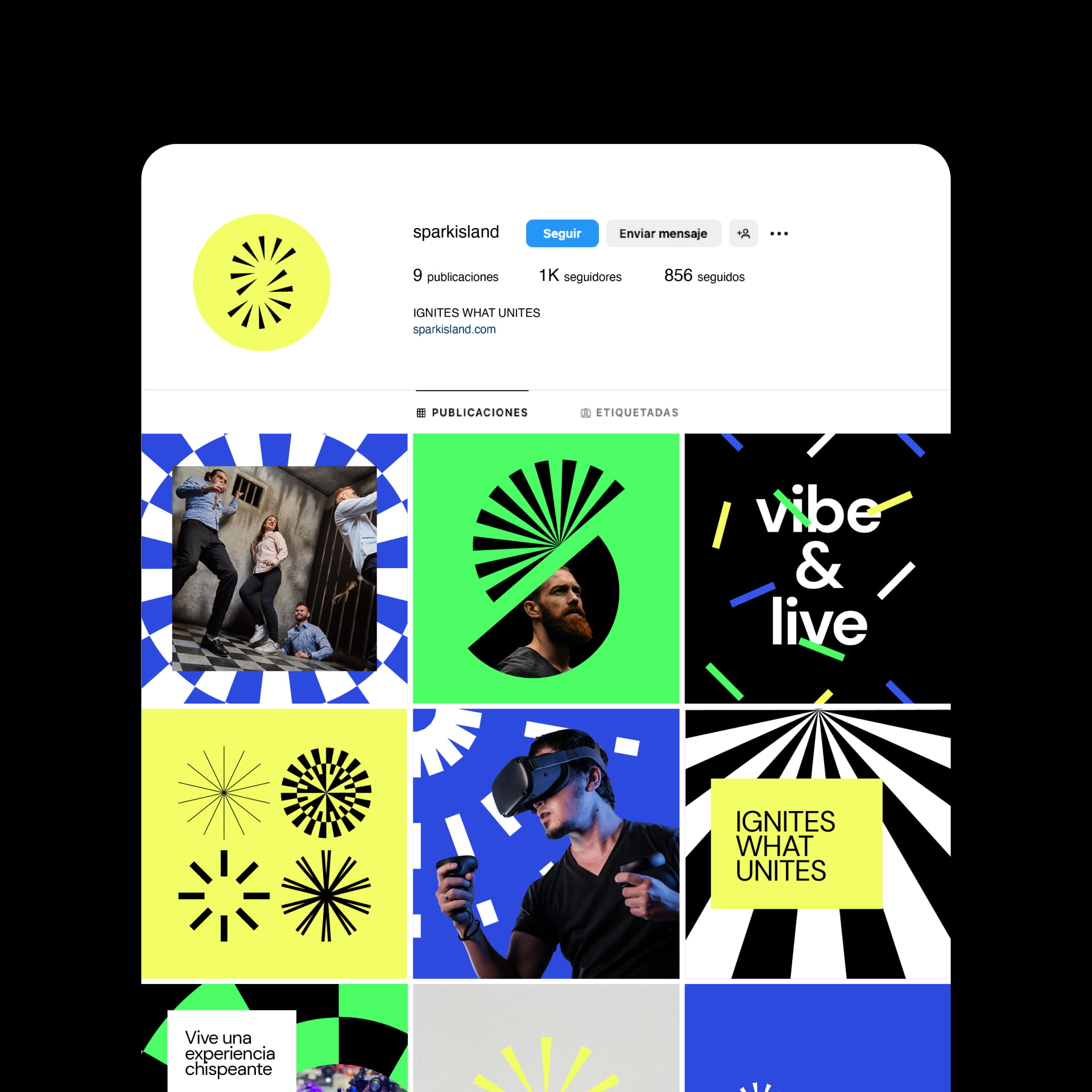
The brand icon is born from the union of two sparks that together form a dynamic and playful “S”—equally dynamic and fun—reflecting the connection between people that defines the brand.
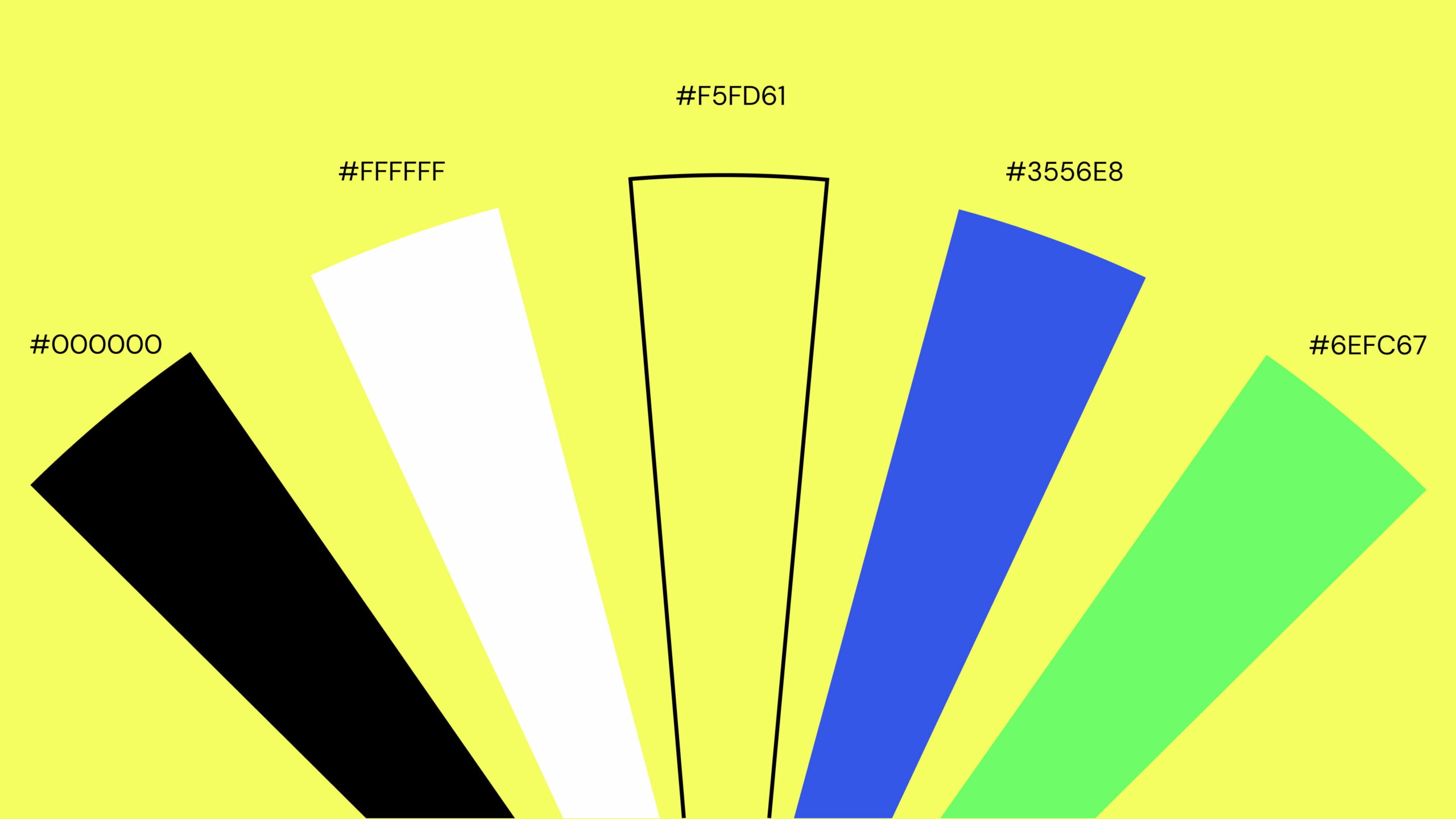
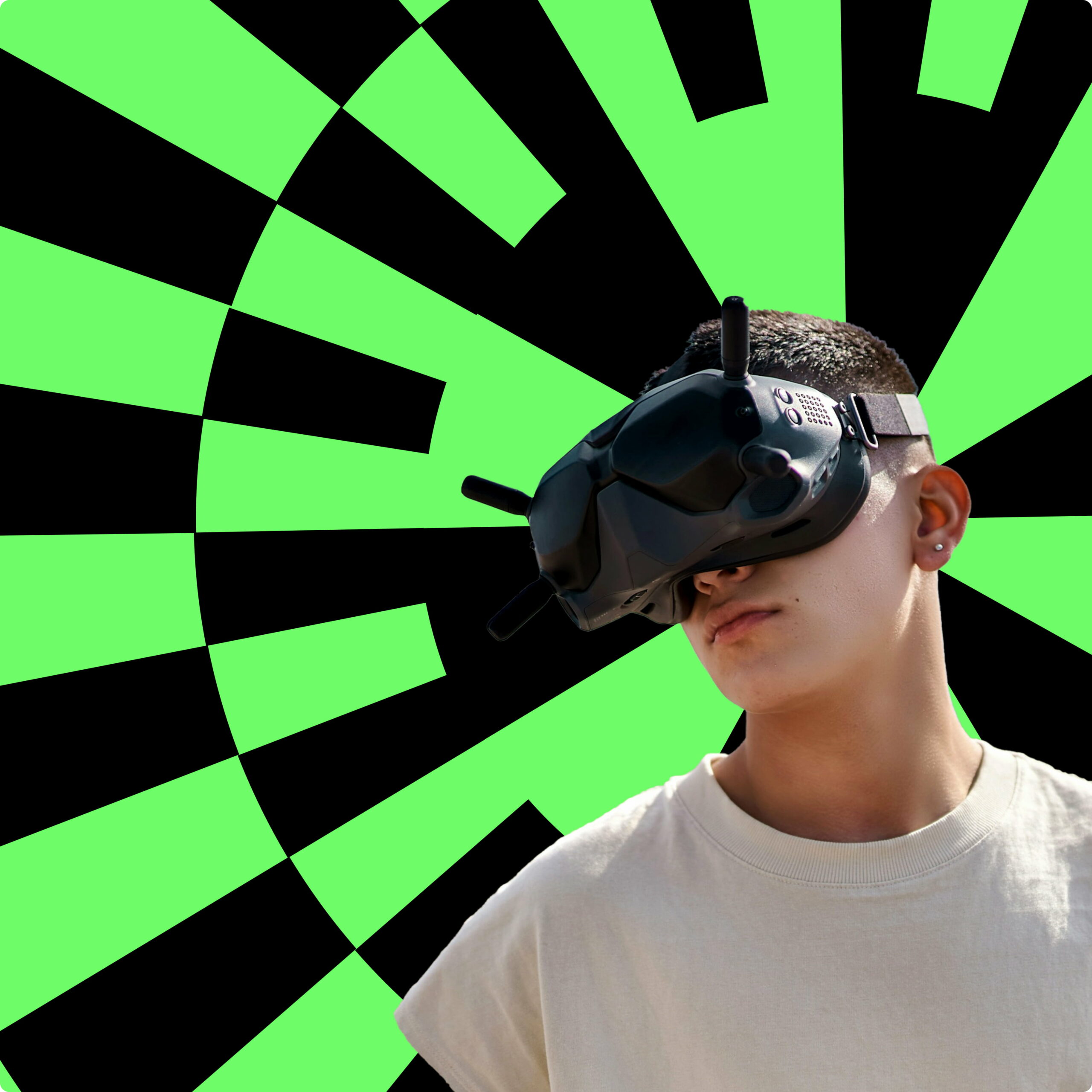
The color palette is based on black and white, along with three accent colors designed to convey fun, memories, and innovation, which are used flexibly depending on the product or subbrand being featured at any given time.
A different spark for each product in the family
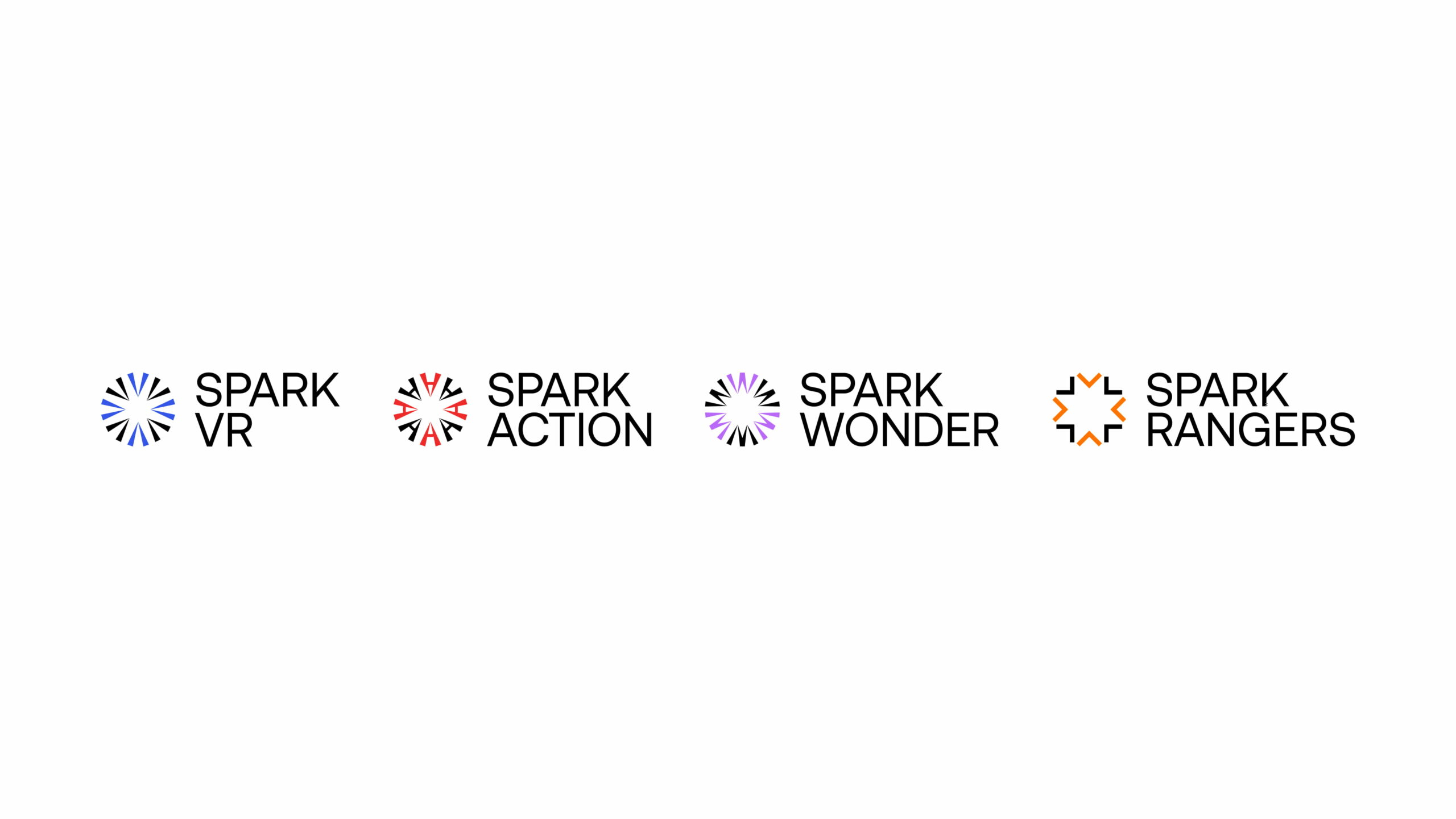
Spark Island needed to be able to grow without losing its cohesion. That’s why we designed a sub-brand system that creates a unique spark based on the first letter of each product, while always keeping the hierarchy with the parent brand clearly visible.

The Spark Island Brand in Action
From the logo to social media, stationery, and day-to-day communications, sparks and flashes become the graphic element that brings the Spark Island universe to life, adding movement, energy, and a recognizable identity at every point of contact with the brand.