Vostok
Adventures connecting emotions
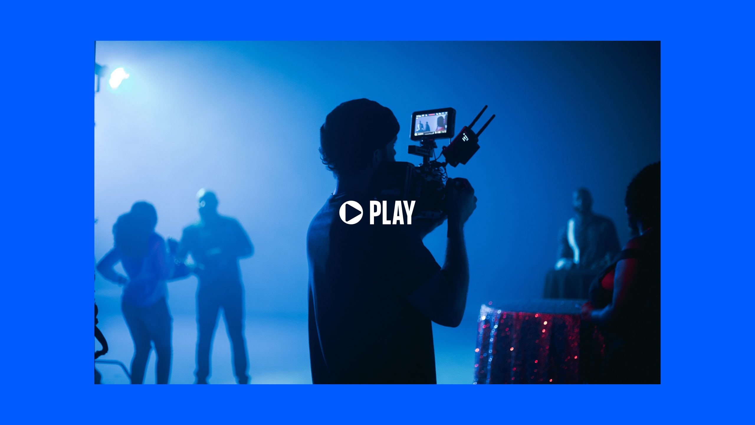
The video production company "Vostok Films" contacted our office to entrust us with a mission: to lead their brand turnaround. As they keep on growing they needed a stronger identity that would help them capture the attention of their audience and represent the moment of success that the business is experiencing.


During the understanding phase we realized that, in general terms, the competitors did not have excessively developed identities. Although those that did —generally the big ones in the sector— had a strongly defined positioning and visual and verbal universe. However, the territory in which Vostok placed his flag was already in his DNA: Ready for Adventure.
It was over this idea of “being ready” for adventure and space programs that we developed their brand strategy, where the reality of the business should also be reflected. And, what is it about advertisements that when they are well done they put smiles and tears on our faces? Vostok creates and produces adventures that connect emotions, this is its essence.


Sí a la aventura espacial, no a la ostentosidad
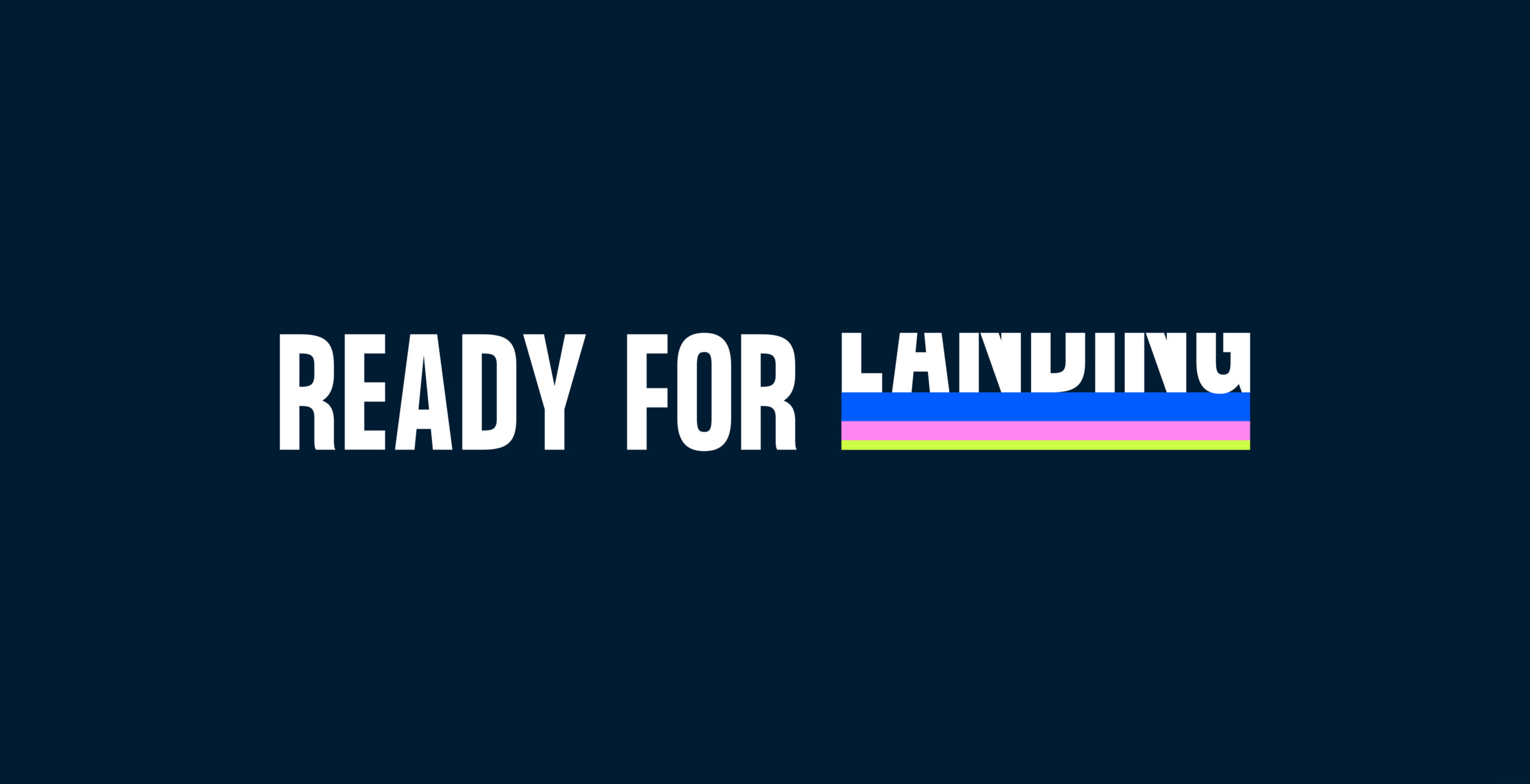
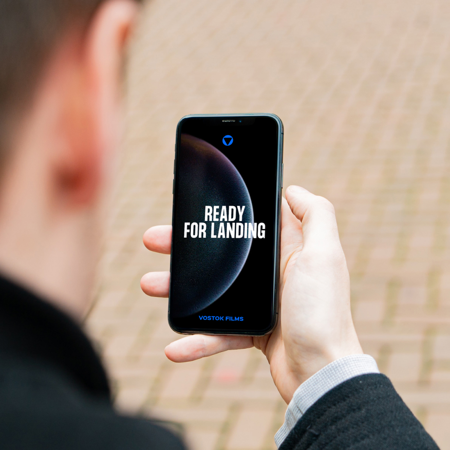
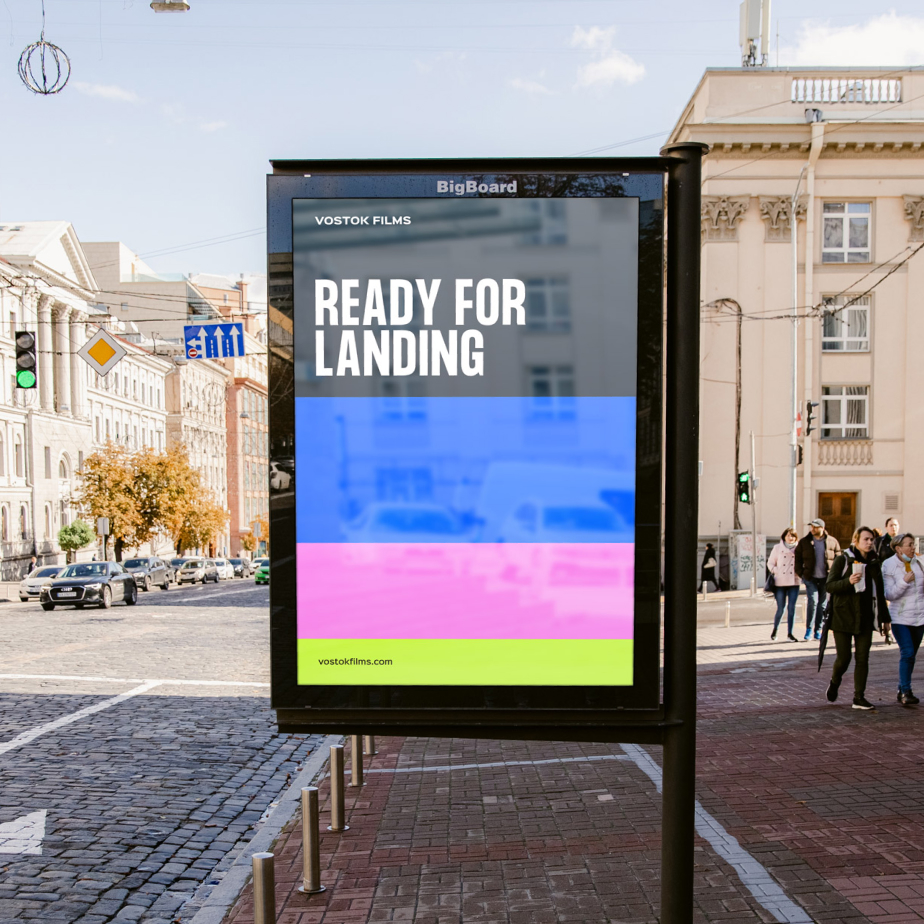
Regarding the verbal identity and the brand tagline, we were looking for powerful messages full of personality. Team spirit, planning, and adventure must be breathed/perceived in a sector where tight deadlines rule. Vostok needed to convey security: Ready for landing, be ready to land your ideas on the screen. Prepared for everything that may come along the way.
Vostok Films team has things clear: yes to the space adventure, no to the ostentation –or the frontier– that the United States represents. During the project, we faced a naming crisis because “Vostok”, as you know, is the name of the 1961 Russian space program that managed to take the first man into space. We decided that if the brand avoided Soviet codes on a visual level, the origin of the name would not carry as much weight as they/we might fear.
Representing the idea of being prepared visually
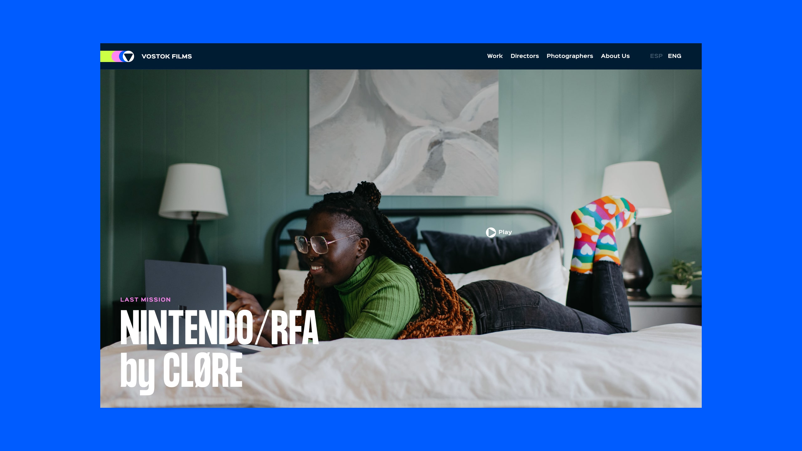
Por último el reto de la nueva identidad visual de Vostok fue transmitir esa idea de “Ready for landing”. El objetivo era significar dos cosas. En primer lugar que son fiables por su expertise y en segundo lugar que son un equipo en constante búsqueda de soluciones óptimas. Para ello definimos a nivel visual una serie de recursos muy rotundos, como la tipografía o el color, que hablan de determinación y fiabilidad, y otros como la estela de color en movimiento o ciertos iconos inspirados en el viaje espacial, que hablan de aventurarse en lo desconocido.
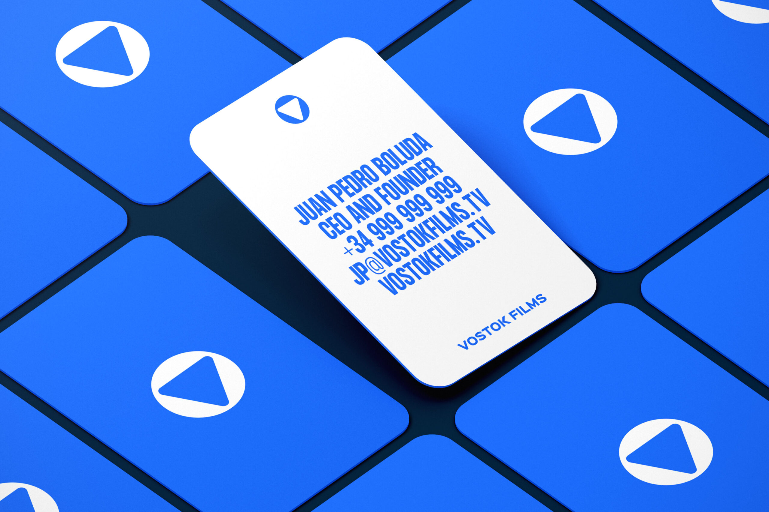
Finally, the challenge of Vostok’s new visual identity was to convey the concept of “Ready for landing”. The goal was build two ideas. First one, they are reliable due to their expertise, and second one, they are a team in constant search of optimal solutions. To do this, we defined some bold visual assets, like typography or color, that convey determination and reliability. And we introduced another kind of graphic elements, like the color trail in motion or certain icons inspired by space travel, that convey the idea of venturing into the unknown.

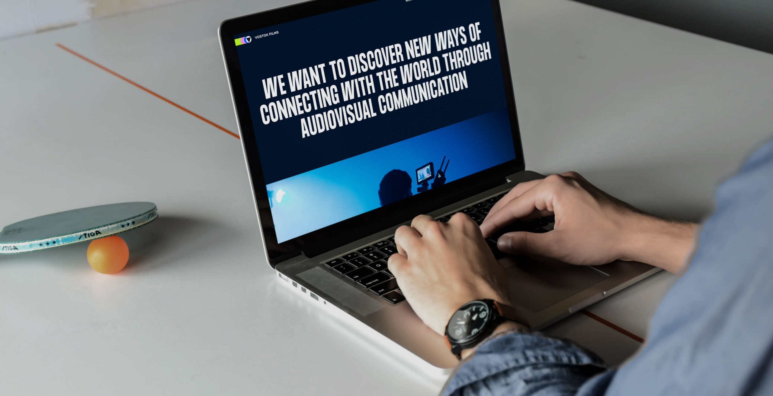
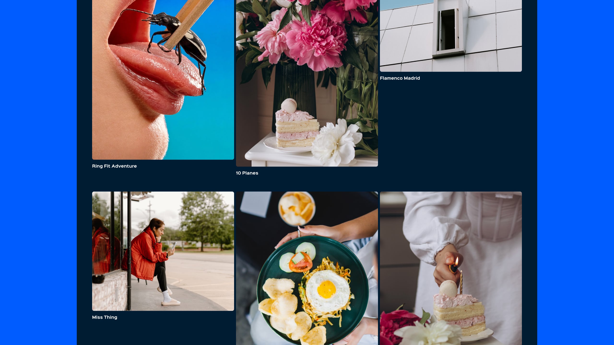
The planet to establish contact: the company website
The key brand contact was its digital portfolio. We worked in concept, design, development and production.