Liceo Francés Rugby
Formar y transformar (Teach and convert)
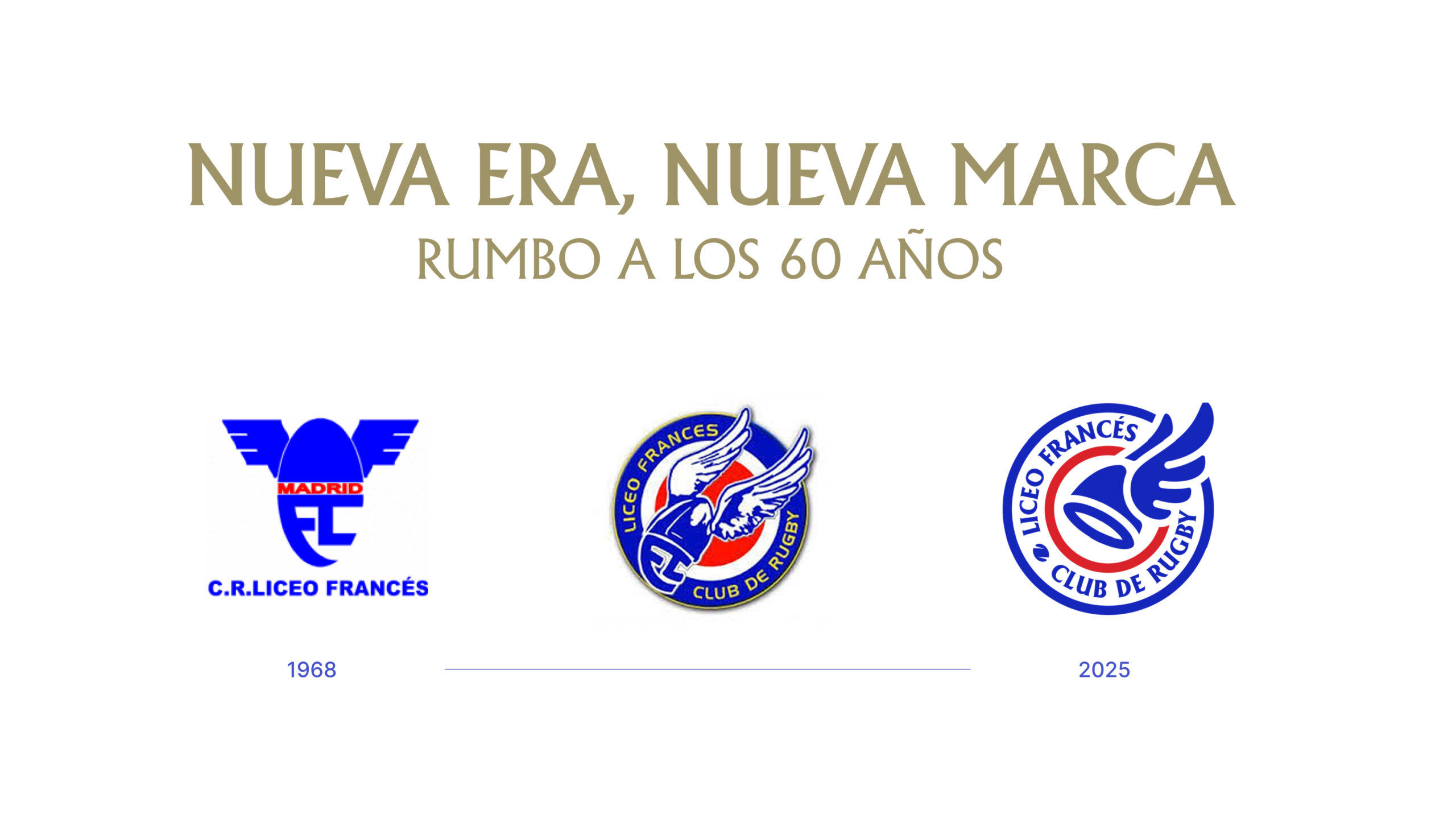
The Liceo Francés Rugby Club in Madrid came to us to redesign its brand and kick off a new chapter in its history. Founded in 1968 by the educational community of the Liceo Francés de Madrid, the club is one of the historical benchmarks for youth rugby in Spain. A challenge on multiple levels: updating its visual and verbal identity without losing its educational essence, highlighting its Franco-Spanish character, and projecting a more cohesive and professional image to its community and sponsors.
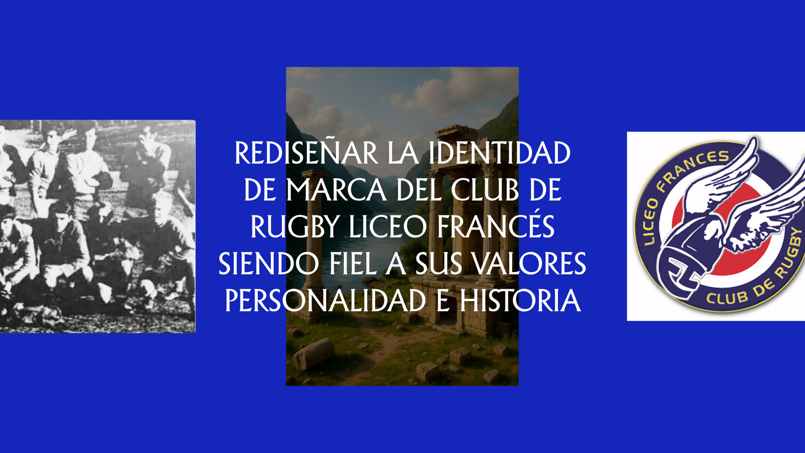
Before redesigning the identity, we conducted in-depth research to understand the club’s history, culture, and vision. Through interviews with players, former players, coaches, and managers, along with surveys and document review, we identified a key tension: maintaining the formative and family spirit that defines Liceo, while moving toward a more professional and visible structure.
This analysis gave rise to the strategic foundations of the new brand: reclaiming its dual French-Spanish heritage, reinforcing pride in belonging, and defining a shared narrative that would unite generations around a common purpose.
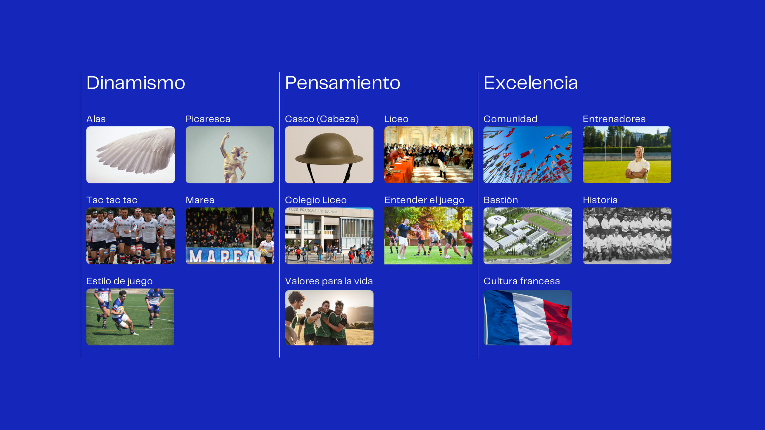
A brand essence to drive them all forward
The Liceo is much more than a club: it is a diverse community that brings together children, teenagers, families, coaches, and high-level players. This diversity made it difficult to find a brand idea that could connect with all of them.
The key was recognizing that, both at the grassroots and elite levels, the purpose was the same: Formar y transformar (Teach and convert in english). A brand that teaches people to understand the game and life, that trains people with values and transforms the way they view sport.
Furthermore, the verb “transformar” (convert in english) itself has a double meaning that is deeply linked to rugby: in the game, transformation—or conversion—is the kick that adds two points after a try, the gesture that completes the play and gives meaning to the collective effort.
At Liceo, training and transforming thus become a metaphor for continuous learning, for that constant desire to improve, to keep adding and for winning ambition.
Hermes and his winged helmet: a mythical identity
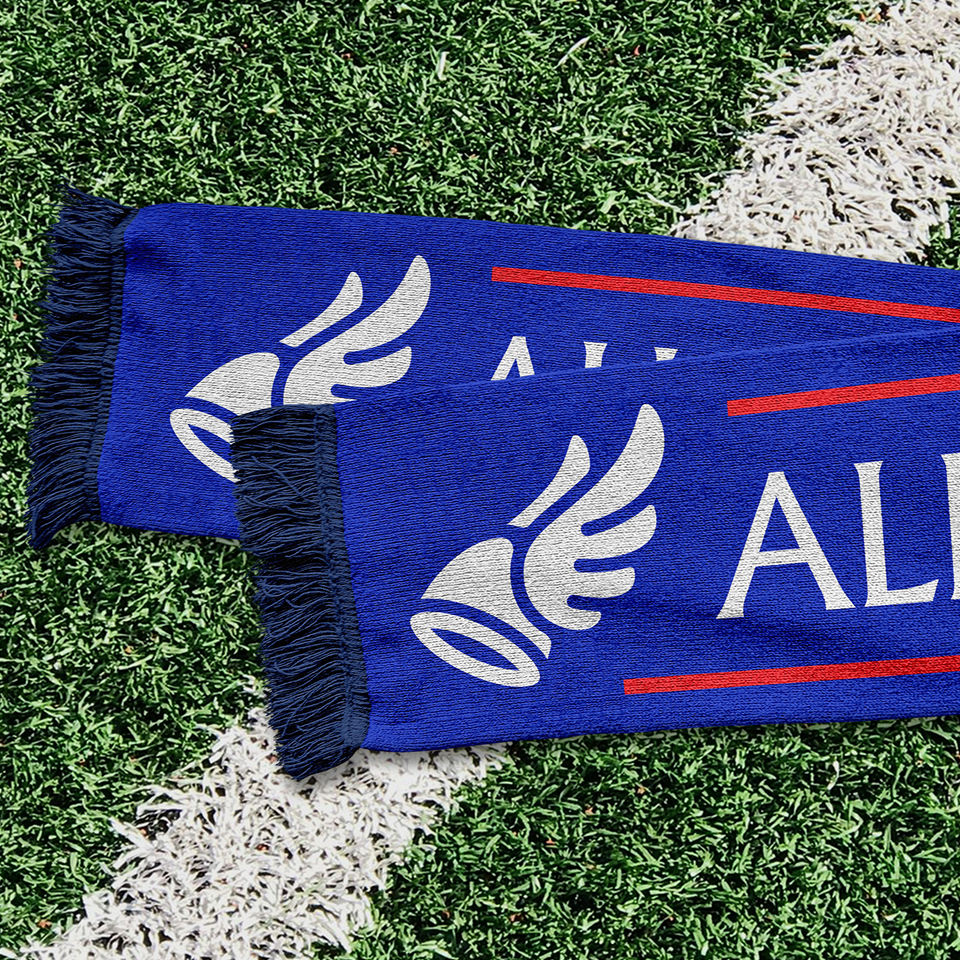
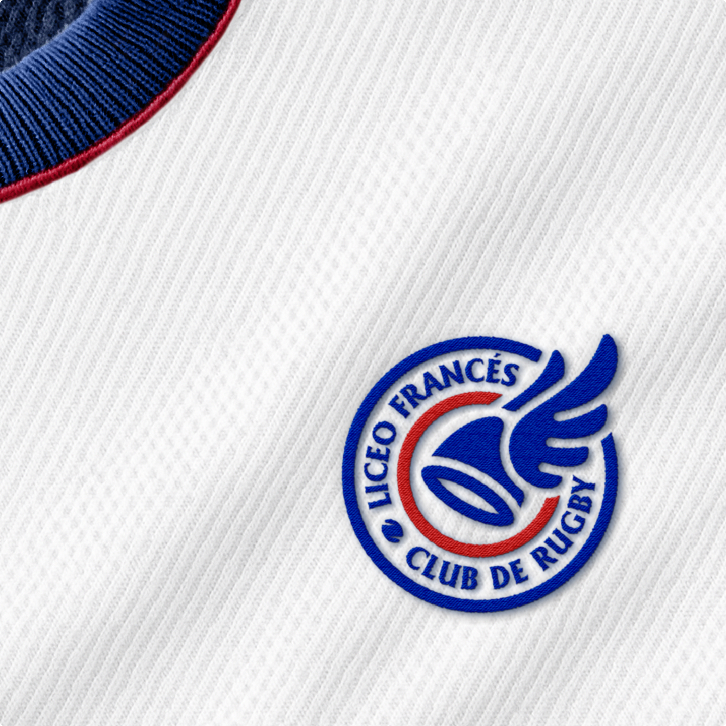
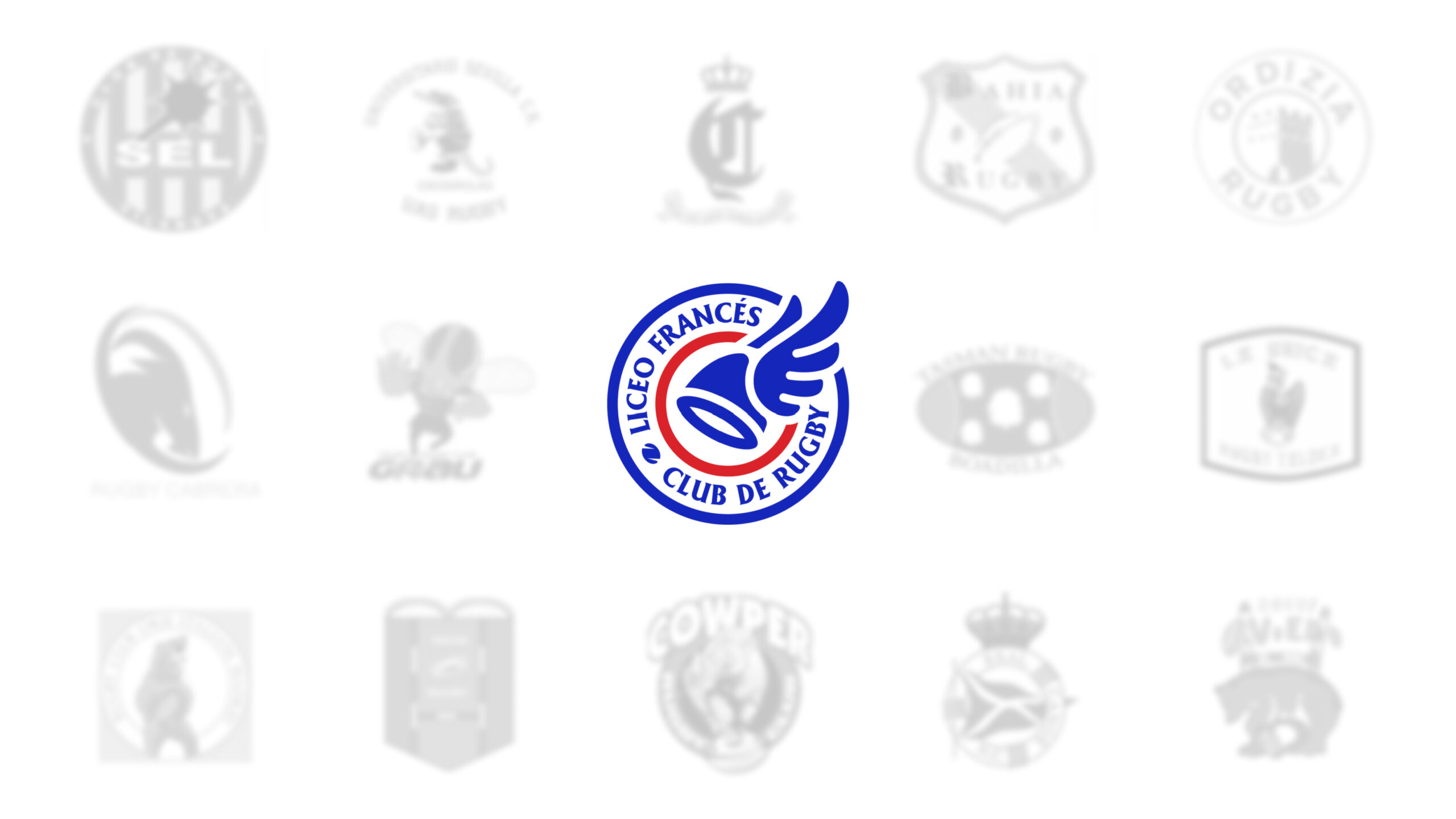
The new identity of the Liceo Francés Rugby Club is based on the symbol that saw them come into being: Hermes’ winged helmet.
God of ingenuity, speed, and communication, this metaphor connects directly with the essence of the club and its understanding of rugby: a game of mind, intelligence, and constant movement.
The mythical helmet is reinterpreted as a symbol of mental agility and collective spirit: a way of thinking and playing with style.
Thus, the winning concept of the creative process was the Olympus of the oval, which reinterprets the club’s classic imagery to elevate it to a new symbolic level.
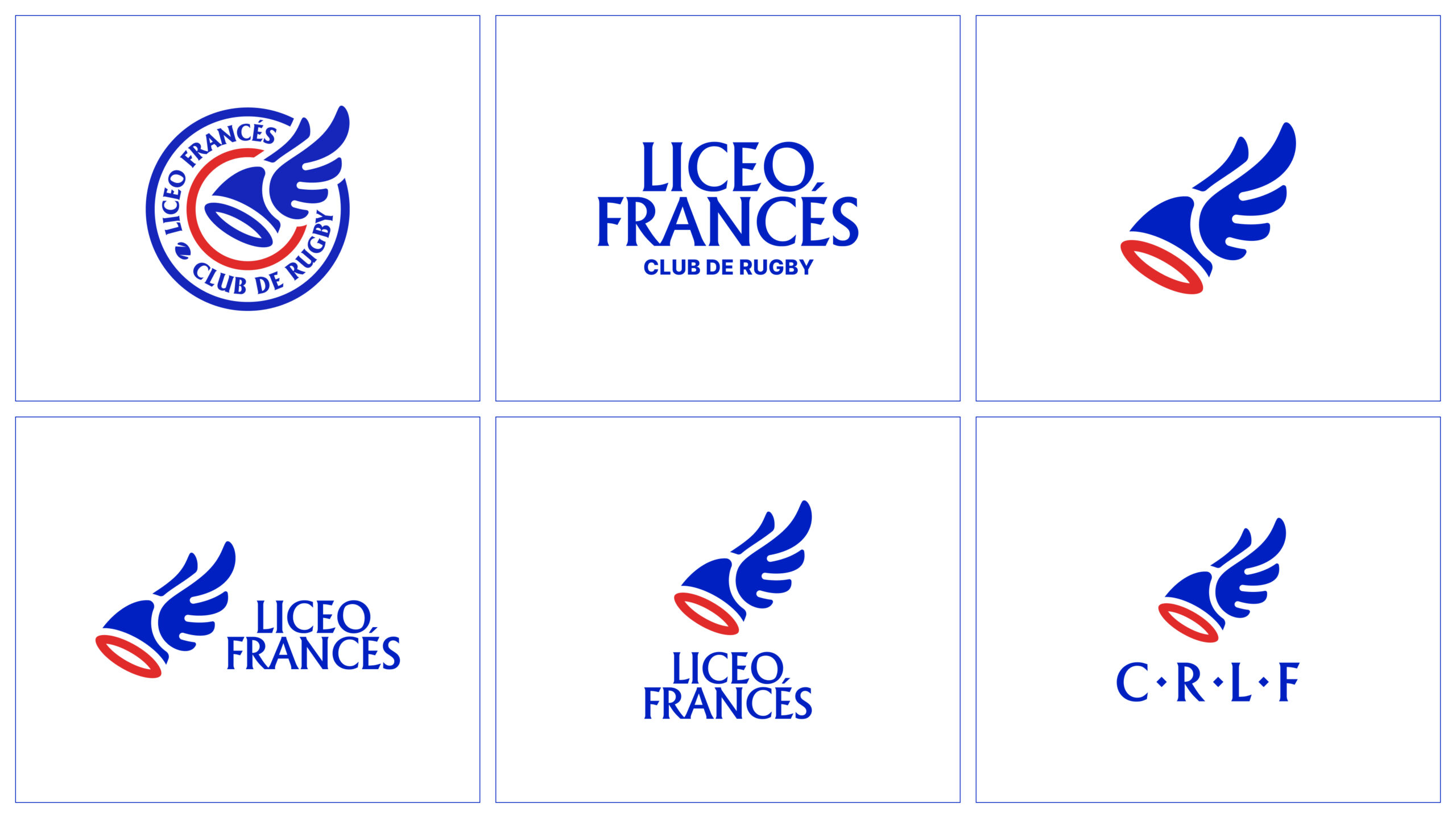
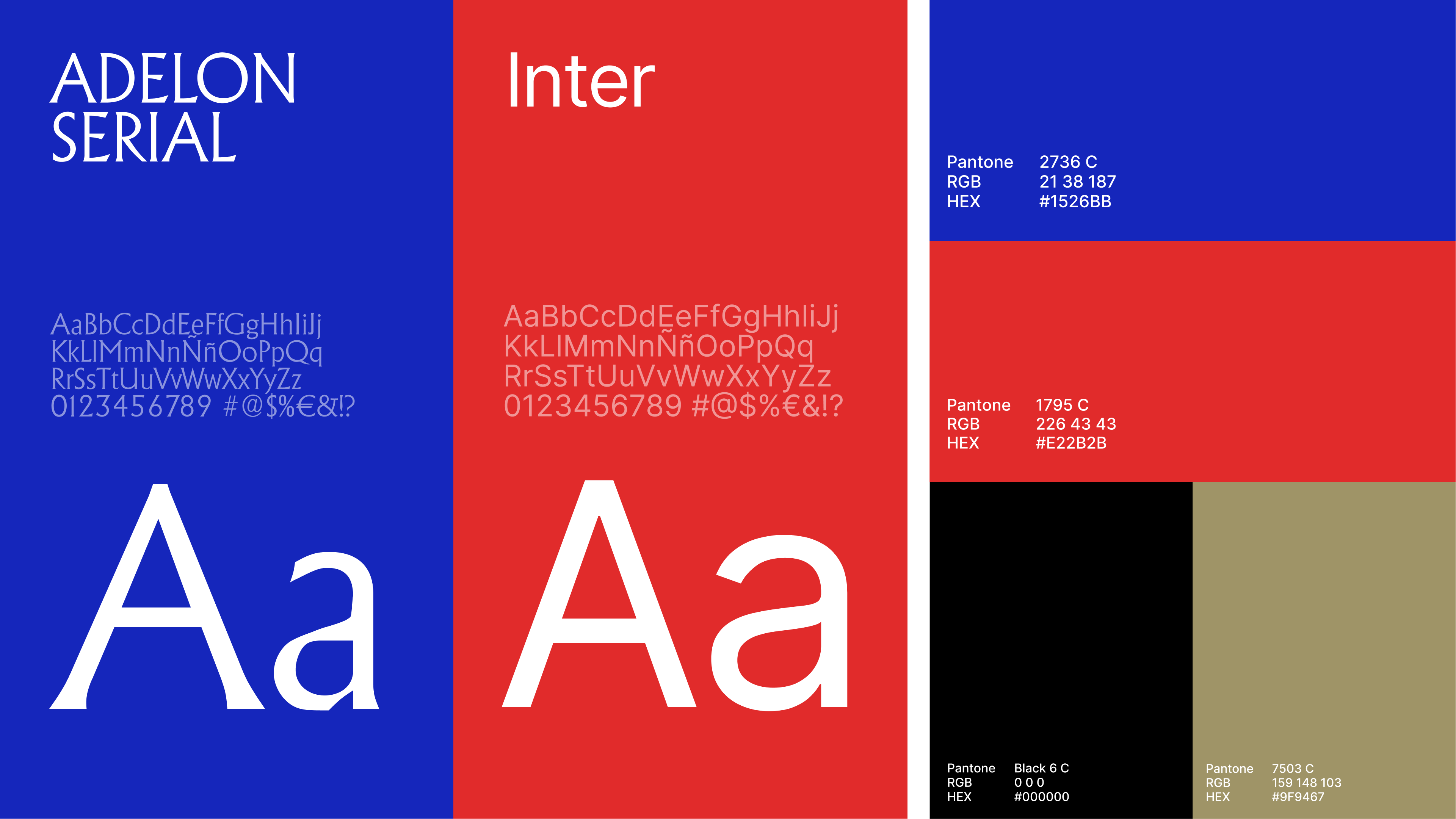
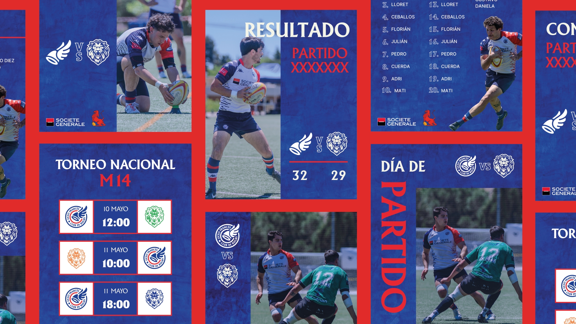
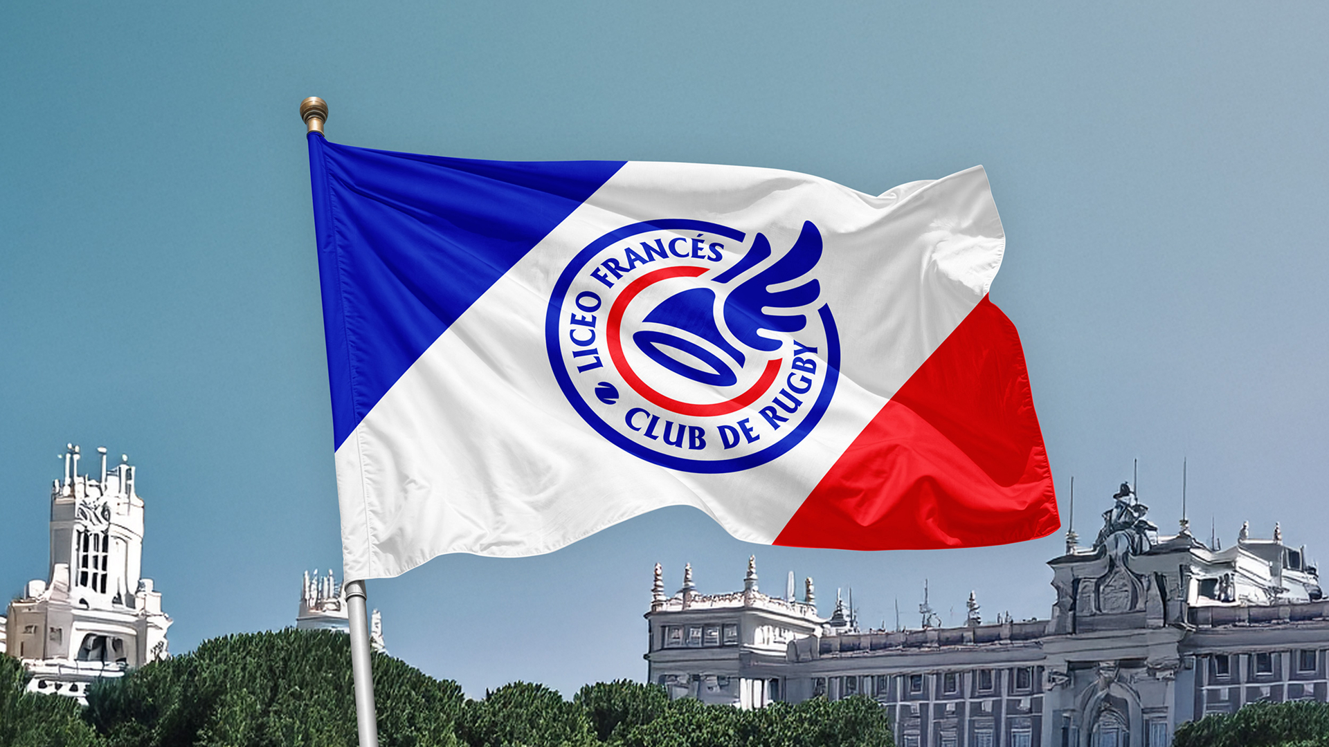
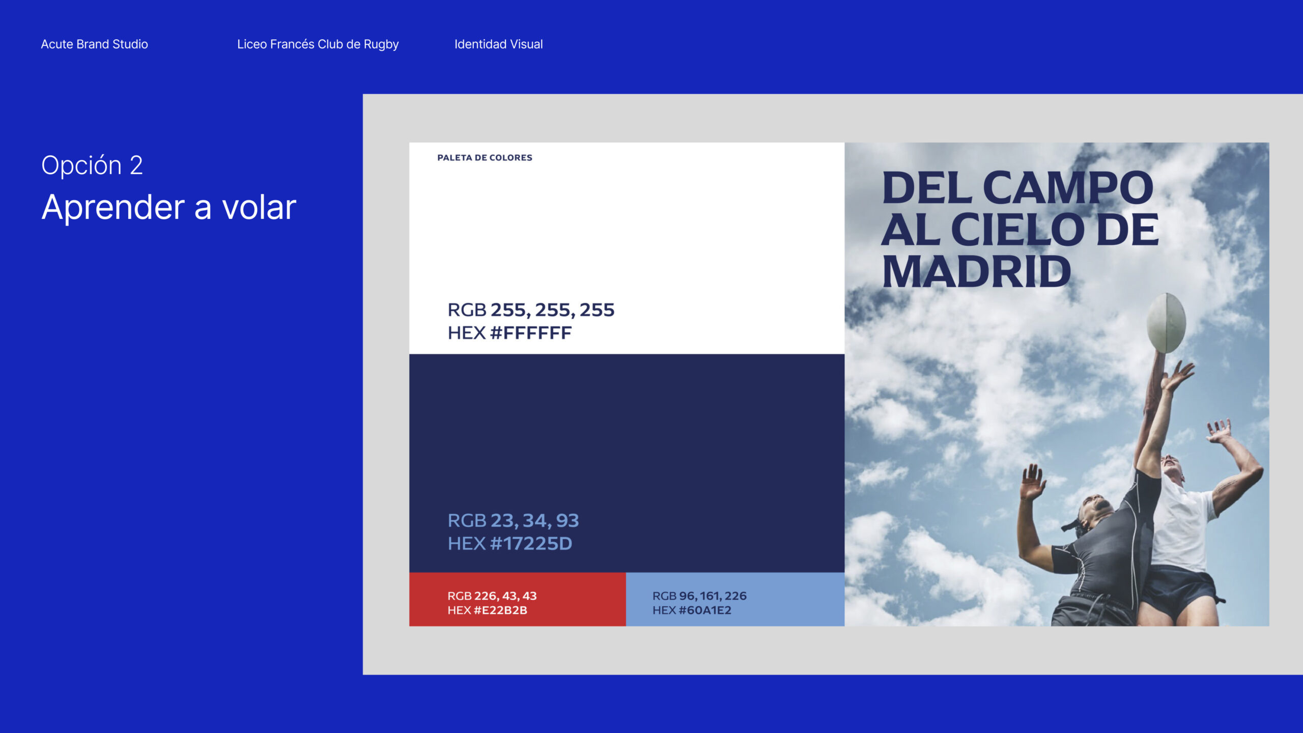
We revised the color palette to balance the elegance of the Liceo blue with warmer, more contemporary shades, and developed a flexible architecture of logos and lockups that clearly identifies the different categories and teams.
